Envision, Create, Share

Welcome to HBGames, a leading amateur game development forum and Discord server. All are welcome, and amongst our ranks you will find experts in their field from all aspects of video game design and development.

The Screenshot Thread

Status
Not open for further replies.
SECHS: I love the tileset very original looking. Something about the cliff edges that go vertical doesn't sit right with me though for some reason. Not sure why. Maybe I'm just imagining it.

DIEGOALE
: A fascinating blend, very detailed and pleasing to the eye. What we'd really like to see is something in action though, because it's clear these maps have the talent but how will they play out in the game is still a bit of a mystery to many of us.

Okay well I've been frankenspriting a tileset to give it a Greco-Roman Classical Period of Architecture look, opinions people. Oh an don't worry if there's a priority off or two I haven't set it up properly yet.
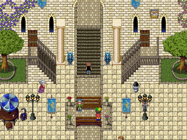
LangaraLowerTier.png
 
@Petros:
There are errors with your map. The wall seems to blend in with the floor tiles, so it is really hard for the player to distinguish what's a wall and what is a floor. Plus, the colors are hard on my eyes.
 

moxie

Sponsor

Also I would mess around with the floor tiles a little bit, as that one dark square makes the grid really obvious. Maybe make a couple of different variations or something.
 
Okay advice taken and amendments made, it's not much but I think its a little easier on the eyes. My only problem is that this grand city of white brick and mable now looks a little dirty and grimy, which wasn't my intention, or perhaps that's just me. Opinions on both accounts please?

LangaraLowerTier-1.png
 
aaaaaaaaa my eyes exploded

please reduce contrast on the floor and walls! [drastically!]

if you do that it'll actually be pretty nice looking though
 
Petros, my eyes are bleeding. You need simultaneously less and more contrast--less on the tiles themselves (particularly the floor tile--it's REALLY confusing right now) and more between the tiles themselves. You should probably make the wall darker than the floor. But yeah, the white stuff looks glaringly out of place with the other tiles. As a tip, things will look unified if they have similar highlight and shadow colors and similar levels of saturation.
 

moxie

Sponsor

On the plus side Roman architecture is amazing. If you get all the problems worked out you'll have yourself a cool, atmospheric city.
 
Alright contrast lowered, I think I'm getting it to a stage where it will look better now, hopefully this is okay now. I'm sort of flying blind here because I'm not sure what exactly constitutes as "eye bleeding" material. I think the columns need some adjustments but aside from that, anything else? Lower still?

LangaraTesting.png
 

Tindy

Sponsor

I think you need to go back to Peri's "more contrast" part of her quote - your walls and floor, though slightly more differentiated, still don't quite have enough contrast to make them separate entities. The walls, I think, still need to be darker, but I think the ground color is ok.
 
Petros":1txaukhh said:
DIEGOALE: A fascinating blend, very detailed and pleasing to the eye. What we'd really like to see is something in action though, because it's clear these maps have the talent but how will they play out in the game is still a bit of a mystery to many of us.

Petros, what you see there is not for a background of a 2d rpg, it's an actual section of a map of my 3d RPG. so that's in-action.
I will soon put some in-game shots, rather than just test ones.
 
I'm aware it's 3D Diegoale, I'd like to see it all in action though. It's not fully 3D now is it? More like PS1 with the pre-rendered backgrounds am I right? If I'm mistaken then I'd really be interested to see a video perhaps that demonstrates this.
 
Petros":1ij6npfs said:
I'm aware it's 3D Diegoale, I'd like to see it all in action though. It's not fully 3D now is it? More like PS1 with the pre-rendered backgrounds am I right? If I'm mistaken then I'd really be interested to see a video perhaps that demonstrates this.

No, its a full 3d game, the environments are rendered in realtime.
the game is made in a 3d engine.

I should have a video pretty soon.
 
@Petros: The floor tiles look better after you followed the advice about reducing contrast. You need to do the same to the walls. After you do that, you need to make them a different color/darkness from the ground. I'm thinking the ground should look like marble (white) and the walls like stone (gray). You could also solve some problem by adding shadows.

This has been bugging me...the road border tiles (that you use around the main path and the grass areas) should not border the stairs. You'll notice the stairs are flanked by the same borders. I'm sure it will look better if there isn't a border at the top and bottom of the stairs.

Also, I tend not to use the banisters on the side of the stairs that's up against a wall. Maybe there ought to be a special banister tile for those spots instead, but the spacing looks wrong to me (the base has a width, where does it go spatially?)
 
Status
Not open for further replies.

Thank you for viewing

HBGames is a leading amateur video game development forum and Discord server open to all ability levels. Feel free to have a nosey around!

Discord

Join our growing and active Discord server to discuss all aspects of game making in a relaxed environment. Join Us

Content

  • Our Games
  • Games in Development
  • Emoji by Twemoji.
    Top