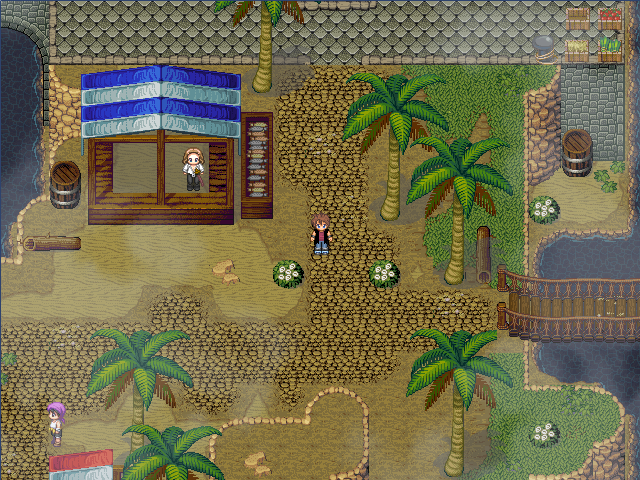
@Ninjuit: These are simply beautiful screenshots. I admire your goal to be a good mapper and so far it looks like you are succeeding. These screenshots look pretty and natural.
Is the first screenie supposed to be a town? It is pretty although I see that the clothesline looks a bit awkward being hanged like that between two houses and blocking the way. You should perhaps keep it in the yard of any of the two houses to look better.
Also, these pillars look too fancy for the rest of the village and a bit out of place. Try removing them and instead put simple flowers without any pillars. I also noticed that there is a semi-burnt piece of wood which I see out of place as well. Why would it be somewhat burned? I think it only fits if the village or at least a house was on fire, but other than that I don't think it works.
The second screenshot looks pretty, too, although I don't get this circle on the water. It maybe an event or something, though, so I won't speak on it. The waterfalls look a bit too straight, so maybe you can move them around a bit?
On the third screenshot, I noticed that there is this piece of wood with a little of a green matter on it (swamps?). I don't see it fitting since I don't see that green thing anywhere else on the map. Also, that chest is a bit silly to find there. Who could have possibly put it there on the edge of a cliff? It also seems to me like an unreachable place.
The caves are looking nice, although I wonder how can green plants grow there underground. I see nothing wrong with last screenshot; it is pretty. ^^
@Paladin: The first screenshot is too dark and too blue. Brighten it up a little and decrease the blue hue. As for the map itself, you still need a bit more practice. The water looks too square and unnatural, and the mountains are too straight as well. You also used more than one kind of tree which is not really looking fit. It's advisable to use only up to 2 trees which fit with each other but that's not the case in your map. The leaves fog looks really ugly as well and only worsens your map.
The second screenshot, however, looks much better. It has a nice tone and the people there fit. The car clashes a bit, though, in my opinion. There is also a bit of grass that is out of the fences, which you might want to fix.


