

You are using an out of date browser. It may not display this or other websites correctly.
You should upgrade or use an alternative browser.
You should upgrade or use an alternative browser.
The Screenshot Thread
- Thread starter Ellie
- Start date
- Status
- Not open for further replies.
RATED-RKOFRANKLIN
Member
SorceressKyrsty":12am0ngn said:It really sticks out since of the complementary colours (that yellow is a tad orange) but not so much it's blinding. It's simple yet flashy.
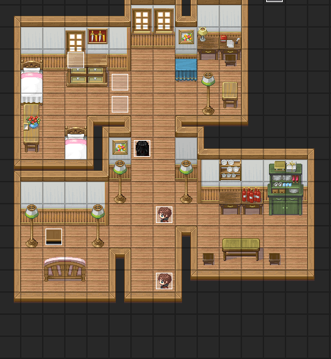
I still feel its too big for an apartment =C.
This is looking good. I love the map!
SorceressKyrsty
Member
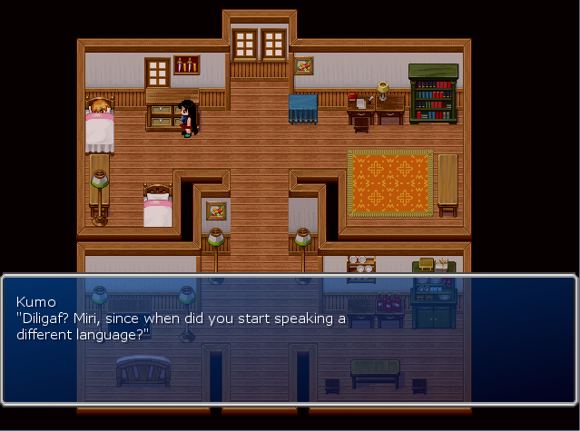
Finished the map. The sprite of the girl is old, and her character design has been changed, so I'll have to re-sprite her.
The TV in the lounge room is by Sithjester.
The study is going to be used for a mini-game involving squats, which is why it's large.
Can't remember why it has that tint, though...
Firgof Umbra
Member
Okay, more ships. More ships. More ships. ... MORE ships. Not a few. MORE.

Okay, stop ships. STOP SHIPS. STOP SHIIIPS!

FFFFFFFFFFFF

Okay, stop ships. STOP SHIPS. STOP SHIIIPS!

FFFFFFFFFFFF
Firgof Umbra
Member
It's actually running really fast. Half-life 2 runs a bit slower than this at that number of tris (thus why the intro sequence with the extremely high-poly GMan was very scripted).
Not to say that even that framerate won't improve. This was part of a stress test I did on Star Ruler to see where our current upper bounds are. Suffice to say I got up to 3,500 ships and 120 planets before I lost the game and I never dipped below 20 FPS.
Hm, note: I didn't notice I had an application running in the background when I took these screens. The actual output of the game is higher than in the screenshot. Also, I didn't notice that I left the profiling on; didn't mean to put the framerate in the shot. :x
@Firgof Umbra:
:3 you made me laugh hard^^
What kind of crazy dlls have you progged to be able do render dynamic shadows in RMXP in such a high resolution? Or is this a custom Game Engine?
@RobinP:
I like the interface's appearance but I can't figure out how to play in a bigger battle with such a little Mapresolutioun :/
@me
I'm playing around with LM's and future Tilesets to help a little project
A lot of people say it's too dark, others say it's too dark :/, I played around with my calibration and saw it too bright in sRGP mode and too dark in Picture mode, so, erm, I would be grateful if you could give me feedback about how you see the picture.

~Ragnai
:3 you made me laugh hard^^
What kind of crazy dlls have you progged to be able do render dynamic shadows in RMXP in such a high resolution? Or is this a custom Game Engine?
@RobinP:
I like the interface's appearance but I can't figure out how to play in a bigger battle with such a little Mapresolutioun :/
@me
I'm playing around with LM's and future Tilesets to help a little project
A lot of people say it's too dark, others say it's too dark :/, I played around with my calibration and saw it too bright in sRGP mode and too dark in Picture mode, so, erm, I would be grateful if you could give me feedback about how you see the picture.

~Ragnai
Skyla Doragono
Sponsor
@Ragnarok
That's actually not bad at all. I've seen screens that are MUCH darker than that. It'd be easier to judge of we could see a screen with a character on it though; if you can still see the character and navigate around the map, then it's dark enough. :thumb:
That's actually not bad at all. I've seen screens that are MUCH darker than that. It'd be easier to judge of we could see a screen with a character on it though; if you can still see the character and navigate around the map, then it's dark enough. :thumb:
rey meustrus
Sponsor
It would be helpful to know how much memory Game.exe takes on other projects (or what it was before?). The processor usage is moot, since processing stops when you remove focus from the Game window.
rey meustrus":3n7by0km said:It would be helpful to know how much memory Game.exe takes on other projects (or what it was before?). The processor usage is moot, since processing stops when you remove focus from the Game window.
This is an engine I created myself, so things which might hold true to RMXP or various other engines don't with this one. The game doesn't stop processing when you lose focus on the form.
I can't post the 'before' because there wasn't a before. I built it so the textures are loaded and unloaded dynamically from the start. I've got 152 character sets and 11 tilesets. If they were all loaded and once, rather than just a single character and tileset, you can imagine it being quite a bit higher. ;P
Hey guys, first post of mine that I've ever had in one of these threads. These are a couple maps I whipped up as a bit of practice(with the two tilesets, as well as fog/weather effects). I included two different versions of the maps to see a general preference among you, hopefully :P
Keep in mind that they are not considered "in game material" for the project that I'm working on, it's just something I decided to give a shot.
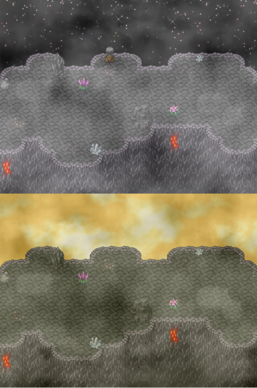
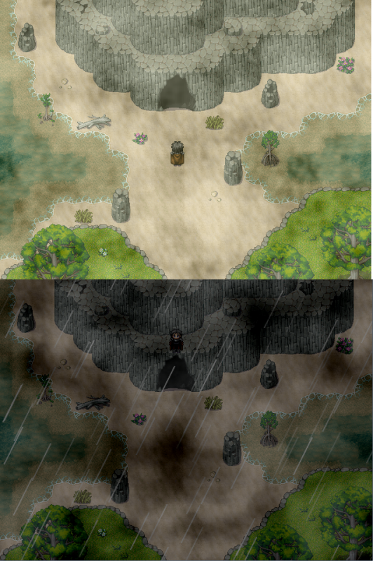
Keep in mind that they are not considered "in game material" for the project that I'm working on, it's just something I decided to give a shot.


WalkingAbomination
Member
@WeaponOD
How much of this spriting is yours?
I think you need to work on the stairs a little because the line in the center stands out too much.
I like the shower btw, nice job there.
I think some shadow along the right side of the walls would really make the whole place pop too.
E-
Maybe darken the color of shadows in general.
- Status
- Not open for further replies.
Thank you for viewing
HBGames is a leading amateur video game development forum and Discord server open to all ability levels. Feel free to have a nosey around!
Discord
Join our growing and active Discord server to discuss all aspects of game making in a relaxed environment.
Join Us


