Envision, Create, Share

Welcome to HBGames, a leading amateur game development forum and Discord server. All are welcome, and amongst our ranks you will find experts in their field from all aspects of video game design and development.

The Screenshot Thread

Status
Not open for further replies.
Click on my link to check it out and subscribe to it. I'm glad you're interested!

@mark1707

I'm no authority on VX/XP mapping, but that looks great. Normally a lot of XP/VX games have the curse of looking alike, but that looks awesome.
 
sxi45x.png
 
In the hope of getting some more people back interested in Last Man's Stand, here's a new screen. I do want comments on it as well. The random blood splatters are were I was bitten while trying to take this screenshot, and the lack in variation of zombies is due to that fact that I'm re-spriting a lot of them.

1-2.png


What does everyone think?
 
The grass looks like it's growing on top of the pavement; I'd make sure we can see the cracks, and maybe some dirt, so it looks more like the street is falling apart and less like somebody dropped turf on it.
 

$t3v0

Awesome Bro

Also - building on the zombie sprite (i know they're wips) the side view shows their arms straight out, yet the back view their elbows are bent.
 
When I was "making" the tilesets, I was really beginning to doubt this would work: now that I've started mapping, I have to say, in my opinion, it looks better than expected.

castle1.png


castle2.png


castle3.png

I intend to replace a lot of the statues with character-sets that will pop out and attack you.

And haunted furniture. You can't have enough haunted furniture.
 

mawk

Sponsor

I'd probably lower it a bit. the bottom left of the floor tiles and the cross-pattern on the carpet seem inordinately bright compared with the rest of the scenery, is all.
 
mawk":31j92ol3 said:
I'd probably lower it a bit. the bottom left of the floor tiles and the cross-pattern on the carpet seem inordinately bright compared with the rest of the scenery, is all.

I'll try it out, but I'm a bit wary of turning it down too much: I was using other autotiles just to experiment with, and it's very easy to lose the details of the furniture etc. I've been thinking of changing some of the shades of black anyway - so I'll toy around with that over the weekend.
 
It really sticks out since of the complementary colours (that yellow is a tad orange) but not so much it's blinding. It's simple yet flashy.

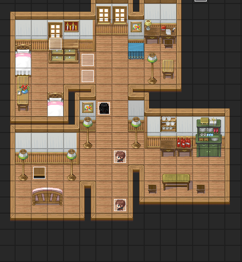
AtsurekiApartment.png

I still feel its too big for an apartment =C.
 
Thought I'd show some stuff for a custom battle system I've been making for a while:

battlee.png


It's action-based, with the bottom bar being the turn meter. When it's full like Gregory's is in the screen, the character faces you, the player, awaiting command. Otherwise they are facing the enemies like Graham or in an animation.

grahamattackanimation.gif

Graham's attack

I plan to give each character an attack, skill, alchemy, and item use animation, and a command, guard, and dead pose. It's a lot of graphics, but it should look good. Right now I just have a few done.

Most of the system is done, but there are still little things that keep popping up that I need to fix, and a few more that I know I need to do. I plan the item animation to have the character reach into a bag and throw their arm up, with the icon for the actual item they used to float up and disappear.
 

mawk

Sponsor

wow, that attack sprite is really fluid. I mean, a lot of it is just moving the component parts around, but it works well. not a lot to say about the system itself, since it seems like pretty standard rpg fare, but good luck with the rest of those.

this is, uh, really garish. it also bugs me that the description line is just a pixel too high at the bottom, and shows the blue window peeking out from underneath.

I mean it's a cool custom menu, but if I have to look at those colours and that ugly patterned background whenever I want to use an item, it's gonna get old fast.
 
Delmaschio":djgknmtw said:
Reminds me of Lufia.
That's because I pretty much modelled it after Lufia II's battle screen. :P

@Ynlraey:
I think the menu looks pretty good. Maybe if you added a black outline around all of the shapes it'd look better, though. It seems kind of bright. Also, the cursor looks like it's just been scaled up because it's edges aren't crisp like everything else.

The colors maybe could be toned down a bit, or something done to make it not as bright. Maybe just different colors. A menu is open a lot, so it shouldn't be something that people don't like looking at. (I absolutely hated the ugly pink and blue of FF10's menu.)
 
Status
Not open for further replies.

Thank you for viewing

HBGames is a leading amateur video game development forum and Discord server open to all ability levels. Feel free to have a nosey around!

Discord

Join our growing and active Discord server to discuss all aspects of game making in a relaxed environment. Join Us

Content

  • Our Games
  • Games in Development
  • Emoji by Twemoji.
    Top