Envision, Create, Share

Welcome to HBGames, a leading amateur game development forum and Discord server. All are welcome, and amongst our ranks you will find experts in their field from all aspects of video game design and development.

The Screenshot Thread

Status
Not open for further replies.
Bruno, looks great. I've always loved that tileset. Something about the 'a' in that font bothers me, though. (I know you spent ages looking for one that worked, though, so don't kill yourself over it.)

JoRu, any reason why there's random furniture abandoned outside the house? The first screenshot also looks somewhat straight and symmetrical, don't know if you can change it up a bit. Also, the candlelight glow in the second pic seems rather bright, compared with the torches. Otherwise, they look nice.
 
ir6sg8.jpg


Anybody remember Magus Magus?
I've decided to remake the game completely and turn it into somewhat 2.5d ( 3d bg with 2d sprite ) Still new to 3D so it might take me a while to get use to it @_@


The character sprites will be pre-rendered 3d , so that it's easier to animate XD

YinYanYaoFull.png
 

JoRu

Member

Regi":28psii4a said:
JoRu, any reason why there's random furniture abandoned outside the house? The first screenshot also looks somewhat straight and symmetrical, don't know if you can change it up a bit. Also, the candlelight glow in the second pic seems rather bright, compared with the torches. Otherwise, they look nice.

Well, yes there is a reason for that. It won't be told in the game, but if you play it you might understand why. That it's straight and symmetrical is a little on purpose, although it might not hurt changing a few things here and there to make it look better. The candlelight glow is an easy thing to fix, I could try out some different opacity-settings to the lights. :thumb:

Thanks for your reply! :smile:
 
Not nearly enough 8-bit goodness in here...

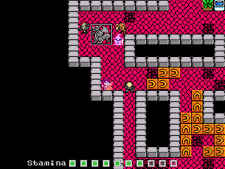
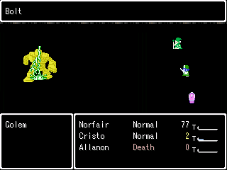
From Hellion (a revived 2007 Rm2k3 project of mine):
arrows.png

The community can always use more arrow puzzles!

icy.png

Slide on the ice

golem_bolt.png

Lightning Bolt! Lightning Bolt! Lightning Bolt!
 
@Woocash: this looks very nice =)
But why did you use another font for "Nomigrod" and that area? looks a bit out of place. The other font is way prettier!

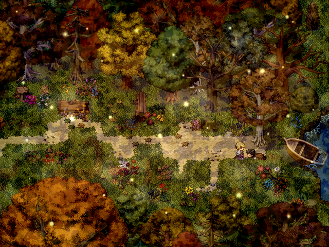
here's a screen from my project:
a_s_o_w_a_bscreen.png
 
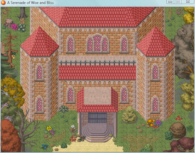
Wow, this is really - and I mean really - beautiful, Lune! The colors are beautiful and the atmosphere is catchy and overall it's sweet looking! Pretty lovely screenie you have here. ^^
 
Lune de la Cruor":1woee7z1 said:
@Woocash: this looks very nice =)
But why did you use another font for "Nomigrod" and that area? looks a bit out of place. The other font is way prettier!

here's a screen from my project:
a_s_o_w_a_bscreen.png
Wauw, this is really my style. Nice recouler and admosfere, it looks like mine maps.
 
@Lune: It's very pretty, but then it's also really cluttered. The fog is too much. If you're going to have that much detail, I would suggest doing something to point out where the action is going on, because all the pretty sparkles and bright autumn colors make it easy to get distracted.
 
rey meustrus":2j1wzk8l said:
@Lune: It's very pretty, but then it's also really cluttered. The fog is too much. If you're going to have that much detail, I would suggest doing something to point out where the action is going on, because all the pretty sparkles and bright autumn colors make it easy to get distracted.
Too cluttered? I think you can NEVER have enough detail. The more the better! Well that's just my opinion really xD
I love when can look at maps for a while and see new things everytime...
And fog...hmm I use like 3 or so at once, but I guess you mean the black spots. I really like that one, maybe I rethink it :O
Anyways, here's another one:
screen2.png
 

No ID

Sponsor

I personally am in favor of the detail, however, your style may be a little too pretty for my video game tastes, but there is no doubt that your do have great mapping.
 
@JoRu - VERY nice mapping skills! Are you using VX by chance, anyhow it looks like you've added just a bit of tint to the 2 outdoor maps which make it look alot better in my opinion, not to mention easier on the eyes

2 new screenshots of my upcoming game Soulwake; Sword of the Spirit

The first is right after Hailey has escaped a machine factory where they are producing Advanced Robotic Weaponry in hopes of stopping the recent nationwide chimera outbreak, as well as ww3 from happening, but things are going terribly wrong above where 1 robot has gained a hieghtend sense of being from too much AI.

NarrowEscape.png


This 2nd shot is an ingame screenie of the Side View Animated Battlers I've started working on, I still have alot of work on them but I'm getting there!

Spiritbomb.png
 
Lune de la Cruor":16ul5ggh said:
rey meustrus":16ul5ggh said:
Anyways, here's another one:
screen2.png

As much as I adore this map, and the other one you posted, with the amount of detail and stuff, there is one problem.

Nature's not like that. I mean, it's impressive and all, but look out your window. Is there a fog like that covering the houses near you.

I do like them fireflies, thought. My advice is to get rid of that fog. I don't think you need it, your mapping skills and tilesets alone are enough to wow any player.
 
rey meustrus":1a6s1f4j said:
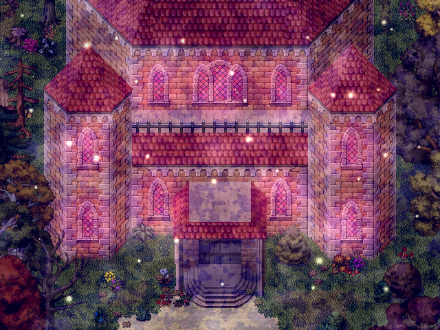
Why is it pink? Personally living in a pink building would make it very unlikely for me to recover from mental illness...
You must be color blind then...it's just the redish light coming from the windows, the house is clearly brown :O
screen3.png
BrunoTR":1a6s1f4j said:
look out your window. Is there a fog like that covering the houses near you.
As you can see above the plain map looks totally boring without the fog. Also in my area it's always foggy, especially during fall season. 30meters after our house the forest starts and often you can't even see so far, that's what kinda inspired me here.
BrunoTR":1a6s1f4j said:
Nature's not like that.
Worst thing to say ever. Is there any XP/VX map that is truely accurate to nature? I don't think I ever saw one.
But I get the point, guess I really gonna leave it out then. Even though I thought it gives that extra "mystic touch".
 

$t3v0

Awesome Bro

No, the building looks pink. And if that's two people saying that then i think it's maybe you that needs to double check your monitor colour settings. I'm running a Viewsonic, so the colours are pretty much true.

Nice map, though :)
 
Status
Not open for further replies.

Thank you for viewing

HBGames is a leading amateur video game development forum and Discord server open to all ability levels. Feel free to have a nosey around!

Discord

Join our growing and active Discord server to discuss all aspects of game making in a relaxed environment. Join Us

Content

  • Our Games
  • Games in Development
  • Emoji by Twemoji.
    Top