
You are using an out of date browser. It may not display this or other websites correctly.
You should upgrade or use an alternative browser.
You should upgrade or use an alternative browser.
The Screenshot Thread
- Thread starter Ellie
- Start date
- Status
- Not open for further replies.
ZericCallavis
Member
Thanks.
@Mr_Smith - Tall grass...yeah, I think I could probably fit some more into it and the adjacent maps.
@Mukanshinblack - Thank you for the comments. To address the RTP issue: Ideally, (and with the exceptions of custom character sprites and a few other things), I'm trying to show that a well-developed game can be made with the built in RTP. Well, I take that back. I'm using a combination of XP and VX RTP (just not the VX tilesets, ugh.... the only thing that turns me off about that program...) It will be interesting to see how well of a town map I can throw together, as one is coming up soon. :/
@craybest - Yeah, I'm like you. Sure, there are some forest area in which you see nothing but pine trees, or other types of tree, but from my experience the majority of forests have quite a variety of plant life, which is what I'm trying to convey in my forest maps.
Thanks for the input. I should have some more maps available to view in the near future.
First of all, MukanshinBlack, that is from a game. It has text, so it isn't justa map.ZericCallavis":25osb71p said:
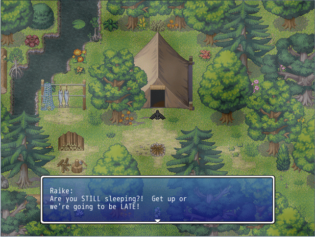
Early morning after a long night. Comments, critiques? Areas that need improvement?
I'm trying not to give in to my "must add more and more" and cluttering the screen up, but if something should be added, I'll take in consideration.
>>>CONSTRUCTIVE CRITICSM<<<
The path shouldn't just lead up to the tent in my opinion. It isn't like they just keep the tent there, right? It is too convenient to be tru, so get rid of the splotch right in front of the tent. Also, when you made your tileset combo, you need to rightclick on the shadow under your tree. Can you see that it is all checkered? That is because you don't have the secondary trancparency color set.
Also, the mangrove bush at the top left it to close to the water. You should have it all the way in the water or not at all. Speakig of water, you need to use this auto tile: http://picasaweb.google.com/kiriashisrmxpics/RMXPResources#5311248104286359202
There is an error right above the peak of the tent, where that dead grass is, it cuts offthe tree's shadow.
And yes, you should add tall grass.
Hope you took this has criticism and not flaming...
rey meustrus
Sponsor
@ZericCallavis: Your trees have interesting shadows. It looks like something out of the 256-color era. It's one way to provide half-opacity, but RMXP and RMVX support full alpha-channel opacity. All you have to do is select the translucent color (the shadows) when you import the tileset (or, for RTP, it's already done for you) and the shadows are half-transparent. Your efforts are admirable, though. I like the large variance in the kinds of trees. Also, Courier New works surprisingly well for your message window.
ZericCallavis
Member

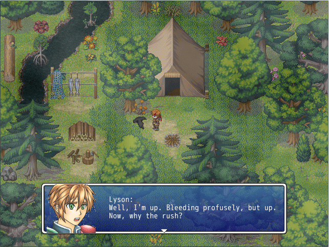
Editted scene with the commented changes. Shadows should be fixed, more tall grass, cut off shadows should be fixed...
On a related note: Does anyone know where I can find an auto-tile version of the tall grass I'm using on that map? I'm having to use it on the second layer as of right now, and that's severely limiting the creative options.
Also: The white pixels in the face graphic will be fixed, it's not high on my priorities right now, will be fixed before a demo comes out.
ZericCallavis
Member
Noted: That's another thing I plan on fixing.
As far as the shadows go...I think it's actually the tileset i'm using rather than the transparency, cause I selected the shadows for semi-transparent after the last guy said something. It fixed it a little, but, eh...
As far as the shadows go...I think it's actually the tileset i'm using rather than the transparency, cause I selected the shadows for semi-transparent after the last guy said something. It fixed it a little, but, eh...
edumazieri
Member

well, i started the project yesterday and i have been for like, 3 years without rpg making, and never did anything with XP either lol, so its a very early screenshot.
its a battle system, made in events, using a few scripts for effects and AMS and etc.
the concept behind it is very interesting i think, its different from any other game i ever seen, and it's a bit hard to explain it all, so basically it's 10 units vs 10 units each with their types and stats, acting in turns. but it's different from normal battle systems because each unit type serves a different purpose, and are made to be put in each of the 3 rows (the middle has 2 rows) and that changes how they attack and etc... i'll create a topic someday about it to explain more.
what's done so far in it, is the base for the databases and the base for the UI.
it doesn't sound like much lol, but it's pretty much 30% of the whole BS, since all there is left now is to create the actions of units and show them on screen =D;
there's much to be changed graphically, and a lot of what is there are place holders
but well.. tell me what you think

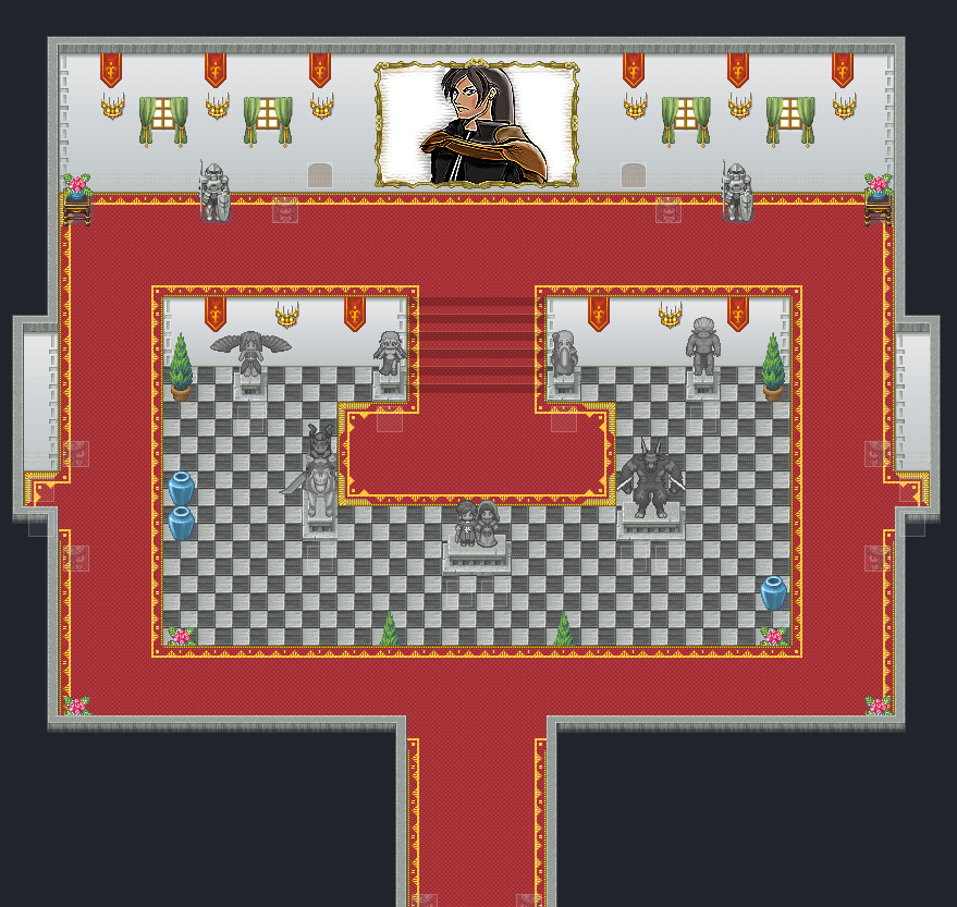
A castle Grand Hall, it's got statues of the Emperor of the castle and his former wife in the center. A huge rather egotistical painting of him at the top. I've been trying to make it as royal looking as possible. In the lower level of the grand hall there are statues of some of the major "Ancient Gods", or as many of us have come to know and love then, Odin, Ifrit, Shiva, Titan, Ramuh and Siren. This is a sort of WIP right now, I want to put a railing in around the carpet but right now I've settled for eventing to make sure you can't go from the red carpet on the upper level to the bottom level.
Opinions please.
Sailor Taurus
Member
For the painting, I suggest some dark, flowery background. To have it just stark white makes it stand out in a negative way.
dadevvtsvre
Sponsor
Petros: It's very hard to distinguish between the bottom floor in the center and the floor above it around it. Try putting a railing or something to at least try and give the impression of multiple levels.
Also, the carpet abruptly ends when it gets to the doorways-Unless there's no carpet on the other side of the doors, make it transition nicely through.
Some other small things, the small windows look weird on such a big wall, so maybe enlarge 'em a bit. And this is just sort of a pet peeve thing, but that carpet really bugs me. The read on it's own looks fine but the yellow border really sticks out. You really don't need the yellow going right up to the wall, so try getting rid of the yellow that touches the walls. It just makes things easier on the eyes.
Little AlchemyX
Member
@Petros: I FIGURED IT OUT! You have a set of stairs going up to the second floor from the center, but the carpet around the edge is flat. You should either add stairs on both sides of the center area or shade in a staircase-sized section of the carpet to look like a ramp. The map is good, but it looks like an MC Escher painting.
-------------------------------------------------------------------------------------------
Excerpt from my DEVLOG (CLICK AND REPLY >HERE< PLEASE) thread:
-------------------------------------------------------------------------------------------
Excerpt from my DEVLOG (CLICK AND REPLY >HERE< PLEASE) thread:
.
..
...This video seems to load slow, might want to let it play out once, then restart it to watch it clearly.
http://www.youtube.com/watch?v=A5m_K2NjUHk
..
...This video seems to load slow, might want to let it play out once, then restart it to watch it clearly.
http://www.youtube.com/watch?v=A5m_K2NjUHk
Hmm... I dunno, You need more detail, I think. More stuff there to make it look more busy. Some tables with decorations, more statues. I know you have some, but you need more decoration. On that note, consider making the room smaller so there's not so much space there.Petros":3bvqb5nq said:no need to quote the big image too -Lou
A castle Grand Hall, it's got statues of the Emperor of the castle and his former wife in the center. A huge rather egotistical painting of him at the top. I've been trying to make it as royal looking as possible. In the lower level of the grand hall there are statues of some of the major "Ancient Gods", or as many of us have come to know and love then, Odin, Ifrit, Shiva, Titan, Ramuh and Siren. This is a sort of WIP right now, I want to put a railing in around the carpet but right now I've settled for eventing to make sure you can't go from the red carpet on the upper level to the bottom level.
Opinions please.
As for the statues... You need less contrast on the characters. Otherwise, they just look too similar to actual characters, if that makes sense. Put the contrast down, and It goes from standing out to blending into decoration just right. Trust me, I did this in my game :D
And for the painting... Well, it looks nothing like the statue. Sorry, chum, but I would never have known they were the same person unless you told me. Try changing the hair. Fighter04's hair would do nicely.
Good start, though. Just needs a tiny bit more tweaking, then you're good.
edumazieri
Member
wow, nobody even looked at mine :~~~~~~
edumazieri
Member
heh i felt left out lol
yea, a bit tactical, i'd say a bit like ogre battle (remember that?)
ps: i specially like this alexs vc alexs fight, i might include that in the game ;p
yea, a bit tactical, i'd say a bit like ogre battle (remember that?)
ps: i specially like this alexs vc alexs fight, i might include that in the game ;p
Little AlchemyX
Member
Mini Update (CLICK >HERE< FOR THE DEVLOG)
Had a couple really good comments about my last post's video. I decided to try my hand at writing a sine-wave drawing function to replace the "stretchy" effect that I previously had over the text. I also changed the menu-in/out animation to a fade in/out using alpha's. Tell me what you think:
[hide]http://www.youtube.com/watch?v=Z4GIcEfwDbc[/hide]
BrunoTR":xsq7dmnr said:And for the painting... Well, it looks nothing like the statue. Sorry, chum, but I would never have known they were the same person unless you told me. Try changing the hair. Fighter04's hair would do nicely.
It's probably hard to tell but at this point in the game you've seen Keiros (the guy in the painting and statue) several times already so it's quite obvious it's him. Without colour it is a little hard to tell. Thanks for the other tips though. I can't really make the room much small it is a "Grand Hall" after all.
- Status
- Not open for further replies.
Thank you for viewing
HBGames is a leading amateur video game development forum and Discord server open to all ability levels. Feel free to have a nosey around!
Discord
Join our growing and active Discord server to discuss all aspects of game making in a relaxed environment.
Join Us
