Envision, Create, Share

Welcome to HBGames, a leading amateur game development forum and Discord server. All are welcome, and amongst our ranks you will find experts in their field from all aspects of video game design and development.

The Screenshot Thread

Status
Not open for further replies.

Wichu

Member

Keinaru":1um3ajpn said:
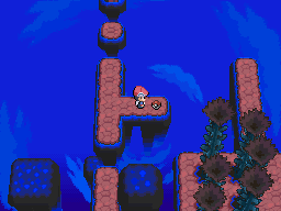
This reminds me of the Distortion World (jumping and all):
tornworld-platinumorb.png

Is it just a coincidence? Anyway, I like the faceless NPCs; it really gives it that creepy feel. But I agree that you should tone down the blue; try using the same palette as you used for the purple roots.

Anyone want to give some feedback on my screenshots (previous page)?
 
Draken":3ihfzl9w said:
Little AlchemyX":3ihfzl9w said:
1st ever screenshot!

Mr. Blue's MisAdventures

blah blah ...

You using the XNA Framework? Got to love C# to be fair.

No, I'm actually using VS, the windows GUI.

I don't know, though. I love C#, but I might just move this to game maker, or see if I can use my engine to export some DLL's that I can put into Game Maker so I can more easily build my levels without losing all of my work. Building my levels and collisions is hard as hell in VS.
 

Jason

Awesome Bro

Draken, that sounds very interesting, especially the overhead view.
So since I've been struggling to make maps etc. with VX, I thought I'd make some buildings, y'know the typical ones, Inn, Pub, Weapon Shop, Armour Shop, and I think they came out well, but this is coming from someone who hates trying to map with VX, so what do you guys think ?
 

mawk

Sponsor

it looks like you've got the right idea, but the way the autotiles work make it look really strange.. use shift+right click, shift+left click so that you don't wind up with a roof's tip where it shouldn't be or those thin lines of the sides
 

Jason

Awesome Bro

every berries":3euqr1pp said:
it looks like you've got the right idea, but the way the autotiles work make it look really strange.. use shift+right click, shift+left click so that you don't wind up with a roof's tip where it shouldn't be or those thin lines of the sides

Oh yeah I get what you mean, I've never actually tried doing that with VX, thanks for the tip.

How about the shapes of the buildings ? Should they be changed at all ?
 

mawk

Sponsor

the inn on the far left looks as if the rooms on top should be getting progressively thinner or else shifting backwards. going by the amount of roof I can see, the second story would be about two tiles long in total; that's only enough room for one row of roof tiles to go on top, or an equally small third story if you're feeling like it. either you can replace that bit of roof with building or get rid of the third story altogether.

this might take a bit of graphical tweaking with the tileset, but hey.
 

Jason

Awesome Bro

every berries":7gpww0bo said:
the inn on the far left looks as if the rooms on top should be getting progressively thinner or else shifting backwards. going by the amount of roof I can see, the second story would be about two tiles long in total; that's only enough room for one row of roof tiles to go on top, or an equally small third story if you're feeling like it. either you can replace that bit of roof with building or get rid of the third story altogether.

this might take a bit of graphical tweaking with the tileset, but hey.

Hmm I see what you mean, however, this is how it is meant to look;

As you can see, the 2nd and 3rd floors go behind the first floor to make a sort of L shape from a birdseye view.
 
I definitely understand where you're going, jbrist, but thats very hard to communicate through a typical RPG view; you just can't see the sides or back to know whats happening. You might want to use a program like World Creator (1.5 is free from random sites, google it, 2.5 is commercial and can be bought here: http://www.inet2inet.com/InetSoftware/W ... s_Form.asp ) Keep in mind there's a reason 1.5 is free and 2.5 isn't. 2.5 is more feature packed and ALOT more user friendly.

The program helps you make isometric sprites, objects, and backdrops in seconds, and you barely have to do anything. Then you could use those sprites and make your game isometric :)

-----------------------------------------------------

Jelly Physics Engine!


This is a quick video demo of the jelly physics engine I made for my project, Mr. Blue's MisAdventures. Every single animation for Mr. Blue was made in real time using my Jelly Physics engine, not a single animation was made, saved or used but a single static image of Mr. Blue.

Note: This is a demo of the Jelly Physics engine, nothing more, please ignore the bad shadow and horrible platform level.

Direct Link - http://www.youtube.com/watch?v=Ldg5XwdPerw

http://www.youtube.com/watch?v=Ldg5XwdPerw
 
Hey hey hey,

If I sound excited, it's because....I AM!
Only yesterday, I decided to reach into the darker corners of my laptop and dust off the ol' RPG Maker XP executable and play around with it once again.

While messing around, I was struck with the idea that I should make a CMS, if only just for kicks. However, in only one day, it's come together quite well, and I have since implemented it into an actual game project I've begun.

I suppose I'm in here because it seemed like to best place to show off my CMS, since it's not an actual project nor is there a Screenshot section of the forums (at least none that I found.)

Without further ado, I shall present it to you.

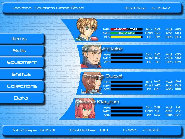
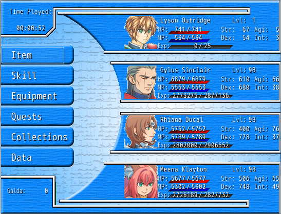
This first image is the concept art I created for the CMS yesterday in photoshop, Note: it is only a photoshop image, and was in no way usable in RMXP. Needless to say, I had NO idea how I was gonna go about getting a CMS looking that way.

CMSHmm.jpg

But, only after a day or so of diligence and hard work, I present to you the WORKING main screen of my CMS.

CMSWoot.png

^.^ Now you see why I'm excited, it looks very good. (Minus the white pixels around the character portraits, those were extracted in kinda a hurry....but they will be redone.)

BUT THERE'S MORE!

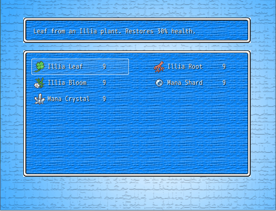
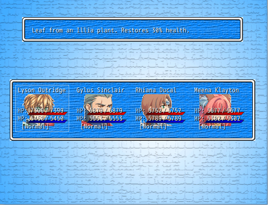
I've also got the Items screen done as well!

CMSItems.png

CMSItems2.png

Stay tuned for more. Next obstacle to overcome is the equip screen. Shouldn't be too hard!

Please use spoilers for images, not code tags. Also, this belongs in the screenshot thread, so I'm gonna merge it. ~Perihelion
 
That's eventually what I want to happen, but I'm taking it one step at a time.

Also:

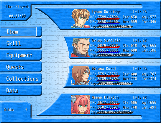
I made a slight alteration to the main menu screen. I couldn't help but think..."that looks like something done in photoshop" everytime I looked at it, so I bordered it with the windowskin border. I'm trying to decide if I should also border the curved portions, but....well, that'll take a heck of a lotta work.

:/

MenuHmm.png
 
Way too much default Photoshop stuff in that design. Search out some free textures and brushes and add something unique to it. There's tons easily available. Google!
 
Thanks for all the critiques. That's partly why I wanted to post it on here, to get opinions on what works and what doesn't.

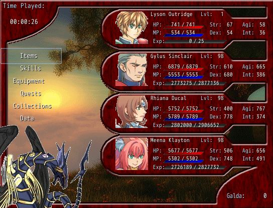
I have taken those opinions and implemented them while redesigning the CMS.

1). Too much sky blue, this has been corrected. Apparently sky blue is a sore on the eyes?

2). Too much default photoshop elements. This has been corrected.

Here's an updated version of the CMS. Note: I have not made the Command Item bars, but they aren't too hard to implement.

CMSNew.png

I am aware of the pixels that need to be fixed in certain areas, but that's nothing more than some busy work.

Comments or concerns about the update?
 
Status
Not open for further replies.

Thank you for viewing

HBGames is a leading amateur video game development forum and Discord server open to all ability levels. Feel free to have a nosey around!

Discord

Join our growing and active Discord server to discuss all aspects of game making in a relaxed environment. Join Us

Content

  • Our Games
  • Games in Development
  • Emoji by Twemoji.
    Top