Envision, Create, Share

Welcome to HBGames, a leading amateur game development forum and Discord server. All are welcome, and amongst our ranks you will find experts in their field from all aspects of video game design and development.

The Screenshot Thread

Status
Not open for further replies.

Wichu

Member

Wichu":1fpwezyd said:
Screenshot250.png
Screenshot251.png
Screenshot252.png

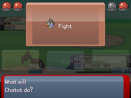
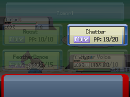
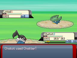
You may remember these screenshots from over a month ago. I've done some more work on the battle system, making it easier on the eyes.
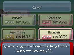
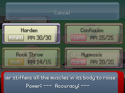
It turns out that the reason the move description wasn't working is because I had lost it when my game crashed and its scripts got deleted; I then forgot to reimplement it. I've managed to remake it, though:
Screenshot262.png
Screenshot260.png
Screenshot261.png

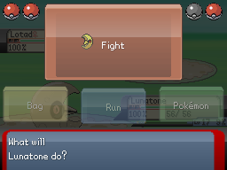
The text scrolls across the screen (and updates when you select a different move). "---" is displayed when a move either doesn't do damage, has a variable base power, or targets the user. Otherwise, the proper value is displayed.

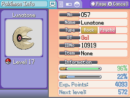
On a different note, I've also improved Lunatone's creepy official sprite (which looks nothing like the concept art):
pkrs125.gif
Screenshot263.png


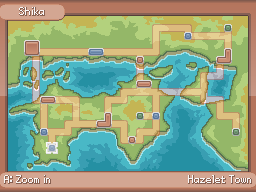
And finally, it's also quite old, but I haven't posted my world map yet...
Screenshot243.png


So, any comments/improvements I should make? Should I post more screens of other things in-game (Pokédex, map screenshots etc)?
 

RPGS

Member

The screenshots is of Ameth - Creation of Planets :

33274284.png

This is the place of The Airship Station where C.O.P begins

sorry for changing this I double posted so the screenshots that WAS here is in my NEXT comment, sorry ^_^
 

Wichu

Member

I'm not too keen on the tiles with gradient effects in the first screenshot; it makes them look like they're rounded. The red and yellow clash horribly, too; try toning the red down a little or changing the colour scheme. It's way too distracting.
 

RPGS

Member

Screenshots is of Ameth I :

94286695.png

The screenshot is of Urgu´han Palatzis where the Urgu´han Undeads lives. The Warriors of Light came here to stop Nova ANgel from destroying The Earth Crystal

49350842.png

This screenshot is of Thoron Volcano where the great whize Dragon King lives.

86560405.png

This screenshot is of Bryxia Sands
 
Here's something I'm working on. I've shown this map to you all before, but it's edited quite a bit, especially with color.

jazardcliffside.png


Here's another one from the game. =)
deathforest.png


It's a dark game, so don't tell me to lighten it up. The atmosphere is exactly where I want it.
 
I think you should make his skin a bit darker, it seems to bright maybe like this:
Edit3.png

The way you've got it is that it draws too much attention. Nice atmosphere though.
 
The character doesnt need to be dark. If he was too dark it would be a LOT harder to see him and you would be stumbling around. I personaly think his face his fine. But meh.
 
@speedpaws- the colours are nice but the de-saturation also means you need more detail to defeat the bland.
Also there is a mapping error bottom right of the first screen shot, the bottom of the rock is missing.
The firs screen shot to me is dull and not all that interesting.
Thesecond one looks nice with the fog but the 'notification' like board is questionable. Paper wouldn't stay like that in the wilderness, the paper would be torn due to wind, broken with the help of rain and basically wouldn't stay there.
I take it, i is meant to be a cross roads but shouldn't you have some path heading the other two directions as well so that it appears as if travelers have actually walked those directions?

@RPGs- The first screenshot is empty and bland as, even a couple of pot plants would do it a tad more justice.
Your colourful map is horrid. Tiles don't fit togeather, the colours clash and it is way too saturated.
The bridges in the volcano just don't fit!
A few more cliff like structures and less random plonking of tiles would be much improvement.
The dessert is yet again random and pleaseremove those railings, I don't even know why they are included in the tileset.
You have a lot of room for improvement but it appears as if you're new to the programme.
 
Speedpaws":zt9dpa8h said:
Here's something I'm working on. I've shown this map to you all before, but it's edited quite a bit, especially with color.

jazardcliffside.png


Here's another one from the game. =)
deathforest.png


It's a dark game, so don't tell me to lighten it up. The atmosphere is exactly where I want it.

The colours looks too saturated...but it's a good screens. There's some mapping error in the corner of the first screen. The second screen not much to comment on cause it's dark.

P.S: Is the screenshot is from Domain Season 2???
 
1st ever screenshot!

Mr. Blue's MisAdventures

This is a Semi-Platformer RPG. Most dungeons are platform-esque in view... but the battles work out like a combination of free moving tactical and turn based battles. Towns and other maps are typical overhead RPG view, but with a degree based movement system (rather than pixel or tile based), allowing full 360 degree movement.

I've written the engine in C#, using DirectX.

MBEngine_Preview.jpg
 
Little AlchemyX, that looks very interesting!! And the info you gave is also pretty interesting :eek: I love platform-type things, even if the game doesn't exactly fit into the platformer genre. I can't wait to see more :D
 
Hello, I don't post here often but was wondering if I could get some feedback on these two screenshots?

screen1m.png
(The part outlined in red is not just floating there it is on a separate map) What I really want to know is how to use stairs cause it looks like they just lead up the wall and I can't figure out how to do it correctly.

screen2frx.png

screen3h.png
In-game
(Is this ship designed okay? When I opened up the ship tileset I was completely lost. Luckily so was someone else and I found a short tutorial on how to use it. The tutorial only placed one mast on the ship which I thought was kind of stupid since large ships have usually more than 5 in order to sail properly. I settled for 2 in between fantasy and realism but I was wondering if it looked okay to someone other than me. There is supposed to be 2 separate and you can tell if you look closely, one is on the back part and the other is on the base part of the boat. Also of note it is an airship... yes an airship with an anchor :shades:

Thanks! and sorry to use ImageShack but Photobucket is currently down :sad:
 
@lorddonk: Pictures look too plain and RTP-ish.

@Keinaru: Don't like the first picture cause it looks random in a bad way, but I like the small room in the second picture.
 

Sabao

Sponsor

Why does RTPish sound like a bad thing? Designwise, I think the map is just fine lorddonk. It's not too bare and not littered with unnecessary decoration.
 
Little AlchemyX":ttmae2uw said:
1st ever screenshot!

Mr. Blue's MisAdventures

This is a Semi-Platformer RPG. Most dungeons are platform-esque in view... but the battles work out like a combination of free moving tactical and turn based battles. Towns and other maps are typical overhead RPG view, but with a degree based movement system (rather than pixel or tile based), allowing full 360 degree movement.

I've written the engine in C#, using DirectX.

MBEngine_Preview.jpg

You using the XNA Framework? Got to love C# to be fair.
 
Keinaru, the sticks on the ground are way too blue. Horrible amounts of contrast when you look at them. The map is nice, but it's really dark and hard to see the fine artwork in it. I'm curious about the jumping; are those single blocks "floating" like in Golden Sun, where they move up and down slowly?
 
Status
Not open for further replies.

Thank you for viewing

HBGames is a leading amateur video game development forum and Discord server open to all ability levels. Feel free to have a nosey around!

Discord

Join our growing and active Discord server to discuss all aspects of game making in a relaxed environment. Join Us

Content

  • Our Games
  • Games in Development
  • Emoji by Twemoji.
    Top