Envision, Create, Share

Welcome to HBGames, a leading amateur game development forum and Discord server. All are welcome, and amongst our ranks you will find experts in their field from all aspects of video game design and development.

The Screenshot Thread

Status
Not open for further replies.
@Me: Well, the thing is, that water autotile crawls back and forth, and in rl it wouldn't look that way if the water from the shore runs all the way onto the beach in a small stream and gets larger there. The water there would be lying still until a new wave comes along.
Btw, 'we' thank you? o.o

@KRoP: Thx, gonna change that.

@hima: Thank you. ^^
 
Yeah we.

We do it more often, although it's not correct, which I am aware of.

For ex.
beach1.png
 

Jason

Awesome Bro

I actually think his beaches look cool, I mean if you use your imagination (I got lots of it so maybe thats why I see it this way), the tide is gonna come in at night, and go far past those rocks, right ?

Well the beach isn't exactly flat, it'll have bumps and "dunes" in it, so when the water has rushed past those dunes, there's gonna be a dip, therefore creating a pool of water...

Yeah, if you don't see that, maybe I'm crazy, but that's the way I picture it.
 
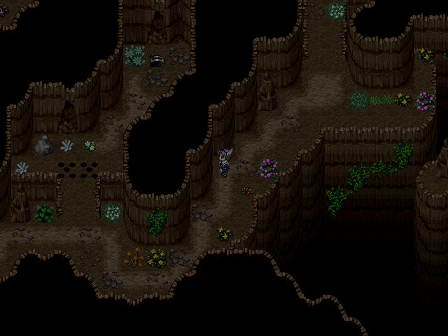
If you dont like making cave maps, it's a very good map to be honest. You have, however, made some mapping errors, as some plants/mushrooms are in a straight line to each other.
 

Numb

Member

Well I just started mapping this, so as you can see there's empty floor space (which there won't be for long) And there are no doors on the bars, inns, and general store. I will post a new picture when I finish it, but here's what I got so far.
Town.png
 

Numb

Member

The arrow is pointing to the doorway.
In the game it is animated and it is to show you that there is a door on the side of the building you can enter.
 
The lighting effects seem too strong and distracting—rather than adding atmosphere, the colors and tints make the map look incredibly artificial.
 

Numb

Member

Luminier":177ry51l said:
the arrow is a bit too obtrusive. make it smaller and slightly transparent. right now you might as well have a neon sign flashing in front of there

Will Do =O!

Despain:. Hmm, Okay I will tone it down a notch.
 

Jason

Awesome Bro

So what happened there ? Some dude/dudette get stabbed ? Care to elaborate ? lol.

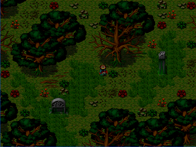
Also, not sure if it's just me, but the colours on the trees look a little too saturated (Especially the bark)

Honeychile, there's no real reason to quote the post just above yours. especially when it's an image. Thanks.
-Luminier
 
jbrist":zz5n2mg0 said:
I actually think his beaches look cool, I mean if you use your imagination (I got lots of it so maybe thats why I see it this way), the tide is gonna come in at night, and go far past those rocks, right ?

Well the beach isn't exactly flat, it'll have bumps and "dunes" in it, so when the water has rushed past those dunes, there's gonna be a dip, therefore creating a pool of water...

Yeah, if you don't see that, maybe I'm crazy, but that's the way I picture it.

That doesn't take imagination. xD

The problem isn't the presence of water, but the animation. If water has reached further onto the beach because of the tide and was then cut off from the sea, it wouldn't have a shore animation but would just be still water.
 
The image, Jaromir, is nice however. There is a creepy feeling there... Cant explain.

EDIT: BRAGGING RIGHTS FOR ME! 60,000th post in this board.
 
fox5":5raibkhs said:
Love the screen, Ynlraey. I'd just say the guy on the right is a little too far in. Try moving him to the right a little bit, But that's just being picky.

Don't worry you're not the first person who told me that (4 people told me about it x.x)
so I fixed it during my week of no interwebs :3

Bettar?
redo.png
 

Ayame

Member

Oh, you did a new version for Reisen, eh? Looks real cool, rae-chan.
However, don't you think Reisen is a lil' bit small compared to Cirno X3?
 

Sabao

Sponsor

Jaromir: I think you nailed the tint spot on for better capturing the mood of the scene, however, as jbrist says the tileset is a bit of a bother. The trees do look oversaturated, which is most likely no fault of yours if you weren't the one who compiled it, and this is just me being nit-picky, but I just realized those red flower things and the small green bushes look out of place in a forest. I'd imagine them to be somewhere a little more tropical.

All in all, it doesn't strain my eyes so much because it's not flocked by so many unnecessary stuff, but it's not bland either. Not a bad job at all.
 
Jaromir - I think you should lighten up on the green in the tint, add a fairly light greenish/grey fog. And loosen up on the tiles, you have over cluttered it on the top, and two environment(plants, rocks, etc.) tiles in a row looks odd.
 
Status
Not open for further replies.

Thank you for viewing

HBGames is a leading amateur video game development forum and Discord server open to all ability levels. Feel free to have a nosey around!

Discord

Join our growing and active Discord server to discuss all aspects of game making in a relaxed environment. Join Us

Content

  • Our Games
  • Games in Development
  • Emoji by Twemoji.
    Top