Envision, Create, Share

Welcome to HBGames, a leading amateur game development forum and Discord server. All are welcome, and amongst our ranks you will find experts in their field from all aspects of video game design and development.

The Screenshot Thread

Status
Not open for further replies.
Ayame":2ud39i2m said:
Oh, you did a new version for Reisen, eh? Looks real cool, rae-chan.
However, don't you think Reisen is a lil' bit small compared to Cirno X3?

Yeah I got that feedback from some people too, I tried changing it but they end up looking blurry. I'll try to solve that issue somewhere.
 
mrbombastig.png
 
BloodRage that looks amazing. I love the art style, is it all original or? Either way I think the beams of light could be a little overkill, they look nice and all but it distracts from the map and art which is not something that should be hidden.
 
Bloodrage- Cut down on the fog. I think the map would look better without any fog, just a tint. Cause the tileset you've got is visually appealing it doesn't need fancy fogs like the RTP.
 
SolstICE - Please don't save images as jpgs. Those staff things with the stones look very flat and out of place; but it's hard to tell cause of the quality of the image.
 
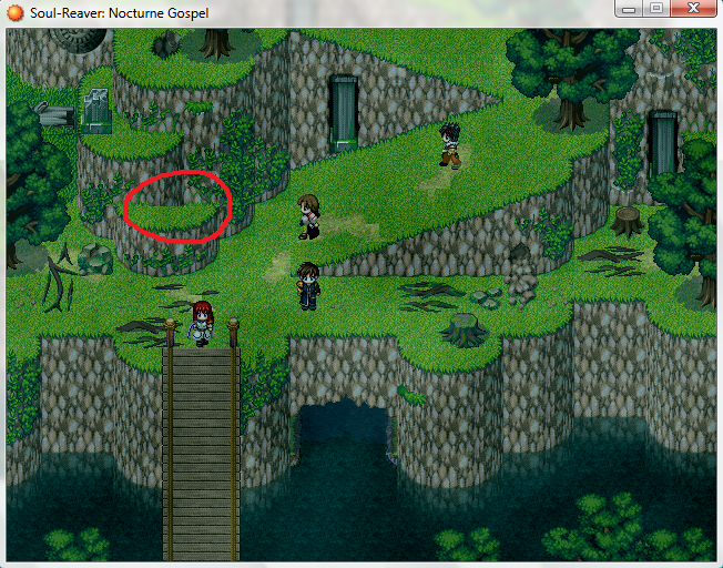
Keinaru: There's a few errors in the cliffs north of the red-haired girl, I think you forgot a tile or two.
keinaru.png
The right part of the circled area should have the grass go up a tile more, and the middle part doesn't marth up with the tile above it.

The school tileset is pretty simplistic compared to the RTP, they don't match up the best. And if the left side of the floor is brighter because of moonlight or something, then it's not very clear that's what it is. Light doesn't fall in one big rectangle like that. It should be broken up a bit more. (unless of course it's not light at all, in which case, woops :| )
 
I didn't realize later on the error of the grass.

I had a dislike in the RTP's grass color, so went ahead and de-saturated and change it's hue along with darkening it D:
Result:

Grass Atmosphere based off of Reive's Quitessences & shadow's very own strange fog tint =D

And I did this yet never notice *once again* the error of the grass D:
 
You need to work on you're cliff mapping just slightly, those straight edges when one clif becomes another look horrid and stands out like mad.
Try placing the bottom of the above cliff on top of the grass of the cliff underneath. (does that even make sense?)
The water catches my attention for some reason, did you add a lighter altered autotile in or is it just me?

Those pillars in the cliff face look like something you would see in Sonic the hedgehog yet look very tasteful here, nice idea. (shading looks a tad odd though)
Also there is a line in the grass above the tree.

The map looks petty good to me if you remove the errors.

Oh yeah and the water cave thing looks slightly odd at the roof (entrance lip thing) not sure but it doesn't look like it connects to the side correctly, especially on te right, try dulling the outlines at the bottom corners slightly.

Edit: just another note the grass seems to change colour slightly around the dirt. Just thought you may like to know.
 
006":2macgpsw said:
SolstICE - Please don't save images as jpgs. Those staff things with the stones look very flat and out of place; but it's hard to tell cause of the quality of the image.

well if I save as bmp it takes forever on dialup. and gif is only 256 colors :(
 
SolstICE":35pszdhv said:
006":35pszdhv said:
SolstICE - Please don't save images as jpgs. Those staff things with the stones look very flat and out of place; but it's hard to tell cause of the quality of the image.

well if I save as bmp it takes forever on dialup. and gif is only 256 colors :(

png
 
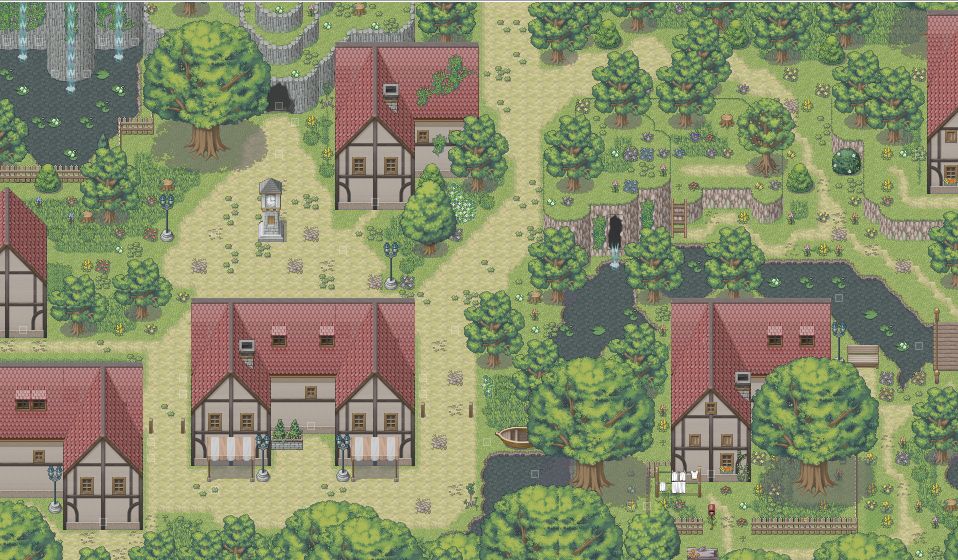
Screenshot of Mist Village in my game.
lol-7.png

Yeah, another village picture by me. Getting alot of them these days <_<

There might be an error somewhere, because I copy/pasted the whole image in paint >_<
 
The_Shadow the map as a whole looks pretty nice and village like however some of the larger houses seem very bare, no windows etc. The biggest example that I can see of this is the bottom left house, it just seems very odd to me. Also its not very likely a village would have all of the rocks and such on the pathways. It would more likely be a lot more clean (not sure if thats the best choice of words) but more lived in and used, rather than like the wilderness where pathways are overgrown and rocks just left because nobody ever walks on them.
 
The_Shadow there is an error..

Look at the little waterfall on the right. At the top there is a row off black pixels..

Still, great tileset. Doing custom tilesets in Paint ain't easy (and I know) so congats!

Gr. LM91
 
Camaraderie.png

A new hero rises to the task...

CouldItBe.png

FORGET EVERYTHING! FORGET EVERYTHING!

HaveStats_YES.png

Your characters have stats, but currently are lacking accessories.

Inn-Stinkpetal.jpg

Maybe you have to go here. Maybe you'll decide to never go here.

I'm working on the sequel to a game that nobody here really played!
 
@Shadow:
Very nice, the lay out is easy on the eye.

@Crazetex:
Is that the legendary VX blur effect on the second screenshot? D: Good stuff. I suggest just saturating the drapes in the first screenshot a tad bit though, but it's no biggie.
 
@Crazetex, that's a nice battle system design. For your status screen, do you intend to allow the player to equip lots of accessories? What goes in the empty spots?
 
Status
Not open for further replies.

Thank you for viewing

HBGames is a leading amateur video game development forum and Discord server open to all ability levels. Feel free to have a nosey around!

Discord

Join our growing and active Discord server to discuss all aspects of game making in a relaxed environment. Join Us

Content

  • Our Games
  • Games in Development
  • Emoji by Twemoji.
    Top