Envision, Create, Share

Welcome to HBGames, a leading amateur game development forum and Discord server. All are welcome, and amongst our ranks you will find experts in their field from all aspects of video game design and development.

The Screenshot Thread

Status
Not open for further replies.
every berries":2285bih4 said:
don't use the bevel effect, either. it really doesn't look very good around the curves.
I would never say not to use the bevel/emboss blend. If you leave the default settings then ya, its likely to look like every else's stuff, but if you use it wisely, it can be incredibly useful. You can use the bevel blending option to quickly add a very nice chrome-style effect over an entire image or just a border(stroke), for instance. Its not useless, its there because it gets used.

I'd read up on some photoshop tutorials, Zeric. The filters and blending options you're using are good, but they're at standard settings and uses, what everyone else does, so its not unique, and some of us are a little tired of the same old designs. Go crazy, but tasteful :)


I finished fixing up my Smart Shadows Engine, check out this video to see for yourself:

http://www.youtube.com/watch?v=IOf_ZZIATCs

Also, I've decided I don't want to spam the whole screenshot thread every time I need some feedback, but I do kinda need the feedback that I get, so I've created a devlog thread here:
viewtopic.php?f=23&t=62717
where I'll be posting almost all of my stuff from now on, so please check it out, bookmark it, whatever, cause you know you want me ;-)
 
Looks amazingly well done. :D

screenshot065.png
 
Is that water underneath the cliffs? If so, I think you should either show some of the cliff under the water or maybe some sort of splash effect. Right now it's a bit abrupt.

Looking forward to trying out your game! :)
 
Dadevster":1q3mngxr said:
Is that water underneath the cliffs? If so, I think you should either show some of the cliff under the water or maybe some sort of splash effect. Right now it's a bit abrupt.

Unless its flaying! :D

It looks awsome TM, thoses stairs need a bit more work though
 
@Twin Matrix: It looks really good, except what everyone else said about the shading, but not just the tower vs the cliff and stairs, also, if the towers are shaded on the right, the light would be on the left, and shouldn't the tent's shadow be slanted to the right, too?

EDIT: - Image Removed By Author -
 
@Muka: Huh? Shading wrong where? D:

@Dave: Thank you. It's flying! :D This is clear in-game when it's animated and you have to fly up a waterfall to get there.

@Avadan: Thnx. ^^ Yea, I thought so too. *fixes*
 
@Twin Matrix - The shading we're referring to is the shading of the towers vs. the shading of, say, the cliff/ridge in the middle and the stairs, and other stuff on the map, its not entirely consistent.
 
Definitely not the second. If I had to pick, it'd be the first, although the glossiness is a bit overdone. I understand you're trying to go for that "goo" effect, but tone down the shine a little.
 
OK, everyone. Final attempt for the night to get the menu looking good. Remember though, you'll be able to customize all the colors (all four corners of the 4-way background gradient and the text color) to your precise liking.
How's this?
menutest3.jpg
 
Little AlchemyX":3f3gh64z said:
@Twin Matrix - The shading we're referring to is the shading of the towers vs. the shading of, say, the cliff/ridge in the middle and the stairs, and other stuff on the map, its not entirely consistent.

But, for all these things the light comes from the top-left? :eek: The cliff has highlight on the left and shadow on the right, same goes for the tower. And the tent is flat at the top, so there can't be shading to the right, just at the front where it goes a little down. (Unless you mean the shadow that the stairs would cast on the cliff/ground. X_x)
 
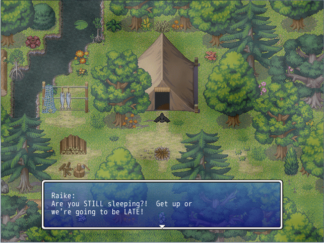
basecamp3.png


Early morning after a long night. Comments, critiques? Areas that need improvement?

I'm trying not to give in to my "must add more and more" and cluttering the screen up, but if something should be added, I'll take in consideration.
 
This isn't a mapping improvement thread, Zeric (and others). It's just meant to show off screenshots of our games and whatnot. I do think your screenshot has too much RTP, and too many different trees for a wooded area. Have you ever been in the woods or a forest and saw such random spieces living intertwined like so?
 
Status
Not open for further replies.

Thank you for viewing

HBGames is a leading amateur video game development forum and Discord server open to all ability levels. Feel free to have a nosey around!

Discord

Join our growing and active Discord server to discuss all aspects of game making in a relaxed environment. Join Us

Content

  • Our Games
  • Games in Development
  • Emoji by Twemoji.
    Top