Envision, Create, Share

Welcome to HBGames, a leading amateur game development forum and Discord server. All are welcome, and amongst our ranks you will find experts in their field from all aspects of video game design and development.

The Screenshot Thread

Status
Not open for further replies.
^

Ooh, like that. I don't think that will be an option for me. >_< I need to keep the filesize down as much as possible, and that gate's pretty huge. To be able to make the animation smooth like all animations in the game I'd need to do it, like you said, 12 times, which would be whopping big and still not look very smooth. I was actually thinking of making a gate that overlaps the other one with different colors and having the opacity go up and down. Actually that might just work...O-o

thx for the idea !! ^^ *goes to check it out*

BTW do you like the shadows better now?
 
@TM: You should remove the shadows from the pillars unless you plan to put the same perspective (if that's the right word) shadows of the whole gate (which wouldn't be a good idea-gigantic shadow). I think you know that the floor tileset doesn't really match the gate, so is there a reason for that or is it a placeholder? I think what makes me think that the most is the gate kind of goves over the cliff on the left. Looks strange.

By the way, don't think I'm nit-picking or bashing or anything at your work. Almost all your work is really amazing, and I think negative criticism (that isn't ignorant/biased) is the best criticism.
 
@Sechs: I like your mapping, especially the interesting way you put the canopy on top of cliffs, although there could be a lot better cliff work (making intermediate terraces just for looks) as well as fixing the stairs (stairs should be double the length of the cliff to look realistic). And then, you waaay overdid the fogs. Especially in the town, in the cave, by the castle, up on the cliff...these are places you wouldn't normally have fog (on the cliff, it's because he's watching a bright sunset, which implies it's a clear day). I can understand the need for darkness in the cave, but I wouldn't use a fog there for that.
 
@Twin Matrix:
This gate looks great! :D
You should work with the colors. I barely could notice that there are FOUR colors there. You said it's a Gate of Seasons, so maybe you should use more contrasting tones (light green and green? d'oh).
The side walls are a bit weird, maybe because of the angle... dunno.

@Wolfgang:
Dude... you should practice your mapping skills.
The Castle has some weird use of the tileset. Where are the edges?
The World Map is simply so odd. There are some odd mismatching edges at the tiles, and a messy combination of styles. And the mountain at the center of the map doesn't look good at all. :(
Keep practicing, and good luck with your projects. :wink:

@Oceans Dream:
Whoa, old school project detected. Wait, isn't that the RM2K icon there? :O
Very nice. The BedBug sprite reminds me of Secret of Mana for some reason. Nice work, and keep at it! ;)

@The_Shadow:
It's preety good. I like when the path is clearly traced but still natural-looking, and you managed to do that. Keep it up!


Here's the screenshots I've promised. Please, comment those.


Argh, I hate the RMVX mapping. RMXP is much better for this stuff. ¬¬
Tell me what's looking good and what's looking bad. And I'm not planning on replacing the RTP resources, so... :cute:

SEE YA!!!!!
 

Croda

Sponsor

Oceans Dream":19op8l8a said:
bedbugaq8.png


I haven't posted in a screenshot topic here for a while, so I figured I'd post a PB screen. Still working on it, got a fair amount made but not done yet.

You are doing well ! I love this.
 
Thanks for the comments!

Whoa, old school project detected. Wait, isn't that the RM2K icon there? :O
Very nice. The BedBug sprite reminds me of Secret of Mana for some reason. Nice work, and keep at it! ;)
Yes, RM2k3. I figured I'd finish this project before I go and use RMXP. Although I'm waiting to see if Action game maker would be any good. If not, then RMXP. Oh yes, I got a Full Metal Hugger type feel from the bedbug sprite, I was even going to make it red but I decided against it.

@Legacychrono:
I like the artistic moves and that menu idea. I wonder why you didn't just stick to the default doors though, unless you're going to change the character size. It looks too big for them right now. Also, the forest looks more like a park or something as it's symmetrical and pretty open. Not really complaining about that point, but I think it doesn't really look that foresty, maybe that changes after you enter.

@Twinmatrix:
No real crits that haven't already been mentioned, but I really love the portal you have going on there. Keep it up!
 
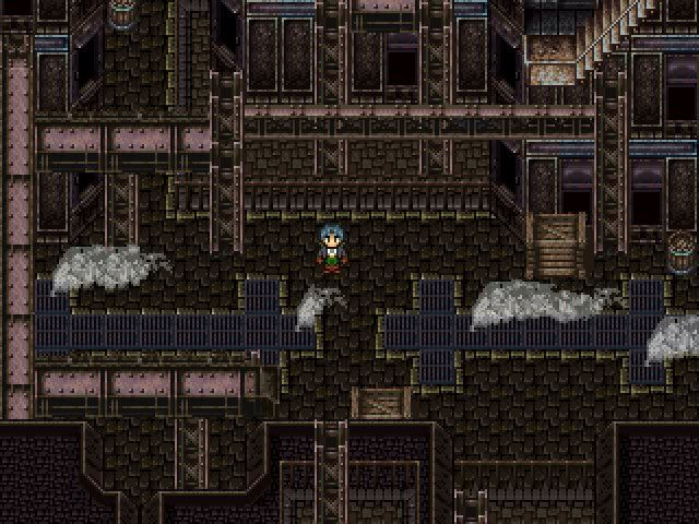
Good ol' SNES style graphics. It's a little hard to tell though what is what, especially at the top of the screen. It's obvious whree you can and can't walk, but it looks like a jumble of metal up there. Still looks great, especially the steam coming out of the grates.
 
Post screenshots of your project here. The other one was getting a little long! Oh, and there's a couple of stipulations, this time:

1. title screens aren't screenshots
2. don't post PURELY to get help with your mapping, there's already a thread for that
and
3. try to include at least one line explaining whats going on in the screenshot

now get postin!!
 
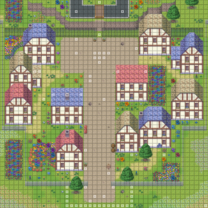
Been meaning to post some new screenshots here and there. This seems like a logical place to start.

Saris2.png

Saris.png


Saris3.png


Saris4.png

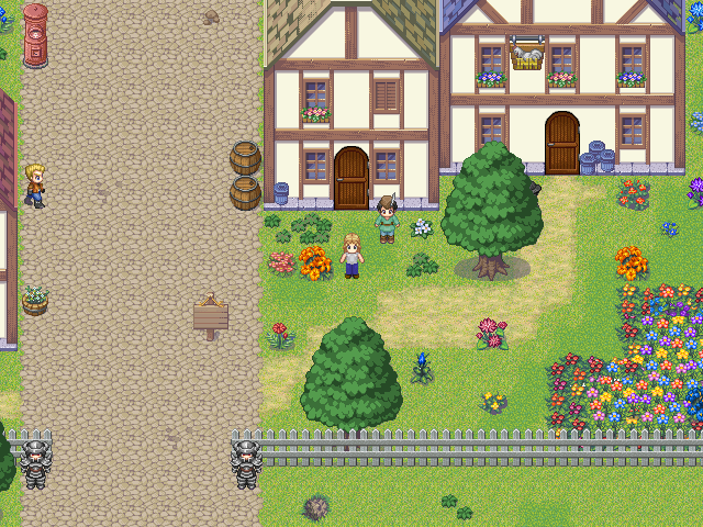
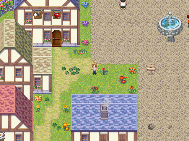
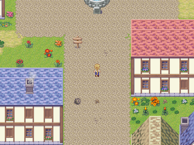
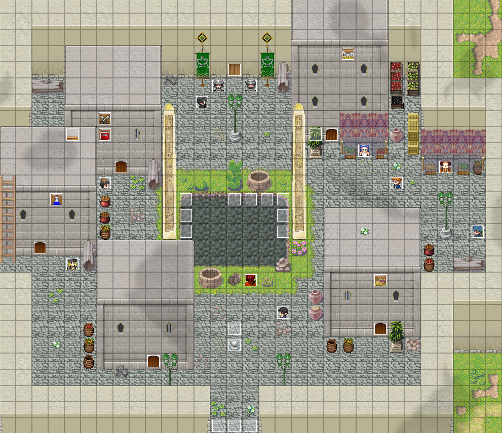
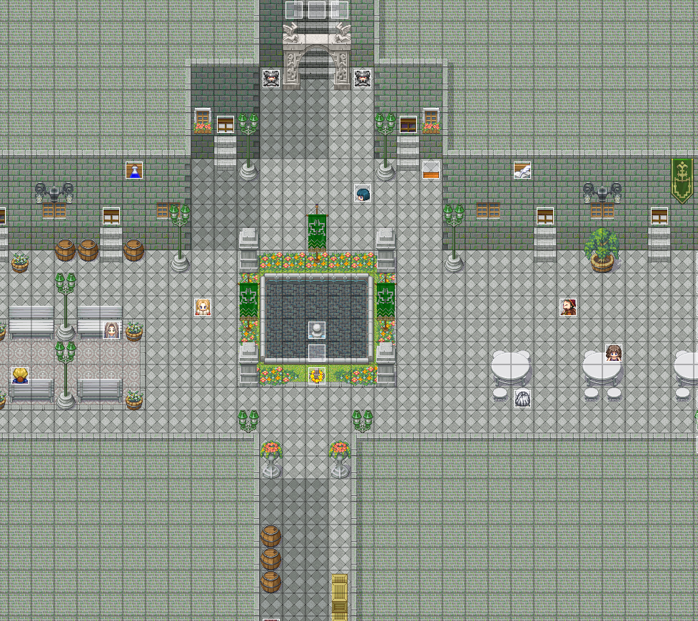
Well this town is called Saris and it's essentially the cultural hub of one of the nations in my game. In a nation where the warrior class dominates, they have artists, a theatre, writers, musicians, a large library e.t.c.
The feedback I'm mostly looking for at this point is for the look of the town, does it look culturally abundant? Does it look like is has flair? e.t.c. And although this isn't a mapping thread, if anyone has some advice I'll take it under consideration.
 

Wichu

Member

Yes, these are Pokémon screenshots.
Screenshot250.png
Screenshot251.png
Screenshot252.png

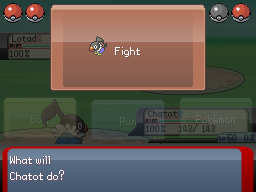
They're from my game, Pokémon Amethyst. I'm using poccil's Pokémon Essentials starter kit. This is the new battle system interface; if you've been following my game elsewhere, you might have seen it already.

Anyway, for the explanation. Firstly, the screen size has been changed (from the starter kit's 240x160 to the Nintendo DS's 256x192), and everything has been repositioned accordingly.

I've completely rewritten the battle command menu code; instead of having a simple window with the different choices at the bottom of the screen, I've added buttons over the top of the battle scene (drawing inspiration from Pokémon Diamond/Pearl and Pokémon Battle Revolution). The battle scene can still be viewed by holding Z, which fades out the buttons and untints the background.
I've also added an indication of how many party members each side has; a healthy member is denoted by a Pokéball in the corner of the screen. KOed members are denoted by a greyed-out Pokéball, while statused ones are darkened. Finally, a member close to leveling up will have a shaking Pokéball.

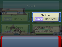
The move selection screen is again inspired by D/P and PBR. Different-typed moves have a different button border and type icon. I still need to add the "What will ___ do?" text; I missed that when modifying the script (as the original script has the entire message window taken up by the move selection box).
People familiar with the starter kit may also notice I've added the new moves introduced in D/P, which aren't originally included. I've scripted their effects, in contrast to just giving them similar, old effects.

I'll probably increase the opacity of the buttons, as they're a bit hard to read.

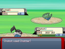
Finally, the actual battle scene itself; it hasn't really changed much. However, I've added more detailed info on the battlers, in the form of percentages for HP and SP. You can't see it from the screenshots, but I've added a smooth colour change to the HP bar (the official games use red for <25%, yellow for <50% and green for anything else, with no intermediate colours). This is because with the addition of the percentage, having different colours to denote half and quarter health is superfluous, so I decided to improve its appearance.
The message window, data boxes and buttons are custom, but inspired by R/S and D/P. The battle background is also custom; I'm probably going to change the colours later, as it looks too bright compared to my other graphics. The Lotad sprite is a recolour, and the Chatot sprite is a 'devamp' from D/P.

If people are interested, I'll post some more screens. I'm planning to make a project thread here once I finish a demo.

EDIT: Petros, I like the roof tiles ;) However, I think you're using way too many different flower tiles; it doesn't look natural. In real life, you only tend to get certain plants in an area; perhaps decide on two or three different flowers, and only use those kinds for that town.
 
Petros: The buildings are pretty repetitive, every one of them has the same amount of windows per wall, except the house in the upper right. (not going to post too much on mapping though since there is already a thread for that!)

Doesn't seem like a very busy town, but it's colourful and gives a vibrant feeling. Maybe you could give more of the cultural aspects of this town? They all look pretty similar and it's a little hard to distinguish the difference between them. When I think o a very cultural kind of town, I think of many kinds of buildings and all types of architecture, not just one style. Also, maybe you could give off more of an artsy theme to the town, like having people playing music in the streets, painting in the park, etc., things to clearly separate it from the warrior-type places of other areas.
 
petros check out the garbage cans in your screenshot 2. one of them is like painted on the wall itself. gotta move that tile down a bit

not seeing the different culture stuff either. think more like how some towns have chinatown & stuff. parts of town need to more difference if thats the vibe you're trying to do. or we could use an example of your other towns to see how its different

does your main character have medusa hair? from xp rtp. looks nice
 
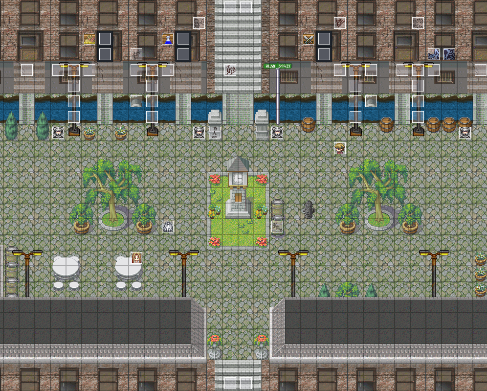
Okay here's the example of the other towns for comparison, I tried to keep them looking as dull as possible with the browns and the greys to make it seem less arty and fanciful and more "Me Warrior, Me No Need Colour, everything Black and White, Good Vs. Evil":

Vos.png
For this one, it's built on top of a hill in a rather harsh and arid climate.

Gorsica.png

Gorsica is a town built by a completely different civilization but was caputured during the war, so it's architeture is designed to look much like the other civs. It's also known as the City of Judgement, where people are tried for crimes by the High Court.

RokariMet.png
[/img]

The capital city, various tiers of huge buildings that surround a massive one up at the top. It, much like the other cities is not very culturally inclined and dominated by the warrior class hence it's state of somewhat disrepair and boring "Manhatten without the fancy stuff" look.


Also, thanks for the help so far. I'm getting some good ideas... one of them being I need to go back to the old cities and modify them a little, they're crap.
 
All of these images deal with a desert-like town and its temple/dungeon.

This is the town you're in before you go to its temple.
gionaxvalleyjy3.jpg
This is the temple, with a sandstorm going on.
gionaxtemplesandstormwn6.png
This is the temple and more of the area around it.
gionaxtemplefullxv8.png
This is the initial room in the temple before you get to the dungeon area.
gionaxtempleinsidehq8.png
Inside Gionax Temple (Dungeon) - there is a problem in the upper right that needs to be fixed
gionaxtempledungeondf1.png
This is what the engraving in the previous picture looks like with jewels entered in it.
gionaxjewelsenteredpw4.png
 
Status
Not open for further replies.

Thank you for viewing

HBGames is a leading amateur video game development forum and Discord server open to all ability levels. Feel free to have a nosey around!

Discord

Join our growing and active Discord server to discuss all aspects of game making in a relaxed environment. Join Us

Content

  • Our Games
  • Games in Development
  • Emoji by Twemoji.
    Top