
You are using an out of date browser. It may not display this or other websites correctly.
You should upgrade or use an alternative browser.
You should upgrade or use an alternative browser.
The Screenshot Thread 2
- Thread starter Ellie
- Start date
BizarreMonkey
Member
I can scale it down, was following a guide, so long as the windows don't have to change. Good time to as of now because the A E S T H E T I C of splitscreen turned out to be a dumb idea so now im shifting it all into one house.
edity: SUCCESS! ON SO MANY LEVELS AAAAAAAAAAAAA THIS LOOKS SO GOOD.


Discovering new room tech!!!

Vrew.
edity: SUCCESS! ON SO MANY LEVELS AAAAAAAAAAAAA THIS LOOKS SO GOOD.


Discovering new room tech!!!

Vrew.
Nathaniel3W
Member
Does the sprite have only two directions? If so are you going to draw more?
BizarreMonkey
Member
In response to this question and Amy's above, consider them placeholders. When they are complete they will have a topleft, topright, downleft and downright facing. Virtually all of the screenshots and this project's entire existence in MV is solely for the purposes of plotting out the plot and environments for the real thing, which will be developed in game maker studio.Nathaniel3W":1xkzuc3d said:Does the sprite have only two directions? If so are you going to draw more?
ALSO NEW CONTENT WHEEEE, and it's for Intelligence this time, another optional boss (and a bit of a sidequest too) coming to build finale.
http://www.youtube.com/watch?v=gWwQuXkvoyE
Despite how hard I'm aping gravity falls, I'm virtually certain anyone and everyone is gonna be like 'wow M.F. Lazarus, that's not just a reskin of W.D. Gaster at all!
But the plan is to distract from how hard I'm aping gravity falls with the incompetence of the undertale fandom's fervor, which from past experience, is sure to succeed.
Some of you may remember my concept sketch / bio of M.F. Lazarus from the Sketch thread.
Now he a thing!
Unrelated, here's some music for Fantasia that was finished just today, coursty of Max M. Dominora!
http://www.youtube.com/watch?v=lz8hcmdHBAM
An on-device mock-up of the scene that immediately follows setting up your character's appearance.


I think my plan is to have this kind of character interaction as a dedicated scene for events. So when an event occurs the game UI is hidden and these chats occur. The first event is the introduction, where you name your hero and their personality is decided.
What I might do is base the starting personality for the hero on the player choices during this time. The resulting personality will decide the starting equipment.
These dialogues would also be how the hero informs the player of special events that occurred, like met another hero or received a message from another hero. I'll likely have a skip button.
The settings cog will always be there as the 3D view and the main game components would be running for these scenes.
I'm not going to pursue the original timeline idea, I'll just display the last event that occurred - unless she's in the middle of a battle where additional information of what's going on is shown. The timeline will be a day-in-review section that the player can inspect out of curiosity to see what she got up to during the day.
EDIT: When these chat events occur, your phone will display a notification in the style of a message and any quick-actions will be available, so if you have a smart watch you can go ahead and perform the interaction on your wrist. What I'll do is detect if the player interacted via the notification and reduce the weight of the messages if this is the case so it's easier to handle on a watch (and gets to the point faster).
Everything will be configured both manually and automatically to make sure these notifications do not become annoying.
Juan J. Sánchez
Sponsor
I agree with the rooms being too big.
Also, I like the mockup.
Also, I like the mockup.
BizarreMonkey
Member
Well this happened.
http://www.youtube.com/watch?v=f8-Oig_ZW1E
Also, couple new music tracks by Max M. Dominora (composer for Fantasia)
http://www.youtube.com/watch?v=2G5VVT1QsEAhttp://www.youtube.com/watch?v=nQi5GzWe7EU
On the Left is Lilac Grave's Theme, the Right is Svoli's Battle theme.
Jake "MoneyMenace" Gamelin has also been doing a bunch. :0
http://www.youtube.com/watch?v=U0NgVOHoC8shttp://www.youtube.com/watch?v=dqd0WPQx6Ow
http://www.youtube.com/watch?v=_rJezdOQzSkhttp://www.youtube.com/watch?v=b2bl4PA9X3U
Top Left: Mira's Character Theme
Top Right: Mira's Pre-battle Theme
Bottom Left: Deprived Agency Character Theme (For those who played menagerie, you may notice it's a warped version fo Spooky Schema's theme, Unfactored Protege.)
Bottom Right: A theme that was designed to be used for the big cutscene in Perseverance: Adherence, I bumped into it while cleaning up my documents and realized that not only was it really good, I hadn't uploaded it yet!
BizarreMonkey
Member
Oh boy! Porting Intelligence 314th Clash to MV!
http://www.youtube.com/watch?v=u6MygQQjUDMhttp://www.youtube.com/watch?v=0i1uatGX6BQ
This has actually been entirely fun so far.


vrew.
http://www.youtube.com/watch?v=u6MygQQjUDMhttp://www.youtube.com/watch?v=0i1uatGX6BQ
This has actually been entirely fun so far.


vrew.
Skyla Doragono
Sponsor
That skyscraper totally doesn't look right... Everything is too small in relation to the door, from the windows to the cars.
BizarreMonkey
Member
I guess that door should be smaller. It's an elevator door anyway so I'll switch it out for one of the 48x48 beauties I have.
Here is a big battle I just finished. I'm not a fan of how large party manages the window settings, I'll fix that along with the other few glitches later.
http://www.youtube.com/watch?v=t-pQT6Jbb8Y
And a couple more screne creme.


Menus and battle interface set up, new iconset done. I've also backgrounded and bordered every face image.
Much work, very tire.
Here is a big battle I just finished. I'm not a fan of how large party manages the window settings, I'll fix that along with the other few glitches later.
http://www.youtube.com/watch?v=t-pQT6Jbb8Y
And a couple more screne creme.


Menus and battle interface set up, new iconset done. I've also backgrounded and bordered every face image.
Much work, very tire.
Nathaniel3W
Member
In the scene with the houses and the grass, everything looks a little too green-tinted. And I don't just mean there's a lot of grass. I mean, the colors on the houses look off. Maybe it would look better with a bit of a shift toward red.
BizarreMonkey
Member
Yeah that tint is a bit offputting to me, I just thought maybe I was imagining things, it's meant to be like early morning, but I think it could stand to be more grey and bit less green.Nathaniel3W":80a87t91 said:In the scene with the houses and the grass, everything looks a little too green-tinted. And I don't just mean there's a lot of grass. I mean, the colors on the houses look off. Maybe it would look better with a bit of a shift toward red.
BizarreMonkey
Member
Sorry to totally break the bump rule but hey, what are ya gonna do?
Enjoy me actually being productive while it lasts... is what.
http://www.youtube.com/watch?v=jnB3JDkcuy8
Weapon sequences done.
And NOW! My voice acting, and some good storywriting, also comes the majority of the skill sequences, along with an epic commonly undiscovered hardmode, when I released the original sisters of virtue, one fella asked if anything special happened if you go to an egregious effort to kill Blu.
http://www.youtube.com/watch?v=VdlKED5Eih0
The answer is yes, indeed yes. Firstly, getting to the point is tremendously difficult, due to Yasondre casting clash of leaves each 15% health Blu drops by (starting at 75%), which does a devastating amount of damage, I have a lot of health extra due to the holy element weapons I have equipped (which often give a boost to HP), and thankfully Unbreakable Pride (Tier 7 Shield for Limbo) some a decent amount of spell reflect. The only way I keep Pep alive is by constantly refreshing Mirror on him. I'm also keeping regens, focus, as well as a 'dampen' buff (halves magic damage received) at all times I can, even with all that, this fight is no cakewalk.
However, while there's no material reward for defeating the hardmode, there is a very heartfelt scene, which you'll see in this video... the fight changes direction basically ENTIRELY.
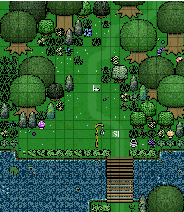
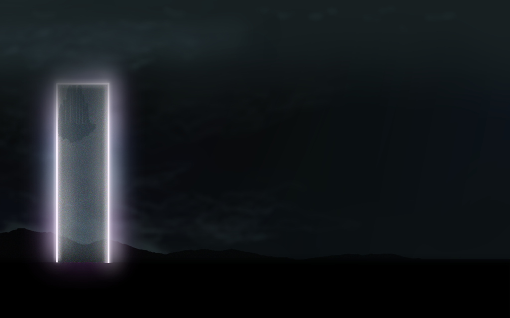
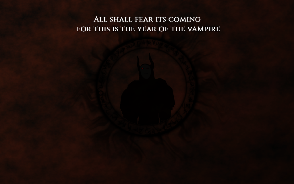
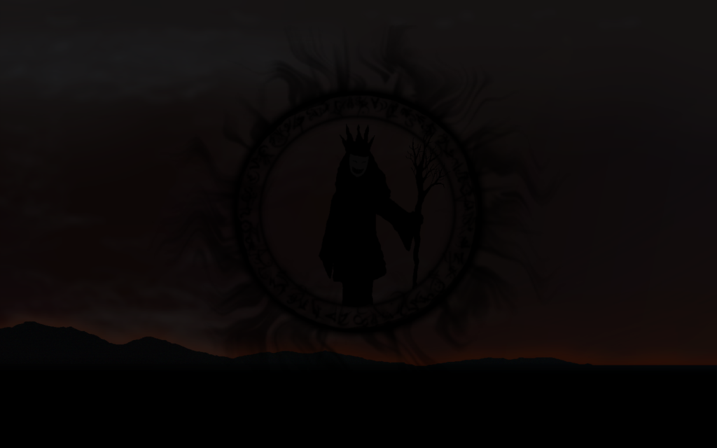
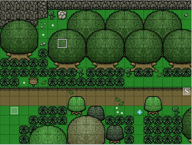
Here are some shots of my project. Story Intro Animation and a forest tileset I've been working on. One of my fav games growing up was Zelda 3 and you can see the resemblance in my style, as I am using a realtime action battle system.
The fortress of Nicothema
Vampire General
Banshee Witch
Forest Tileset (WIP)
The fortress of Nicothema

Vampire General

Banshee Witch

Forest Tileset (WIP)

Yeah that's right. They seem to be too close to the forground in both colour and detail. Perhaps they just need to be a little washed out, or rather just have rocks in specific areas rather than covering the entire floor with them.
EDIT: just a 2 second paint mockup, but i think you get the idea

I love the style though, I look forward to seeing how it progresses :thumb:
EDIT: just a 2 second paint mockup, but i think you get the idea

I love the style though, I look forward to seeing how it progresses :thumb:
Thank you for viewing
HBGames is a leading amateur video game development forum and Discord server open to all ability levels. Feel free to have a nosey around!
Discord
Join our growing and active Discord server to discuss all aspects of game making in a relaxed environment.
Join Us
