Envision, Create, Share

Welcome to HBGames, a leading amateur game development forum and Discord server. All are welcome, and amongst our ranks you will find experts in their field from all aspects of video game design and development.

Pixel Art WIPs/Small Things Thread

Looks nice, but you might want to add some lightspots for reflection. Very good definition of shape, but the metal door needs more work.

And...
Newsprites.png


Left: Normal seed, mana seed, strong seed, reworked tree sprites (including new mana and strong tree sprites), normal fruit, mana fruit, and strong fruit.
Right: Chaos shards (yellow=swim, green=run, purple=fly, red=power), and the following small animals: penguin, boar, parrot, and gorilla.
 

onzephyr

Awesome Bro

Raze":1ynd6xiv said:
Z8sOW.png

Any tips on how to shade the clothes better?


Z8sOW_v1.png

Can't say I know much about spriting a wide variety of cloth. But here is quick take on it. Mainly I sharpened the specular highlight of the cloth and increased the overall contrast and hue range. ends up feeling more like a silk or satin , so if the goal is a diffuse cloth say burlap or wool completely ignore this. :smile:
 

Raze

Member

No offense, onzephyr, but I don't like that very much. However, thank you for trying to help :]

The right version is the new one I just did; is it better?


Jason

Awesome Bro

I honestly can't tell the difference except you changed the colours from grey to blue... is that all you did? Also can you use imgzoom tags please so we can get a closer look.
 

Jason

Awesome Bro

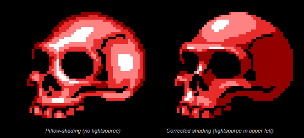
Oh yeah I can see now lol, it still looks pillowshaded, actually with the shapes you've chosen it looks MORE pillowshaded, I'd have made the cloth crease or something as if it's actually dangling down, y'know?
 
From what I can see the problem with the clothes is that they're pillow shaded (light coming from between the viewer and the object) and when you redid the shading you only exacerbated the problem.
 

Jason

Awesome Bro

Well here's a quick example I did, mine is the one on the right ofcourse, it's a little sloppy by my standards but I think it gets my point across:

I've also slightly changed the sleeves and the chest cloth too... only slightly though but I think it makes it look better, atleast in my opinion


(I could have done it SO much better, but /effort, lol)
 

Jason

Awesome Bro

I'd probably change the colours slightly if I were you as well, change the tones and stuff to match more with the style of the skull head (Which is miles ahead of the rest of it in terms of colours and shading by the way), and it DEFINITELY needs more contrast...
 

Raze

Member

So I decided to give it another shot today, looking at a contrast tutorial on pixel joint. I think I'm getting better.

Left = Original, Right = Recent


It's nice looking, but you may want to define the edges a little.

Cyblarg%20V1%20SPRITES.png

Some sprites for a metrovania like pet project. Cave Story sprites used as a base, partially.
 

Cait

Member

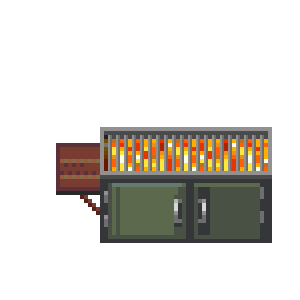
BBQPit.png


(o_o) I've been transfering Mack and Blue 2000/2003 graphics to RMVX Ace, when I realized that they didn't have a BBQ kind of graphic that would have made complete sense on a porch! So I kind of frankenspirited one, but I am not sure I did all I could to make it look nice. Any advice would be nice!
 
Okay. SO I know I can't make sprites... In fact I can't do anything arty at all.
I do have to say however, I am proud of this:
Shin2.PNG

I know. I shouldn't be proud. But still. I am.
 

Thank you for viewing

HBGames is a leading amateur video game development forum and Discord server open to all ability levels. Feel free to have a nosey around!

Discord

Join our growing and active Discord server to discuss all aspects of game making in a relaxed environment. Join Us

Content

  • Our Games
  • Games in Development
  • Emoji by Twemoji.
    Top