Envision, Create, Share

Welcome to HBGames, a leading amateur game development forum and Discord server. All are welcome, and amongst our ranks you will find experts in their field from all aspects of video game design and development.

Mapping Improvement Thread 4

If you've ever tried a resolution change script and removed the tilemap viewport, you can see that the tilemap only draws tiles inside the 640x480 area. Actually it does something complicated involving Z index that's probably related to optimizations -- the point is that the RMXP tilemap doesn't lag at larger sizes. It does, however, take up more memory and take longer to load. I'm not saying this as part of any argument for or against what anybody's doing, but just to add to this discussion my knowledge about the way such things work in RMXP.

By the way, I like the changes I see. No more strangely lush plant life in the frigid cave and the statue is a nice touch; I'm guessing it has some significance to what's deeper inside?
 
thes are incomplete around the edges usually i'll add bits of flair to them while i'm watching a movie or w/e:

casson.png


crow.png


onoak.png


also some interiors:

interior1_watermarshal.png


interior2_speakeasy.png
 
The blue mailboxes are meh. They REALLY stand out. Maybe make them brown or tan or something to match the color scheme more because they are the only thing I see when I first look at the map. The two different houses seems confusing not because they're just different but because the wood involved is so different. Usually there's a singular wood. I'd just make them all the same imo, just because the town doesn't look that large. Why is there so many different road types? Or are you trying to see what looks best?
 
You would really benefit from some clever mapping on the roads, especially considering the desert location. Overlaying some tiles which are designed specifically for that area would be great - stretches of sand swept across the road, rough edges in some parts, cracks, missing bricks (because given the industrial nature accidents - dropping heavy things - and perhaps heavy vehicles would be common I guess). Cart tracks where people have gone off the road, the buildings being partially buried in the sand, etc. I just think in a map this large with that many open spaces (which isn't a BAD THING) that sort of detail would really improve it for very little additional effort.
 
RavenTDA":1gjco66a said:
The blue mailboxes are meh. They REALLY stand out. Maybe make them brown or tan or something to match the color scheme more because they are the only thing I see when I first look at the map. The two different houses seems confusing not because they're just different but because the wood involved is so different. Usually there's a singular wood. I'd just make them all the same imo, just because the town doesn't look that large. Why is there so many different road types? Or are you trying to see what looks best?

the blue mailboxes have gameplay purpose so thanks for confirming i'm glad they stand out: one of the party members is a postman.

and the differences in architecture are meant to convey the jagged before and after appearance of the world in the aftermath of revolution. do you think it's too jarring? it wouldn't be hard to make them blend better by changing the colors a bit.

also after talking to teloch last night i plan on adding some pueblo architecture and lots of original tiles to the set :3

and each town has a different type of road to differentiate them. if they all have the same road they would all look the same.

also amy yeah that's a swell idea. in the old version years ago i had lots of cool tiles with splattered sand effects that i was pretty liberal with i just haven't made any for the new tileset. i knew it was missing something thanks.
 

Tuna

Awesome Bro

I really love your interiors, especially the interesting way that you layer the exits. My only criticism is that your outdoor brick/stone autotiles just don't look right. For whatever reason they don't blend well with the rest of the atmosphere. Maybe it's just that the uniformity clashes with the general chaos of the surrounding desert environment.
 
Don't know if it's a priority issue or what but the stairs and exits in the interior rooms bother me (it just looks strange how stairs/the wall/curtains extend into the darkness. It would be cooler imo if you had them fade out (maybe just make a simple semi-transparent dithered tile to layer over for that effect?)

Also, not sure if this is from RTP or your edits, but the sand doesn't tile well (there's an obvious pattern to the greyish dots). I dunno if it looks the same zoomed in, however, so maybe it's not a problem.
 

Spoo

Sponsor

This thread got abandoned, apparently. Been testing some interior designs and I'm kind of feeling this one.

interiorlarge1.png


I borrowed Des's exit idea and it looks pretty awesome IMO.
 

Tuna

Awesome Bro

Looks good. My only complaints are that the desk in the corner of the bottom-right room is probably supposed to be running into the wall, but in actuality the wall doesn't appear to extend that far, so the desk is kind of reaching out into the hallway, and the top-most entry into the kitchen looks more like a plank door because of the way the grain is running. I really like what you did with the kitchen, though. I always have a terrible time with them.
 

Spoo

Sponsor

I'm trying to find an interior door characterset someone made once to put at the kitchen. I haven't seen it in a while, though. As for the desk, I just noticed what you're talking about. I might edit the desk if I have the time or just cut off the corner there.
 
too much empty space ;o

Upper left hallway is gigantic. Bottom left room could be one row smaller and lower, so it's symmetric with the kitchen area (looks a tad strange right now). Kitchen is also massive, there is way too much empty space there. Dining room is okay, but space beneath that could be cut. Finally, living room in the upper right needs some chairs or couches; and the bottom space could be cut.

Read tindy's or bacon's mapping tuts if you haven't, they'll really help you get a better feel.
 

Spoo

Sponsor

Any hint as to where I might find some sofa tiles that go alright with the RTP? I'm certainly not crazy about the love seat thing in the Castle Town Int.
 
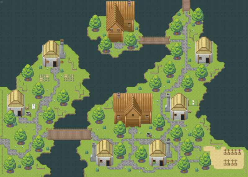
Not bad for a first map, especially with a difficult tile set like the Farm one. Few pointers are the straight roads, the roof of the right house doesn't make completely sense and it could do with a bit more details, like some extra weeds and flowers. Also the scarecrow has a bit of a strange position.
 
Well, my first maps were a lot worse.

Besides the couple of mapping areas, I don't think there's much wrong with it that isn't down to the RTP itself. The roads could do with being less straight, but being RTP that isn't going to look good easily. Plus variation in the grass would be nice but again, RTP.
 

Tindy

Sponsor

Looks pretty good, Zealo - but *please* get rid of those ugly undulation tiles. They look really out of place and detract from the rest of the map.

Also, check out your chimney placement on the stone houses -- I think all of them need to come down about 1 tile. They're not connected to anything right now.

Last but not least is the meandering paths you have. The design is quite aesthetically pleasing, but there are 2 things that come to mind:
1) Those paths are paved. Why would anyone pave that haphazardly? Make the paths dirt and it works; but if it's paved, it needs to be straight.

2) You have at least one if not more couple odds and ends on the paths that don't go anywhere; also, some really square sections (check out the lower left corner). Clean those up and you'll be good.
 
I'm looking for some suggestions on improving my mapping skills and this place was recommended, so I'm going to put something out there and see how chewed up it gets. It's a small map for the bottom of a waterfall visited early on in the game, so it's not hugely detailed.
waterfall_map_by_chaoslamorak-d4psftt.png
 

Thank you for viewing

HBGames is a leading amateur video game development forum and Discord server open to all ability levels. Feel free to have a nosey around!

Discord

Join our growing and active Discord server to discuss all aspects of game making in a relaxed environment. Join Us

Content

  • Our Games
  • Games in Development
  • Emoji by Twemoji.
    Top