Envision, Create, Share

Welcome to HBGames, a leading amateur game development forum and Discord server. All are welcome, and amongst our ranks you will find experts in their field from all aspects of video game design and development.

Mapping Improvement Thread 4

Jason

Awesome Bro

What'cha mean, cause the way I've done it, is that there's;

Layer 1 - Grass
Layer 2 - Bridge Floor
Layer 3 - Bridge Ropes

But since it's the gay ass dirt that doesn't have anything surrounding it (If it had grass around it on the autotile, I could make it layer 1 instead of the Grass), I'd have to do it like this;

Layer 1 - Grass
Layer 2 - Dirt
Layer 3 - Bridge Floor
Event - Bridge Ropes

And call me picky but I am NOT using an event just to fill in one tile of the map, infact, I wouldn't use 'em to fill in a whole area of a map either, events are for events, not filling in maps...

And besides, is the dirt not going under the bridge really THAT much of a problem that I need to go through this trouble and edit an autotile just to get it to look right ?

@ Tindy when you said
"people don't just walk across it and then take a running leap off, do they?"
Why would people have to take a running leap to get off the bridge, they scared of grass ? o.O especially grass that lasts like, one footstep until the dirt road o.O
 

Tindy

Sponsor

It's not that people are afraid of the grass - if there's a path that means that people have trampled the grass to the point that it doesn't grow anymore. That, and the fact that the bridge's shadow would imede grass growth, would imply that the path should connect. Unless that one specific spot has an overabundance of Miracle Grow? Now, if it can't be done with regular RTP then so be in, but there are loads of fixes around it. Otherwise - eh. It looks all right.
 
Jbrist: Your map is decent. There are a few problems though:

1. The dirt doesnt extend all the way to the bridge. Use an event. Is an event so bad? What the difference. :)

2. Your maps is a little bland at the moment. Try using the shadow grass autotile to spice up your map and add variation to the grass.

3. Your long grass needs to be spread out more.

4. Your cliffs are not very random and not very detailed.

5. You seem to be clumping certain objects together, such as the logs and stumps. Spread them out more.

6. Get rid of the weeds in the water and use them on the grass.

7. Watch out for symetrical mapping. Your flowers and other objects are creating too much symetry.

8. That bath is really BOLD. Try using the grass dirt autotile and make a path, then highlight it using the dirt path autotile.

:)
 

Nolund

Sponsor

Need some feedback on this map of mine. One of my biggest problems is creating larger maps, and I can't make a game with just 20 x 15 maps (well, I COULD, but I don't want to >.>)

Anyway, I think I did pretty good, but I need some other opinions.

333x0yg.png
 
NNolund:

1. The different trees you have are very distracting and look bad. They clash with one another.

2.The pink flowers you have clash

3. the long grass isnt very well done. break it up into smaller chunks.

4. Same goes for the flowers.

5. While most of your path is good, there are some spots where it is in a straight line.

:)
 

Nolund

Sponsor

Alright, so I know I need to fix the long grass, but I have a question.

Would it be better to replace the trees, or replace the flowers? I'm not very good with bunching trees together, and I don't want to make another small map.
 
Replace both. Use a certain type of tree, and stick with it. Dont use a bunch of different trees. The flowers, the tile not the autotile, clash and are a bright disaster. :)
 
@NNolund, nice map.
Try bunching some of the trees together. About using other trees:
trees.png

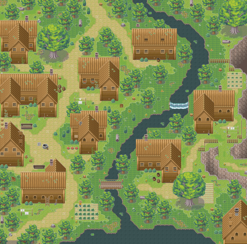
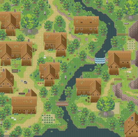
Here's a map I made for Team eternal Blood. Do you see anything missing in it?
foresttownprev.png
 
Umm, it's raining inside? Other than that, both maps are quite blank and uniteresting, but they're not too bad considering they're RTP. Try adding a bit more ground variation I'd say.
 
That's weird, when I testplay the rain appears only on the second screen where it's supposed to be...
I'll try adding more variety.
 
dylanf3":y4uy8f4n said:
There is a waterfall, where there is no elevation, kinda weird
There is elevation, it's hidden in the tall grass and.... just kidding, I'll fix it.
foresttownprev2.png

Edit: yeah, I think it looks better now ^^
 
One thing i would say would be that the grass makes it seam as if no one ever goes down to the river, i mean wouldn't you get anoyed of walking through the tall grass every time you want to get to a river, espicially near the brige that should be atleast beaten down a little bit if the people want to go accross the river.
 
silver wind


Nice map, looks pretty fucking awesome to me I like how the water fall is fixed looks 100% better

you have alot of people living there near the water, perhaps you should add a dock with some boats

if I lived there so close to the water i'd for sure own a boat lol

anyways this map makes me wanna hit the bong keep up the wicked map makeing silver wind


Note from Towlie: don't forget to bring a towel.
 
This is my map from becoolio's contest
Note: it's is my fix up after I got some pointers on that thread

C&C would be appreaciated :grin:
 
Next time, Don't put a castle in a PLAINS map. It's called a PLAINS map for a reason. Also, don't use those things use used as tops and corners. They don't look right, and are used to have a stairway to a castle.
 

Thank you for viewing

HBGames is a leading amateur video game development forum and Discord server open to all ability levels. Feel free to have a nosey around!

Discord

Join our growing and active Discord server to discuss all aspects of game making in a relaxed environment. Join Us

Content

  • Our Games
  • Games in Development
  • Emoji by Twemoji.
    Top