
You are using an out of date browser. It may not display this or other websites correctly.
You should upgrade or use an alternative browser.
You should upgrade or use an alternative browser.
Mapping Improvement Thread 4
- Thread starter Æ№∞₧
- Start date
Zekallinos
Sponsor
Good map overall! Only a few little details bug me. First, since when does weed (or whatever it is) grow on water? Use aquatic plants instead (add it to the tileset if needed). On your house's walls, there are two climbing plants at the same place, which looks a bit weird (mirror effect). The four trees on the lower-left are a bit symmetrical, too. Finally, near your white selection box, some roof tiles have a seam. The color change isn't smooth. Can you fix that or is it the tileset?
---
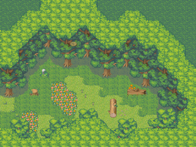
I've edited heavily the non-working shadow trees from the forest tileset, and here is the result. The canopy still has some work to be make, but how about the way I used the trees?

---
I've edited heavily the non-working shadow trees from the forest tileset, and here is the result. The canopy still has some work to be make, but how about the way I used the trees?

@Love:
Zeka pretty much said what I was going to say, but aye, you're on good track. I would just suggest throwing down some long grass tiles here and there to dress up the ground a bit.
@Zeka:
That shadow edit's pretty smooth, and I really like the details e.g. overgrown grass covering the log. As for the canopy thing Ana and Tindy were pointing out, it may be able to mesh better if you recolour the canopy tiles to the exact same palette as the tree leaves.
blakependragon
Member
love: looks good, but why are there no plants behind the scarecrow? looks wierd. you can always make the top of him an event if you're out of layers.
i am no good at map making. i've looked at tutorials, and understand how to do it, but lack imagination. anyway, i finaly did an ok one, took half an hour :biggrin:
i'm going to add critters, but forgot.

i am no good at map making. i've looked at tutorials, and understand how to do it, but lack imagination. anyway, i finaly did an ok one, took half an hour :biggrin:
i'm going to add critters, but forgot.

It's very open - it's VERY open. It's not necessarily a bad thing that it's open but just remember that as you play you'll be wakling in all that openness, not seeing very much. A bigger issue is your long grass - it's growing in a rectangular patch in the middle of a trail. Which leads me to another point - your map has no trail! Not the worst thing in the world, but it's got to be aggravating when you're sending a hero into a very wide, open forest (hint: Add more trees), with no trail. ...In fact i just noticed that almost every ground pattern you have is in a square. Step away from the rectangle tool! Use the pencil tool and kind of scribble on the ground, then clean it up a bit. It'll look tons better, I promise. The river looks all right but it's got some very long expanses of straight banks - I'd switch those up a bit if I were you.
So to recap: Don't use the Rectangle tool, put a path in *or* put more trees in (you can do both, but one or the other for now is ok), unstraighten some of that river, and plan out some things. Flowers tend to grow in bunches, long grass tends to grow in untouched areas, trails are formed by walking a lot... Etc.
So to recap: Don't use the Rectangle tool, put a path in *or* put more trees in (you can do both, but one or the other for now is ok), unstraighten some of that river, and plan out some things. Flowers tend to grow in bunches, long grass tends to grow in untouched areas, trails are formed by walking a lot... Etc.
blakependragon
Member
thanks. well, none of it is traveled much so no path, i'll go with more trees.
p.s. i don't use the rectangle tool but rather the eclipse, and connet it a bunch, switching to pencil mode
p.s. i don't use the rectangle tool but rather the eclipse, and connet it a bunch, switching to pencil mode
Love":1us4phk3 said:Overall, it is a very good map but it really lacks details. Try adding more plants, more flowers, etc so that it wouldn't be empty. ^^
Will do lol, although I'm just using what comes with the tileset, so I'm gonna have to add some stuff onto it, lol, I'll see how that goes.
It does ? o.O Well I just took the first things I saw, which were obviously the most basic tiles for this sort of thing haha, although I didn't hesitate to get rid of that damned square water tile, seriously, why did enterbrain give us a square water tile... dumbasses...
Hello fellow members (forgiveme if I posted wrong area) I Looked and looked not sure where to post
I would like to share with you 4 of my maps to my game, I am currently working on each of these 4 at different times, coming and going through each of them working little bit at a time.
I would appreciate your feed back, on what u think of these maps
map 1
I would like to say thanks to willowsidhe on this map this person makes awesome mapping Tutorial, this map consists of homes and a few shops and a big goverment building, with a small market close by.

Map 2
This map is my Shop area, Has a church,fishing store, Ligure store, Train station, apartments, fleemarket, Houses, Driver Licence Building.

Map3
This is a town map, just homes, A school, playgrounds, also a Home to buy

Map 4
This map is my forest that will lead up to a camp ground where you will be able to do some Fishing, start camp fires, or even maybe a forest fire, that is if you choose to be a arsonist

Note: all maps seen above are not finished not even close, and I think my Forest trees maybe a bit far part to call a forest, but thats why im posting this. please comment thank you all for reading this post
Good luck with all of your projects.
fellow memeber DAC420
I would like to share with you 4 of my maps to my game, I am currently working on each of these 4 at different times, coming and going through each of them working little bit at a time.
I would appreciate your feed back, on what u think of these maps
map 1
I would like to say thanks to willowsidhe on this map this person makes awesome mapping Tutorial, this map consists of homes and a few shops and a big goverment building, with a small market close by.

Map 2
This map is my Shop area, Has a church,fishing store, Ligure store, Train station, apartments, fleemarket, Houses, Driver Licence Building.

Map3
This is a town map, just homes, A school, playgrounds, also a Home to buy

Map 4
This map is my forest that will lead up to a camp ground where you will be able to do some Fishing, start camp fires, or even maybe a forest fire, that is if you choose to be a arsonist

Note: all maps seen above are not finished not even close, and I think my Forest trees maybe a bit far part to call a forest, but thats why im posting this. please comment thank you all for reading this post
Good luck with all of your projects.
fellow memeber DAC420
Thank you for viewing
HBGames is a leading amateur video game development forum and Discord server open to all ability levels. Feel free to have a nosey around!
Discord
Join our growing and active Discord server to discuss all aspects of game making in a relaxed environment.
Join Us


