
You are using an out of date browser. It may not display this or other websites correctly.
You should upgrade or use an alternative browser.
You should upgrade or use an alternative browser.
Mapping Improvement Thread 4
- Thread starter Æ№∞₧
- Start date
silver wind
Member
Great map, Sase, must took you awhile ^^
I see nothing wrong with it, but you should spice it up with fog, screen tone, wild animals and NPCs. Since you're not using the waterfall autotiles, you can add flowers with autotile 47-flower01 or add details to the path using autotiles 03 and 41.
I see nothing wrong with it, but you should spice it up with fog, screen tone, wild animals and NPCs. Since you're not using the waterfall autotiles, you can add flowers with autotile 47-flower01 or add details to the path using autotiles 03 and 41.
Not bad for a mountain map. I would suggest working on the straight areas though (some undulations, cliff edges, rocks), where they could be less linear. I see a lot of paths there, probably more than necessary; unless it's a very popular mountain road, generally there wouldn't be so many. Don't be afraid to add more grass (I prefer large areas to the tiny 1-tile clumps) and more elevation, though you've done a decent job with that already.
Thanks.silver wind":3ec05jtd said:Great map, Sase, must took you awhile ^^
I see nothing wrong with it, but you should spice it up with fog, screen tone, wild animals and NPCs. Since you're not using the waterfall autotiles, you can add flowers with autotile 47-flower01 or add details to the path using autotiles 03 and 41.
I actually did have a fog and screen tone for it, but to take the whole map (or 90% of it) into one screenshot I had to print screen from editor view. I think I accidently deleted the event tho, but its not that hard to make a new one.
I wanted the mountain to look a bit plain so I didn't add anything "man-made" expect the bridges.
Frankly I had a hard time with using the other layers since for my normal mapping this was pretty tightly together-put map and 2nd layer was almost full. I'll see if I can improve it in some way.BubblesVonSalamancer":3ec05jtd said:Not bad for a mountain map. I would suggest working on the straight areas though (some undulations, cliff edges, rocks), where they could be less linear. I see a lot of paths there, probably more than necessary; unless it's a very popular mountain road, generally there wouldn't be so many. Don't be afraid to add more grass (I prefer large areas to the tiny 1-tile clumps) and more elevation, though you've done a decent job with that already.
LaDestitute
Member
A map I'm working on for the evented intro in my game TCT.

What I have so far is a N/R/R Chao coming onto the screen, spotting a 20 Rings itembox (then a ! emoti-ball). The Sonic Chao grabs a Speed Shoes itembox, dashes forward, jumps onto a spring, jumps upward and then snags the 20 Rings itembox. :D

What I have so far is a N/R/R Chao coming onto the screen, spotting a 20 Rings itembox (then a ! emoti-ball). The Sonic Chao grabs a Speed Shoes itembox, dashes forward, jumps onto a spring, jumps upward and then snags the 20 Rings itembox. :D
luv_kitty12
Member
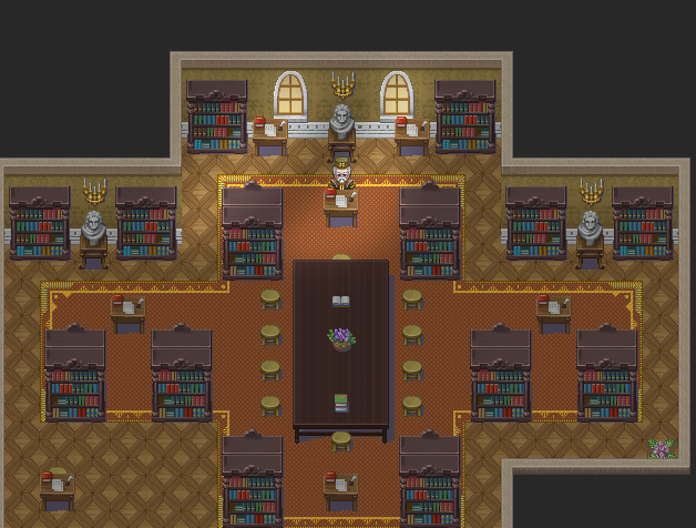
Hi there! I was wondering if anyone could help me here. I have a tileset and two carpet autotiles but I can't really decide which one should I use (and I should just use one~) so I'd really appreciate some help!
The First One:

The Second One:

Personally, I am going for the second one, but I'll really appreciate help or even suggestions!
The First One:

The Second One:

Personally, I am going for the second one, but I'll really appreciate help or even suggestions!
Sgt. Cookie
Sponsor
I'd suggest the second one.
rey meustrus
Sponsor
I'd suggest the first one.
luv_kitty12
Member
Thanks, everyone, for the suggestions! I like the second one, too. Okay, second one it is. And I will do that, Regicida. Thank you very much!
Pokémaniac
Awesome Bro
Thank you for viewing
HBGames is a leading amateur video game development forum and Discord server open to all ability levels. Feel free to have a nosey around!
Discord
Join our growing and active Discord server to discuss all aspects of game making in a relaxed environment.
Join Us


