Envision, Create, Share

Welcome to HBGames, a leading amateur game development forum and Discord server. All are welcome, and amongst our ranks you will find experts in their field from all aspects of video game design and development.

Mapping Improvement Thread 4

Tindy

Sponsor

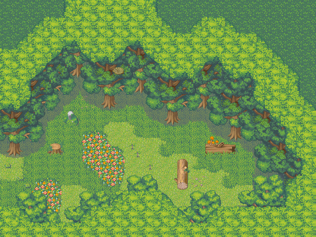
The way that the "forest" autotile is meant to be used, at least as far as I have been able to figure out, is only to mark the bottom and sides of a map (to make it a closed-in map, that is). When it's placed on the top as you have it, it looks like bushes, because there aren't any tree trunks visible. Being that this is a 3/4 mapping style, you NEED to be able to see tree trunks from that angle. Otherwise, it's just borked and doesn't look good.

I can also comment on how empty the map is, period. While for dungeons/mazes and such it's good to be more open, there needs to be a balance. What you have is, essentially, a room with some unfortunately shaped walls. It's not a maze, it's not a forest - it's a room.

As for your fog - don't. Just don't. It's too saturated and hurts the viewers eyes and really only serves to hide bad mapping.

So what do you need to do? You can keep the tree autotile, but only use it for the bottom portion and/or sides of your map, where it won't matter if you can't see tree trunks. Use trees for everything else - and I do mean everything else. Use more layers, and don't be afraid of layering trees against each other. Don't be afraid of the long grass tile, either - it can really pull your map together.
 
If you absolutely want to make something else, then it should look like this I posted a while ago (there are still plenty of problems, I haven't fixed them yet, I know :sad: . It's not perfect, notably on the lower part of them map and the palettes, as it was pointed out. Anyway, that's how the tiles should (I think) be used.)
Example.png
 
Picture001.jpg

Hand-drawn to Photoshop CS2 Trial version,
How the hell can I improve, before the damn trial is over?
finished_mountain.png

EDIT: This map is for VX, taking advantage of the backdrop in game feature. I will not be placing anything over this except for the transition events out of the map and inside the dark cave.
 

Tindy

Sponsor

Well.... In terms of the lineart itself, maybe clean it up a bit, but really it should go in Visual Art if that's the kind of critique you're after.

In terms of the map itself, it looks all right to me... I'm just going to assume that you're going for a desert plateau. I'll also assume that that's not the only piece that you have and that somewhere there's more map than just that.

Besides that, I'll assume that something important will happen there, since it's separated from everything else and there's only about 10 tiles of walkable space.
 
Mimi Chan: Your map can use work. You have way too many different things going on. You are throwing things on the map, and it looks bad. that custom tree sticks out like a sore thumb. Stick to one type or tree with maps. Also, you have too many different types of flowers. Stick with one color of flowers per map. It adds a lot to have restriction on maps. Ypur long grass is bad, try to make if look more random and natural. Your cliffs, while they are random, seem to repeat. Also, I have a major issue with having that black cliff combied with the regular cliffs. It looks almost lazy in my opinion. Take the time and map out those cliffs to replace the black cliffs. With the weeds, combine the one weed and two weed tiles to reate a nice, flowing effect. The only other issue I see with your map is your symettrical mapping errors. Make sure to be cautios about these.
 
Tindy":1guvwcwk said:
Well.... In terms of the lineart itself, maybe clean it up a bit, but really it should go in Visual Art if that's the kind of critique you're after.

In terms of the map itself, it looks all right to me... I'm just going to assume that you're going for a desert plateau. I'll also assume that that's not the only piece that you have and that somewhere there's more map than just that.

Besides that, I'll assume that something important will happen there, since it's separated from everything else and there's only about 10 tiles of walkable space.

I'm using this for the opening to a total Sahara-like dessert level. the other question that i did not put on there was, Does the shading make sense and how can I make it so that the character changes graphic when climbing down the stairs via common event? I've never used the common event function before and am willing to give it ago on this one.
 

Tindy

Sponsor

Mustardy85":1bvk00ip said:
Tindy":1bvk00ip said:
Well.... In terms of the lineart itself, maybe clean it up a bit, but really it should go in Visual Art if that's the kind of critique you're after.

In terms of the map itself, it looks all right to me... I'm just going to assume that you're going for a desert plateau. I'll also assume that that's not the only piece that you have and that somewhere there's more map than just that.

Besides that, I'll assume that something important will happen there, since it's separated from everything else and there's only about 10 tiles of walkable space.

I'm using this for the opening to a total Sahara-like dessert level. the other question that i did not put on there was, Does the shading make sense and how can I make it so that the character changes graphic when climbing down the stairs via common event? I've never used the common event function before and am willing to give it ago on this one.

Well, now you're asking for art critique as well as eventing help...

Yes, the shading looks fine, it makes the map look like a late 90's computer game (ala King's Quest VII or so). I also don't understand why it's so pixelated but I don't think it detracts from the map.
As for eventing, you could make the ladder itself an event, set to Player Touch, so every time the player touches it it changes graphics. You'd also need an event on either end to change it back.

Seriously, though, this is for mapping critique and help. Please stick to that topic.
 
The colors are very strong and the lineart is very pixeled :l

_________


Well, I started to create some maps here in RMXP, about 2 days, and I came in these two, that I liked more. Can you help me to make it better?
And sorry for the bad english, I'm brazilian.

mapasteam2.png


mapasteam.png


Best Regards
 
Azor:

Make sure you block off the sides so that the character won't just hit the end of the screen.

And use of the trees to halfway hide the crest was okay, but maybe it could have been done better. If you sorta hide a part of the chest beneath the tree, there's a chance the player could miss it.

Not sure if that's the best way to do things, but that's my way. regards.

Thanks for the tips, but as this isn't an map off my game, I am not worried with that, these are just random maps that I'm making for evaluation.
About the chest, that was a good point, I'll look for making it in the next one.

Thanks for commenting =P


Best Regards
 
Here is my map that I've been working alot on, comments please. on the top of the map where there are all the little land masses I have made jumping events for my character to jump across, it was for a quest.


nordredar.jpg
 
@Gardakor : It's normal in mapping ratings, but has some interesting points you can improve.

1 - Form of the map - It seems to be a island, right? Well, maybe in plans. This map seems like a ugly piece of earth :cute:
You should make it with less tiles of snow alone in the water, and put stones in theier places. It should look more natural, and better I think.

2 - Natural Shapes - You should use better auto-tiles, like these I have here, to improve your maps. Feel free to use ;)

Sn_Ground01_D.png
Sn_Water01_D.png


3 - Bridges - Islands are made by nature (at least were), so they haven't a shape convenient to human several times. So they make things like bridges to pass across the water the sometimes come in several places.

I think with that you can improve this map ^^
And again, sorry for the bad english D:


Best Regards.
 
where could I get some rocks that float out of water, maybe I should just not use RTP but I don't understand when I upload something I can walk everywhere onto the map. And did you mean add more bridges or?
 

Tindy

Sponsor

When you've uploaded a new tileset, you have to import it and use the database to change the map settings (IE, passability, elevation, bush tiles, etc...)

I agree with Azor about adding more bridges, but on the other hand, it would be to the detriment of the "shape" you're going for. Realistically: why on earth would you live on that center island if you only have a bridge to your neighbor's and a bridge that leads to a really long windy trail, when you could just put another bridge right next to the house? But I realise that in gameplay sometimes you want to force the player to walk around. Also realistically (though to the detriment of your jumping game), the residents would most definitely put a bridge somewhere across those little land masses. Maybe make the bridge broken down? That would lend a lot more realism to the map and make the jumping game worth having.
 
Ok I'll get to work on that, but I want to make the character jump more than just once or twice, but if I make a bridge with like 6 holes it will get very repetitive. And the path is destroyed because of a flood, but I guess that is very hard to show, and I guess It looks like an island in the middle, do you have any recomendations to make about how to make it look less like it's in the middle of nowhere while keeping the the same feel of the area, like I want it to look feel secluded.

I was thinking about taking out of that path leading out of the map to the left and making it somewhat of a mini forest, and I was thinking about putting a bridge out of the map to the right of the center house leading out of the map, then I was thinking of putting those small mini bridges that are in some tilesets to cover some of those jump things at the top.
 
I would like opinions on this map, and in particular how I can make it better. Mapping errors are no big deal - this isn't a map for my game. Just to practice after a 3-4 month absence to the program :shades:
mapforest.png
 
Mr. Smith
  • The first thing I notice is how blocky your cliffs are. You have too many straight lines. To adding variety to the cliffs more and add more curves.
  • You have some symetrical mapping issues going on. Make sure to check that there really aren't any repeating [atterns in the mapping. Right now, I am able to connect lines of how you mapped what.
  • Your long grass is nice, but it could use a little more variation with the circled long grass tiles.
  • The weeds you have are too bunched up. Try using the one and two weed tiles. For a great effect, bunch up the one and two weed tiles together in little patches.
  • In my personal opinion, you have too many different things. Some of the objects you use don't play off eachother very well. I would personally get rid of the red a pink flowers. I would also use the just the pine trees and get rid of the forested trees. Remember to have a pallette when mapping. Ususally question I ask myself are what colors am I going to accentuate in my mapping. For your map, I would use orange and yellows along with the weeds and bushes. Play off the colors to create a mood.
  • Make sure to spread out some of the same objects out more.
  • This is just a personaly opinion, but I think stairs are really tacky for a nature map.
  • I suggest using different autotiles to add variation to the grass. I would use grass dirt and even the shadow grass. It goes a long way when mapping.
 

Thank you for viewing

HBGames is a leading amateur video game development forum and Discord server open to all ability levels. Feel free to have a nosey around!

Discord

Join our growing and active Discord server to discuss all aspects of game making in a relaxed environment. Join Us

Content

  • Our Games
  • Games in Development
  • Emoji by Twemoji.
    Top