
You are using an out of date browser. It may not display this or other websites correctly.
You should upgrade or use an alternative browser.
You should upgrade or use an alternative browser.
Mapping Improvement Thread 4
- Thread starter Æ№∞₧
- Start date
Bacon":axa90njc said:yes, the water will probably be changed, no worries on that one. I disagree with the bridge though. Its not designed that way, its supposed to go on land. Bridges go on land and water. It look odd to have a bridge in water alone.
I think what was being referred to was more along the lines of how MUCH of the bridge is on land. It looks to me like the bridge is almost twice as long as it really needs to be. When I make a bridge I put at most the first 2 pieces (the very edge of the bridge and one more) on either side on land, with the rest of it on water.
Neither one of you is wrong in this sense, but I agree that your bridge needs to be smaller, or the river needs to be made a little wider.
Just my 2 cents.
I agree, with the second part in a sense, the bridge does look overly big. I agree with that part of Rey's comment as well. I just dont believe that you should shrink your bridges to make it barely taouching land, it makes no sense to me. There would be no support, and the bridge would collapse and multiple people will die and it will be all your fault. o:
rey meustrus
Sponsor
The thing is, that is a suspension bridge. It's supposed to be supported only by those individual posts on the side, which have ropes running between them and to the slats. The individual slats have very little holding them to each other (just at the edges where there is some strong knot work to the suspension), and indeed were you to walk across one of these bridges it should bend downward wherever the weight is applied. It's a style of bridge that is seldom used in the modern world, because it's very difficult to make it strong enough to carry automobiles.
Actually the bridge looks quite nice; you guys' focus is turned towards it though because it is the center of attention. Maybe one more square of water under the planks would be nice, but that's it.
You might wanna consider more tall grass and some flower auto-tiles though. Here's a water Autotile:
http://img21.imageshack.us/img21/5808/r ... oedges.png
And with grass edges:
http://img22.imageshack.us/img22/5084/roundwater.png
Some people use this one instead, but the aforeposted one is much better IMO:
http://rmxpunlimited.net/forums/uploads ... 3_2803.png
:thumb:

I think it's not really an issue with the bridge, because I tried making a bridge with each idea in mind (Shorter and longer). Each look okay, and workable. I think the problem is with the shape of the river, and the area I circled is one of "THE" main issues. It makes the river look smaller than it is, and when you look at it, it just feels like it is too big. Handle that, and I think people might change their tune.
Drengeroth
Member
Hey, decided to make a sort of cell / prison room, what do you think?


rey meustrus
Sponsor
Really nice lighting effects. I think you're using the walls wrong, though. There's the tiles in the tileset: 123 and a wall W, and you have:
And I think it's supposed to be:
Code:
WW123WW

WW   WW

WW   WW

22   22
And I think it's supposed to be:
Code:
WW222WW

WW   WW

WW   WW

13   13
Drengeroth
Member
Yeah, thanks for the reply
i know what you mean, i tried it like that first, but it didn't look that good. this way looks better, in my opinion, since im pretty much used to the fact that 1 and 3 are used for the edges of the wall, and since those walls are more in the centre, then in an edge
i know what you mean, i tried it like that first, but it didn't look that good. this way looks better, in my opinion, since im pretty much used to the fact that 1 and 3 are used for the edges of the wall, and since those walls are more in the centre, then in an edge
rey meustrus
Sponsor
I may agree that the part that juts out does not need the edge tiles, but it looks wrong to put them where they are (inside the cell) because they don't belong on interior corners.
Drengeroth
Member
Ah, yeah. i noticed a while ago.
warpshadow
Member
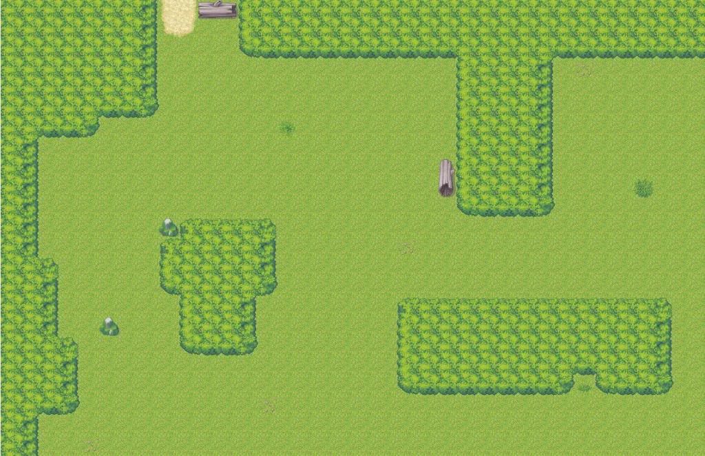
Here is my very sad forest maze map (or at least part of it).. I use a fog graphic to convey the fact that there are more trees overhead. So what can I do to make this suck less?
DEAR GOD MY EYES!!!! 
Just kidding. :haha:
No srsly, you need to add a crapload of stuff on the ground. By stuff I mean things like flowers and weeds. A couple of rocks, yeah, but too much would just kill the map. Don't go overboard, obviously, but for now, just set down a whole lot of white flowers. You know the weeds? the 1,2,3,5, etc. weeds? set some of them down. Also, one of the tiles is a grass tile, but noticeably darker. Set that with the same amount of randomness, and it'll help. Of course, set all these things down with random, not just in little bunches. Mapping like this in XP really looks a bit better.
The forest/tress thing... god, you need to change that a bit. WAY TOO SQUARE. Get that? It's supersquare, which is simply bad. add bits that stick out here and there, remove one or two tiles at the edge, etc. so it can be better.
Try to enclose the area that one can move a bit; make it a bit more obvious which way to move. It'll be weird having all this space to move, and then suddenly running into the edge of the map like WHAM.
I would really suggest taking a look at Tindy's tutorial here. It hasn't got specifically details on forests, but has all the basics you need to know for a decent map.
When you're done, I would take a look around the screenshot thread or even this mapping thread for other examples of forests. I'd recommend getting rid of the autotile, it looks hideous; instead, pile trees in different layers. Then add in minor details on the ground like shrubs, bushes, etc.
When you're done, I would take a look around the screenshot thread or even this mapping thread for other examples of forests. I'd recommend getting rid of the autotile, it looks hideous; instead, pile trees in different layers. Then add in minor details on the ground like shrubs, bushes, etc.
warpshadow
Member
I heard your comments and made some changes. Is this too much, not enough or just about right?
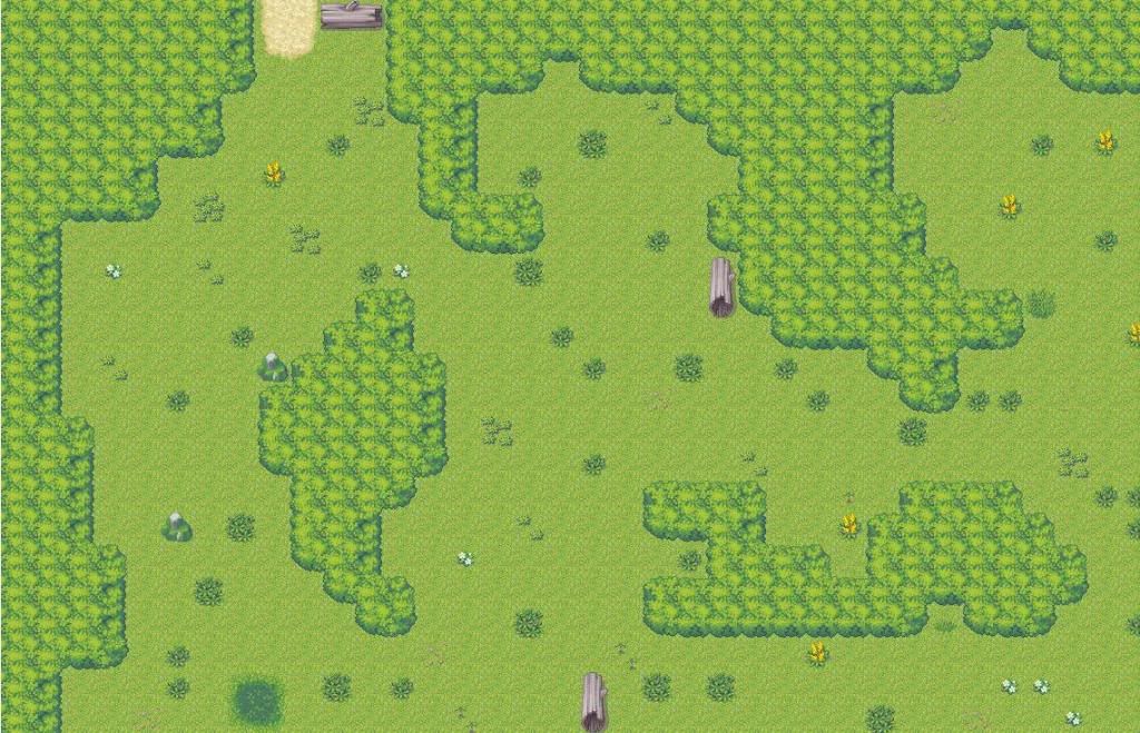
As stated before, you need to get rid of the tre autotile. The map look worse than before to be quite honest with you. You need to add a variety of stuff. Watch out for symettrical mapping as well.Dont use the 5 weed tile, as it looks bad imo. On a more technical note, your forest to me doesnt seem like a maze, it looks like a forest.

There are some technical, symettrical, and pallette errors. Ive also posted this like a million times as well, though I hope I can get a good example across.
There are some technical, symettrical, and pallette errors. Ive also posted this like a million times as well, though I hope I can get a good example across.
Honestly, I have to say that it is much better. However, some irks:
you used way too much of the same type of tile, like, really way too much. The weed? yeah. cut down on the amount you have, and use different types. Lots of different types( i.e., use all of them.). However, make sure the ones that you use are passable; if you use too much of the weeds/rocks/whatevers that are not passable, that would just become annoying.
The tree thingey has really improved. Regi's advice for your style of mapping should be noted: use different layers, namely two and three, to ad an extra level of trees. Not covering over your current level, mind you, but to add that extra... oomph.
Okay, with that out of the ay, check this out:
what type of maze thingey are you doing? Is this dungeon of yours one giant map, or a series of small maps? If it's one giant map, make sure that the paths allowed for the player to view are a bit narrower than what you have now; right now, your map is pretty much one giant screen, rather something with an actual maze/path for the player to follow.
As before, check out everyone else's maps, and just try to copy them until you're capable enough to make your own style. With proper skills, RTP looks epic.
warpshadow
Member
I have worked on this a little more. I have a fog graphic that comes with the map and probably needed to show it in action. It is a big part of the reason I chose to use the tree autotile as the graphic gives a canopy feeling with the autotile working as underbrush.
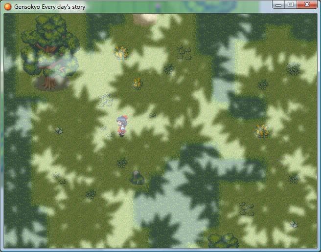
You still have symettrical mapping errors in your maps. You also do not use enough variety in your mapping when it comes to scenery. If you want to make a good forest, do not I repeat, DO NOT use the tree autotiles. Honestly, I hope you noticed this. Plus anyways, if you were to use that tile, you are using it wrong. You do not have the body of the tree. To be honest, that canopy autotile you are using makes the trees look like grass. Again, if you read what I stated earlier, it looks tacky having the 5 weeds clump tile randomly dispursed throughout the map. You should use 1 and 2 weed tiles and combine them into small patches to create a better effect. I recommend using long grass as well, as it adds to the map.Another note I would also add is the fact that the main green grass you are using is too light for a forest. I recommend using a darker grass. The fog makes your map worse. Fog does not make a bad map better. For a forest, I recommend using different types of grass and ground. It add an effect of nature. Animals would be a gread addition to any map as well, to give it more life.
Thank you for viewing
HBGames is a leading amateur video game development forum and Discord server open to all ability levels. Feel free to have a nosey around!
Discord
Join our growing and active Discord server to discuss all aspects of game making in a relaxed environment.
Join Us