BizarreMonkey
Member
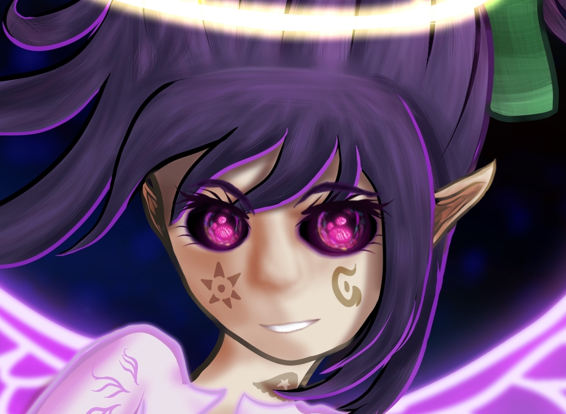
That feels overacted, it'd probably have more impact if she was more subtle and devious about it, but I dunno, that just seems like the sort of thing that you don't see written often-- not in that way. There are plenty of character who are psychopathic beyond all belief, the crazy baby-obsessed woman from Drakengard comes to mind, but it was done in a way that wasn't in your face.
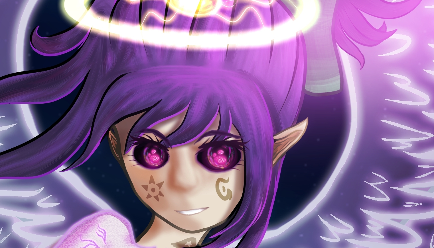
I mean Mira from the Ravenous route of Crowfeast would be the closest to being similar, but she's written in a way that isn't offputting, and I'm not sure if it's just me, but that 4 lines of dialogue is offputting, and not even in the 'it's too sick and twisted for mortal eyes' way, it's more just so juvenile and morbid it feels like a fanfic writer could tear it to shreds. I don't wanna sound too harsh because I know I myself used to write somewhat like that, to which I nowadays cringe, so since your art is really what I should be offering constructive criticism for if anything, I'll lend my two cents on it instead.
I'm gonna get the criticisms over with first, the head is a damned mess, and you only need to look at one decent tutorial on drawing anime to correct every problem, here's one I used that is literally one page.
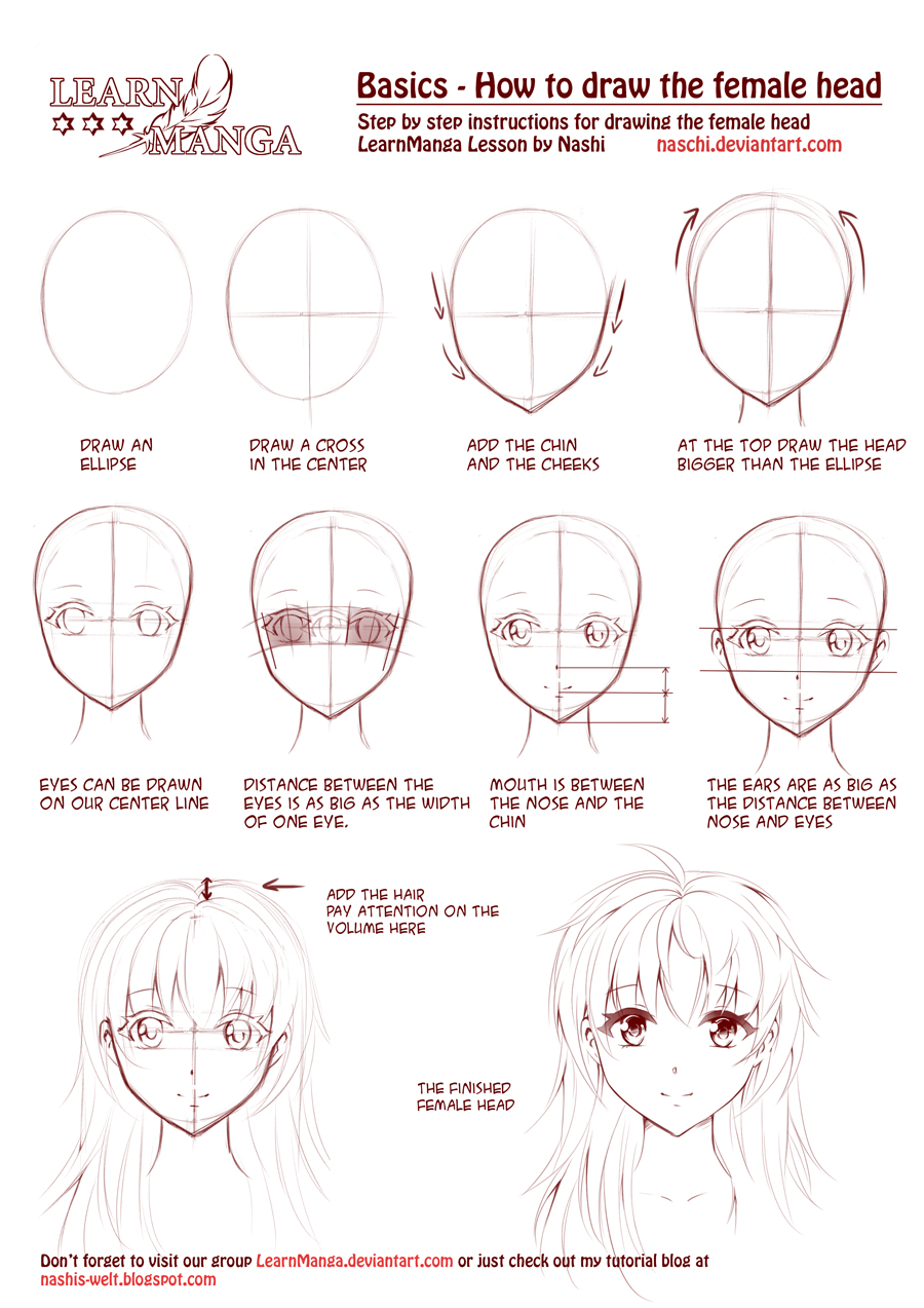
So you went wrong with basically everything you could, first the eyes entirely are too large and defy the one-eye-width rule, they are also inhumanely slanted, the head as a whole is too heighty, and as a result, everything is far longer than it needs to be, also the nose and consequently, mouth, are up too high. It looks like bad DBZ fan art.
I could go into how boobs don't work that way and that the neck is too long but I feel like that's just insult to injury at this point, once you get faces down the rest will fall into place.
Also the eyes could be down further too, the ears are out of alignment, but are actually about where they should be, though you'd also want to also lower the cranium down too.
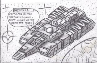
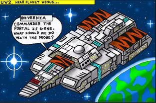
Okay, so what's good? Well, your details are very fleshed out and your shading is solid. Just follow that tutorial trust me it's what I did and it's the difference from this:
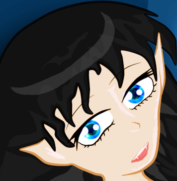 To this:
 What's good about the tutorial is you don't even have to make the drawing in it, it's good for pointing out the rules and proportions that makes the difference between the drawings above. I abhor that first one, it was and still is a fucking abomination, that update while newer, is still over a year and a half old, but it holds up because it knows the rules, also the eyes are still super pretty.
You'll see the second looks a lot more proportional and based, where as the first one looks sloppy, like I had no idea what I was doing. That's because I had NO idea, what the christ I was even doing.
But it only took that tutorial and a couple drawings applying it's laws and I was at stage 2. People say 'practice' a lot, but really it doesn't take much practice to do a thing right once you understand it. What's good about that tutorial is you only have to read it and look at the diagrams to understand it.
In actual sketchy news I finished the cat.

I mean Mira from the Ravenous route of Crowfeast would be the closest to being similar, but she's written in a way that isn't offputting, and I'm not sure if it's just me, but that 4 lines of dialogue is offputting, and not even in the 'it's too sick and twisted for mortal eyes' way, it's more just so juvenile and morbid it feels like a fanfic writer could tear it to shreds. I don't wanna sound too harsh because I know I myself used to write somewhat like that, to which I nowadays cringe, so since your art is really what I should be offering constructive criticism for if anything, I'll lend my two cents on it instead.
I'm gonna get the criticisms over with first, the head is a damned mess, and you only need to look at one decent tutorial on drawing anime to correct every problem, here's one I used that is literally one page.

So you went wrong with basically everything you could, first the eyes entirely are too large and defy the one-eye-width rule, they are also inhumanely slanted, the head as a whole is too heighty, and as a result, everything is far longer than it needs to be, also the nose and consequently, mouth, are up too high. It looks like bad DBZ fan art.
I could go into how boobs don't work that way and that the neck is too long but I feel like that's just insult to injury at this point, once you get faces down the rest will fall into place.
Also the eyes could be down further too, the ears are out of alignment, but are actually about where they should be, though you'd also want to also lower the cranium down too.
Okay, so what's good? Well, your details are very fleshed out and your shading is solid. Just follow that tutorial trust me it's what I did and it's the difference from this:


You'll see the second looks a lot more proportional and based, where as the first one looks sloppy, like I had no idea what I was doing. That's because I had NO idea, what the christ I was even doing.
But it only took that tutorial and a couple drawings applying it's laws and I was at stage 2. People say 'practice' a lot, but really it doesn't take much practice to do a thing right once you understand it. What's good about that tutorial is you only have to read it and look at the diagrams to understand it.
In actual sketchy news I finished the cat.


