
You are using an out of date browser. It may not display this or other websites correctly.
You should upgrade or use an alternative browser.
You should upgrade or use an alternative browser.
The sketch thread!
- Thread starter dadevvtsvre
- Start date
hey that's pretty cool
you should do it properly - on white pages, with clean lines
make big ones, cool compositions and stuff
imagine stuff like this http://www.fubiz.net/2011/04/29/performance-drawings/ but in another style obviously
(and without the performance)
you should do it properly - on white pages, with clean lines
make big ones, cool compositions and stuff
imagine stuff like this http://www.fubiz.net/2011/04/29/performance-drawings/ but in another style obviously
(and without the performance)
MagitekElite
Member
@noise:
Ivysaur! I love that Pokemon so much! Its really good noise, awesome job! :D
@Strawberry:
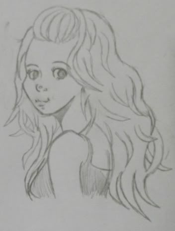
I love your artstyle! It reminds me of the art in FF12, which I happen to think is absolutely amazing!
The last image you post looks like she'd make an awesome character!
@Dr. Funk:
That's pretty cool! I agree with Tomas! It would look sick in red, yellow and orange xD
@Meness:
I think its pretty good, especially if you haven't drawn in a while! Will you do a cleanup of it? :grin:
Amazing art everyone and awesome work! I will definitely keep an eye on this thread. :thumb:
StrawberrySmiles
Sponsor
MagitekElite":2f1dtoyu said:@Strawberry:
I love your artstyle! It reminds me of the art in FF12, which I happen to think is absolutely amazing!
The last image you post looks like she'd make an awesome character!
That artist is my favorite artist of all time. o.o So to hear someone say that to me, means a lot. XD Thank you!
Moar doodles. :D


I dont know where to put this but I found a pretty nice color tutorial:
http://purplekecleon.deviantart.com/gal ... l#/d31xj5t
http://purplekecleon.deviantart.com/gal ... l#/d31xj5t
dadevvtsvre
Sponsor
We should make a thread for art tutorials. I have a tons saved in my favourites.
dadevvtsvre
Sponsor
go for it, brotha
people can add whatever tutorials they find neat.
people can add whatever tutorials they find neat.
there's a supermassive thread full of links here but no one ever uses it so
dadevvtsvre
Sponsor
i consider art/painting/tutorials vastly different from standard rpg maker things. but it doesn't really matter in the end.
glorious caesar
Sponsor
@des: thr shading of the suit really makes it hard to distinguish his tentacles. Sure, we know it's there, but for some reason the blue dark shading of the tentabkes makes it feel a bit obscure, as if we know it's there, but now we have to actively look for it since we see the dark blue. Meh, either that, or a general unbalance of light/dark in the thing. Then again, it might look better when animated.
Also, I'm not sure if the sketch thread is the perfect place for pixellated art; i think we have a thread for that in the pixels section
EDIT: I find it extremely funny how the higher it is in my line of vision, the blacker the clack becomes, while the lower it is, the black becomes tinged with the light green-blue color
Sgt. Cookie
Sponsor
I had nothing better to do. So I did this.

I am only a novice, but I think it turned out OK.

I am only a novice, but I think it turned out OK.
StrawberrySmiles
Sponsor
I think it's pretty good for a hand. Probably better than what I could do.

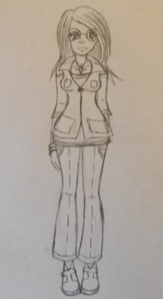
Main character of my game. :D

Main character of my game. :D
Sgt. Cookie
Sponsor
Thanks, I just drew around my left and and shaded what was on my right. Minus gash.
On to the picture. The eyes look a little too far back, throws the nose out of proportion. Unless that is the way it is meant to be, I would recommend that you bring the eyes forward.
On to the picture. The eyes look a little too far back, throws the nose out of proportion. Unless that is the way it is meant to be, I would recommend that you bring the eyes forward.
Holder: The right leg (our left) seems to be thicker than the other.The pose is pretty dynamic though. Make sure to post progress
Strawberry: I think the issue is that the forehead/nose gap goes way too far in, making the face look awkward. It looks like she has a huge cranium. You are getting so much better though so keep going~
Cookie: remember to block things out more.

oh no other angle faces
:c
its a fanart too so now its a double oh no
i have to tweak the feature placement it looks a bit off :c
also gotta fix the neck its off i think oh dear
Strawberry: I think the issue is that the forehead/nose gap goes way too far in, making the face look awkward. It looks like she has a huge cranium. You are getting so much better though so keep going~
Cookie: remember to block things out more.

oh no other angle faces
:c
its a fanart too so now its a double oh no
i have to tweak the feature placement it looks a bit off :c
also gotta fix the neck its off i think oh dear
StrawberrySmiles
Sponsor
How did I miss this. O_O
I think that's a nice start, Bacon. ^^
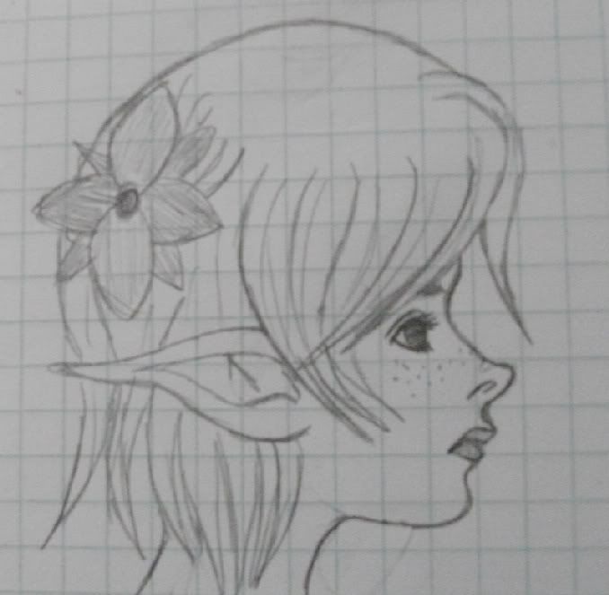
Another sketch on graph paper. D=

I think that's a nice start, Bacon. ^^
Another sketch on graph paper. D=

glorious caesar
Sponsor
so the other night bacon convinced me to draw some robots


Thank you for viewing
HBGames is a leading amateur video game development forum and Discord server open to all ability levels. Feel free to have a nosey around!
Discord
Join our growing and active Discord server to discuss all aspects of game making in a relaxed environment.
Join Us


