Envision, Create, Share

Welcome to HBGames, a leading amateur game development forum and Discord server. All are welcome, and amongst our ranks you will find experts in their field from all aspects of video game design and development.

The Screenshot Thread

Status
Not open for further replies.
Frizzlefratz":286b14nc said:
Some screens from my upcoming game.
Image

Image

No the biggest fan of the RTP but it works. May do some edits to give the tilesets a little more stylization.
I don't think anybody is a fan of the RTP. But yeah, it does work I guess...

rosse119":286b14nc said:
I just couldn't resist here is a pic of what I was working on last night

Image
The car reminds me of Micro Machines for some reason. Therefore I love it.
 
[/quote]
The car reminds me of Micro Machines for some reason. Therefore I love it.[/quote]

That's awesome cheers dude, guess its like Micro Machines just a tad more violent lol
 
I'm attempting to read the depth buffer directly from the GPU.
depth_buffer_grab.png

It looks funky because it's aligning a 32bit floating point number with a 32bit colour format.

I am still researching this, performance is terrible, that's a drop from over 3000FPS to ~130FPS, which is totally unacceptable.

My old method of rendering the scene twice kept me only just on 300FPS, the target frame-rate, I'm trying to find faster methods but it's difficult.
I'll have to keep working on this one, OpenGL gets difficult when you mess around with stuff like this.

My method here is copy the entire depth buffer to CPU memory (Very slow), then copy all that into a texture (Very slow again) and then render the texture to the screen, what I'm going to try next is avoiding the CPU as much as possible, so I'm trying to bind the depth buffer of the screen to an object where I can simply grab the texture at will.
 
Frizzlefratz":ialce7kx said:
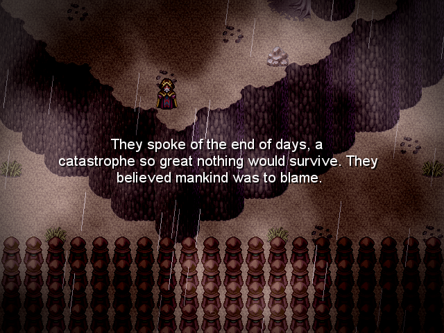
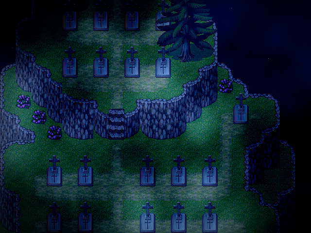
Some screens from my upcoming game.
ScreenShot2013-05-26at121453AM_zpsd9c1eb7c.png


Untitled-3_zps8565692a.png


No the biggest fan of the RTP but it works. May do some edits to give the tilesets a little more stylization.


Lacking personality. I'm personally quite experienced with utilizing RTP, and your stuff is really lacking. RTP's issue is the genericism and conformity of the style, so the way to break it is honestly really simple: go batshit crazy with randomness. (kay not too crazy, but w/e).

In terms of roads for your graveyard, consider this: people don't visit graveyards much. Somple dirt trails right next to grass tends to be a bit disfigured. So, trails like those are uncommon, excpet for fresh graveyards. If this is just a common graveyard, have one or two rooses/flowers on top of a random grave - someone waas new.

You've got more of the idea there in the desert map, but geez, cliffs as straightforward and angled as that are really hard on the eyes, particularly in the excess of space they show to the viewer. Add a random extrusion here or there,particulalry in terms of a different high extruding from on eo fthe sies. Vary it, make it longer at places. Additionally, this might not work depending on yoiur storr/scene, but add some peopel behind that king guy. It's like, that's alot of free space behind him that's being wasted. HAve soldiers marching, particularly iff they have one animation frame different every other soldier so that it looks more different yet still ordered. Not sure if that was worded well. w/e.

And in general add more scrub, flowers, DIFFERENT colored grass (there's like two or tree in the rtp last I checked), which tends to allow for eyes to focus/not focus on certain areas. Vary it up.

Admittedly this is only one style, but whenever I see good maps (quintessence blighted venom comes to mind) they have a LOT of ranodm and variance. He also gives a LOT more recolors, but w/e. This is just my personal preference on how to make rtp outside maps really good.
 
Yea, I really despise people saying it's because they are using RTP tilesets the maps are bad because that is a lie.

You can make beautiful maps with RTP alone.
 
Reaper*":hg0xucaf said:
Yea, I really despise people saying it's because they are using RTP tilesets the maps are bad because that is a lie.

You can make beautiful maps with RTP alone.
This is true, but it does take some skill, I mean the RTP is monotanous and bland, it doesn't have much to change it up and leaves you with large blank spaces.
You have to learn to actually map with the RTP to make it look good. I guess that is true for any map, but still, I'm just saying.
 
DJ that looks sick, one thing though your npc that is leaning on the table looks off. I think you need to re-allign the sprite so she is a little higher up or make the table taller. It seems like shes standing in side view but shes leaning on a diagonal angle.
 

DJ

Some guy that did RMXP before
Member

WeaponOD":3sqt6t6r said:
DJ that looks sick, one thing though your npc that is leaning on the table looks off. I think you need to re-allign the sprite so she is a little higher up or make the table taller. It seems like shes standing in side view but shes leaning on a diagonal angle.

..That is not mine. I was also saying the same "Holy shit!" stuff about that thing.
 
I recently finished making destructible environments for Odyssey. It's hard to show off in the form of screenshots, but this was a painstaking effort and feel the need to show something.

oyq.png


l83.png


The Zelda styled bushes have been replaced with small trees you can cut through, and each tree will fall a certain direction, depending on how the blade passed through the tree trunk. Not to mention, you can burn trees with the lantern, blow them up with bombs, and cut them down with other projectiles. It's satisfying, and each tree comes with its own custom destruction animation. Cut down trees can potentially drop health, gold, bombs, or arrows to replenish your supply. The barrels and pots can be interacted with the same way. The design change itself was supposed to help keep the player from getting confused, so they won't attempt to cut down static patches of grass.
 
Thanks for the inspiring words guys. I'm trying really hard to finish this project this year, making cuts has been difficult. It won't be the longest game, but I'm trying to make something genuinely memorable.
 
I'm basically messing around. I want to add a sunbeam type effect to this map to show that it's seeping through and that's how the trees grow. This doesn't belong to a project, but is basically mapping practice/fun.

8vs.png
 
Strawberrii":2r1mf3je said:
I'm basically messing around. I want to add a sunbeam type effect to this map to show that it's seeping through and that's how the trees grow. This doesn't belong to a project, but is basically mapping practice/fun.

8vs.png

I think the mushrooms need shadows :)
 
Very nice Strawberrii, I love the giant mushrooms! Although I agree with ZenVirZan that they could use some shadows underneath, it'd help them look less flat. My only other criticism might be that the floor itself is relatively sparse. I know VX has a relatively simplistic mapping style, but don't be afraid to experiment mixing and matching your own tiles to get some variation in the dirt and grass, pebbles, rocks, leaves, etc. Nature is supposed to be wild and free; as of right now the floor itself looks clean and tidy, with most the smaller items tucked neatly away in the corners. With all that being said, I've been seeing big improvements in your work in general, keep up the good job! :thumb:


I've recently started remapping some of my older cave maps, which lacked color and personality. What was once brown, bland, and ugly has gotten a major facelift:
xpj.png


I also wanted to showcase the newly finished boomerang, which can be used as a ranged weapon, to hit switches, and can also pick up items from a distance, such as keys and gold. It's also useful for mowing down trees and barrels, and even scoops up the dropped loot on the way back!

The first item equipped, in case anyone was wondering, is the lightning boots. The lightning boots are used to dash forward at lightning speeds (see what I did there? :wink: ), and can also be used to leap over gaps, similar to the one pictured in the screenshot. I'll be sure to show them in action once I've finished the dashing animation.
 
I know this isn't anything special as everyone's seen this before, but here's version 2 of my edge lighting shader.

This version has an improved depth buffer behind it with a better level of accuracy, it also gives a further activation distance (So the effect lasts up to 10x the distance as the previous version) and most importantly, it doesn't send my FPS down to 300FPS! And in this shot it's combined with the FXAA shader and it's still over 300FPS (The target framerate).

That probably doesn't sound impressive as it's on a test map, however this test map is full of corridors designed to stress out the map renderer, this morning I would get ~400 FPS in the worst case area, this afternoon that became ~1000 FPS in the worst area which gave me plenty of room to plug in my FXAA and edge lighting shaders!

The 3D test model is TF2's Scout remodeled by Tommy Tallian download them here

Big Image - battleworldrpg.net

EDIT: Here's a smaller image with a different test of a pencil shader + outline + FXAA, still at over 500 FPS, amazing!
tumblr_motg3svNzc1s81huvo1_1280.jpg
 
Status
Not open for further replies.

Thank you for viewing

HBGames is a leading amateur video game development forum and Discord server open to all ability levels. Feel free to have a nosey around!

Discord

Join our growing and active Discord server to discuss all aspects of game making in a relaxed environment. Join Us

Content

  • Our Games
  • Games in Development
  • Emoji by Twemoji.
    Top