
You are using an out of date browser. It may not display this or other websites correctly.
You should upgrade or use an alternative browser.
You should upgrade or use an alternative browser.
The Screenshot Thread
- Thread starter Ellie
- Start date
- Status
- Not open for further replies.
There are a few things I don't understand about this/I think you could improve on, so I'm just going to jump in at the deep end.
First off, you've got a load of space at the bottom of the screen, yet you stick Lena and alices things at the side. It kinda makes the screen look cluttered, you could even stick it by the chains on the right hand side, but just, on the left makes it look out of place.
Secondly some parts of the map are missing things, you've got half a tree stump and a lot of trees with their bottom missing. although I guess it's a common mistake to have parts of the tileset missing by accident.
Thirdly why is there that one guy with the very long Chinese name? I'm pretty sure most Chinese names aren't that long o,o
While we're on the subject of names. Why are some of the characters missing names?
Oh, might aswell ask this too, Why is there a goblin thing with the name "Chicken" Like... I mean... I don't get it...
 On the whole, it's not too bad. I just think that some of it looks out of place.
Keep up the good work though :thumb:
First off, you've got a load of space at the bottom of the screen, yet you stick Lena and alices things at the side. It kinda makes the screen look cluttered, you could even stick it by the chains on the right hand side, but just, on the left makes it look out of place.
Secondly some parts of the map are missing things, you've got half a tree stump and a lot of trees with their bottom missing. although I guess it's a common mistake to have parts of the tileset missing by accident.
Thirdly why is there that one guy with the very long Chinese name? I'm pretty sure most Chinese names aren't that long o,o
While we're on the subject of names. Why are some of the characters missing names?
Oh, might aswell ask this too, Why is there a goblin thing with the name "Chicken" Like... I mean... I don't get it...

Keep up the good work though :thumb:
Juan J. Sánchez
Sponsor
I love your blood splatter.
Juan J. Sánchez":30st7xn7 said:I love your blood splatter.
Thanks Juan, But those are actually corpses. Blood splatter is displayed in subtract blending.

rosse119":cx0ps8g1 said:May as well get involved, here is Karmageddon Khaos :biggrin:
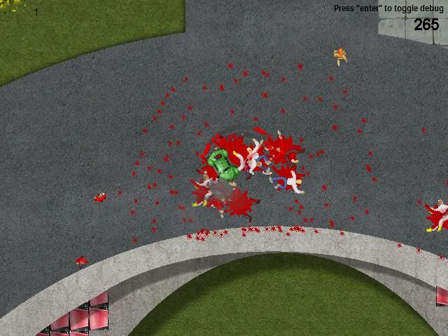
I find it so much fun running people down that it's slowed down development, blood everywhere...lovely lol.
That looks quite amazing. Reminds me of GTA2. Is it the similar kind of game?
DJ":3i50nw4m said:rosse119":3i50nw4m said:May as well get involved, here is Karmageddon Khaos :biggrin:

I find it so much fun running people down that it's slowed down development, blood everywhere...lovely lol.
That looks quite amazing. Reminds me of GTA2. Is it the similar kind of game?
Thanks, it's not like GTA no, the only thing it really shares is the top down view.
It's got a lot in common with a game from the 90's called Carmageddon but mixed with a lot of original ideas, basically kill all pedestrians on the level or destroy all opponents, some levels will have checkpoints were pedestrians equal time.
I've got my own thread, I'm always happy to have feedback if you are interested
BizarreMonkey
Member
Man... and here I thought I was the only one making a 'kill everything in bloody murder' game.
I'm going to agree with Amy, the default tilesets for RPG Maker XP are pretty much the epitome of awful, mind you I hate the VX and VX Ace RTP too, but honestly I think XP's look worse... that weird purple shadow and horrid blurred softness are terrible looking, I like some contrast and this tile-set is the most lacking in that field, it looks like a really terrible painting made by an artist who didn't know what the color black was.
Texture and detail are redundant in scoring a tileset if the tileset has no moxie, the XP tilesets are horribly bland and uninspired, I've never seen a mainstream game or actually any game not made with XP that has anything quite so undernourished.
Though I suppose when you make an RTP with 50 of these bloody things you have to cut costs somewhere.
Anyway, while progress has been staggering, i haven't had a chance to make an updated gameplay video, a lot of things are in the works and its hard to get far in the game without having that save error later, but fear not I have something to show as Consolation. The music is temporary, my composer is leaving the sync tracks until last.
http://www.youtube.com/watch?v=aOfq7YHY0nI
StrawberrySmiles
Sponsor
I feel like I could get a better fog and effect, but I don't know what to do. :|


C-7":3hyrtamt said:Oh, what the heck... here we go! Here are two shots:

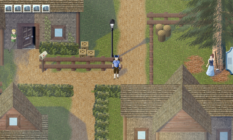
Holy shit. That looks really awesome. Especially the characters are not that big-headed fellas of RTP.
Frizzlefratz
Member
Some screens from my upcoming game.
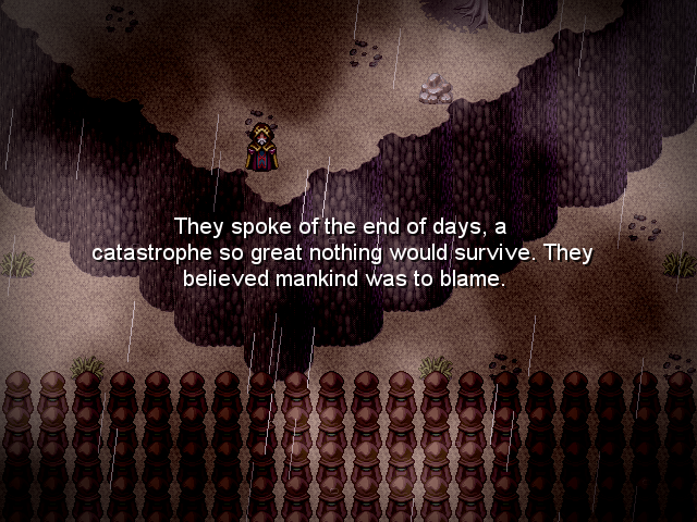
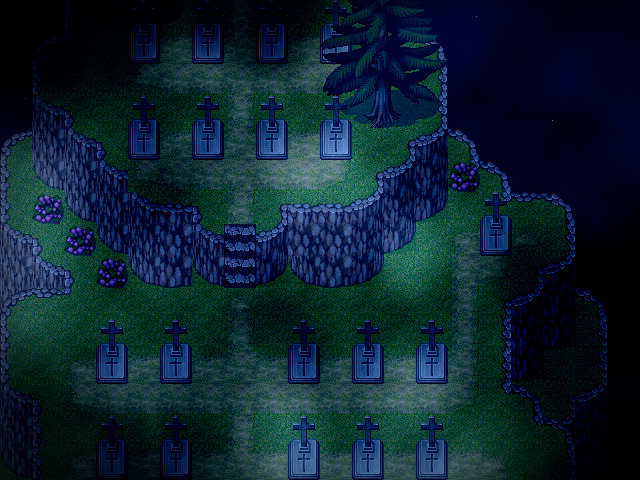
No the biggest fan of the RTP but it works. May do some edits to give the tilesets a little more stylization.


No the biggest fan of the RTP but it works. May do some edits to give the tilesets a little more stylization.
- Status
- Not open for further replies.
Thank you for viewing
HBGames is a leading amateur video game development forum and Discord server open to all ability levels. Feel free to have a nosey around!
Discord
Join our growing and active Discord server to discuss all aspects of game making in a relaxed environment.
Join Us


