Envision, Create, Share

Welcome to HBGames, a leading amateur game development forum and Discord server. All are welcome, and amongst our ranks you will find experts in their field from all aspects of video game design and development.

The Screenshot Thread

Status
Not open for further replies.
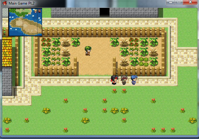
Feels like I've seen that area before... O_oa

So I mapped some areas in my side project. I recently got RMVX Ace, so I've never mapped in it or messed with it before. I had little to no experience doing it in RMXP either. Lols.

Without further ado - some screenshots:

ironheartvillage.png


ironheartshop.png


ironheartmines.png
 
For some reason, I really like that screenie, Amy! XD Nice tileset too! :)

That's some good mapping there, Strawberrii! :) Quite pleasantly surprised, loving the sunbeams and the nice balance of space and objects!
 

Jason

Awesome Bro

Just wondering, what's the >: all about? o.O Both maps also look extremely bland and empty... you need to fill the space, especially on the second screenshot, it's so ugly and empty... look at the right, you need a lot more happening there, more trees, add some bushes, longer grass, flowers or something... atleast make it look like you've put SOME effort into the mapping.

... I'd also say to make the cave look a little less squared on the first screenshot, and add more layers on top of it, how many caves do you know that are completely squared on the outside, and flat on the top? add stuff around the outside of the cave too, and on the beach in general, can't you add shells and drift wood and stuff? just items that you'd generally see on a beach, and again, make it look like you've actually bothered to make it look like a map.

Not trying to insult you or anything, but your maps... are ugly as fuck.

Fix it before Jim does...

I'd really think about heading to the map improvement thread for help...
 
Jason":2j8iue0l said:
Just wondering, what's the >: all about? o.O Both maps also look extremely bland and empty... you need to fill the space, especially on the second screenshot, it's so ugly and empty... look at the right, you need a lot more happening there, more trees, add some bushes, longer grass, flowers or something... atleast make it look like you've put SOME effort into the mapping.

... I'd also say to make the cave look a little less squared on the first screenshot, and add more layers on top of it, how many caves do you know that are completely squared on the outside, and flat on the top? add stuff around the outside of the cave too, and on the beach in general, can't you add shells and drift wood and stuff? just items that you'd generally see on a beach, and again, make it look like you've actually bothered to make it look like a map.

Not trying to insult you or anything, but your maps... are ugly as fuck.

Fix it before Jim does...
But I want Jim to fix it T^T
The ">:" is there because it controls the way the earth moves around the sun and if I didn't put it there all hell would break loose. (Essentially it's there because I like it)

Just quickly, the second image. You are aware that is a transition right? The screen has faded out. It's not the night...

As for the cave. Yeah, I see what you mean about that. I'll work on it. I'm just trying to get the outline of the island done for now though.

I don't think the maps need to be filled with stuff. I'm trying to get the point across that the area is kinda deserted ((SPOILER SPOILER)except that one guy)
Thank you for the drift wood idea though. I should add lots. Fill the beach up a bit!

I don't want the area to look apocalyptic, just as if there hasn't been much human intervention there.
 

Jason

Awesome Bro

Deserted = No people, there's still an environment, lol... and I didn't say second image, I said second map, don't try to get cocky with me laddo! :box:

Adding trees and making real environments wouldn't make it look apocalyptic, like you said yourself, you want to make it look deserted, and desertion doesn't take the environment with it, does it?

Seriously, just try it, and I think you'll agree it'll make the map look so much better...
 
Jason":226sgijx said:
Deserted = No people, there's still an environment, lol... and I didn't say second image, I said second map, don't try to get cocky with me laddo! :box:

Adding trees and making real environments wouldn't make it look apocalyptic, like you said yourself, you want to make it look deserted, and desertion doesn't take the environment with it, does it?

Seriously, just try it, and I think you'll agree it'll make the map look so much better...
True, there is still environment, but I don't want the island to look over run by nature and trees. It would be horrible if the whole island was filled with trees and wild-life. As you can see. That man and that house are there, so there HAS been some human intervention, but not much.

Sorry, I just assumed you said 2nd image. Because of the way I made it, I don't view it as the 2nd map xD
(It's actually the third map I made)

I will try adding some more environment and make it look less bland, but once again, I don't want to fill the maps until they look like a horrible mess.
 

Jason

Awesome Bro

Well if there weren't any humans left, the environment would get larger actually, the house would be covered in vines and grass, trees and such, would be everywhere... something similar is the game by Naughty Dog, The Last of Us (It's not released yet, but there's trailers and screenshots and such released):

lastofus_screenshot.jpg


The city has been deserted, and the wildlife and environment has been left to grow and pretty much take over all the buildings and man made structures... you should think about this.
 
Once again. There HAS been human intervention. That man you see in screenshot 1.

Some areas will have a lot of trees, but the house is supposed to have been kept looking good.
Instead of thinking apocalypes, imagine: an island that was uninhabited, but then people came along and built a house on it.
That's the kinda setting you're in.
 
I think a lot of it is due to the tileset - it doesn't look good with the same tile repeated over and over such as the grass. I'm going to try and make a tutorial on it to explain what I mean, it'll be in the next ezine, but for now some thoughts are to nab different textures from the forest and swamp tilesets and edit them a bit, or maybe there are some autotiles that could work, I'm not sure. Even the best kept garden is going to have patches where people have walked, considering there's a door in shot, or areas where the sun hasn't hit much so isn't in shade necessarily but is a little bit yellower than elsewhere, etc.
 
Hiccup. Your maps are very bad. So far all you have done is explained why something looks bad. If you have to explain why the area is the way it is through text, then you are not mapping correctly. I posted some links in pwoym but i am reiterating that if I saw those maps in a project thread, it would be an instant no download. There are ways to make your maps look busy and clean without over or under populating them. You are not mapping correctly and they all need work.

The ">:" is there because it controls the way the earth moves around the sun and if I didn't put it there all hell would break loose. (Essentially it's there because I like it)
This is stupid. Its annoying when you are trying to read something, especially something where you are required to read.

I think a lot of it is due to the tileset - it doesn't look good with the same tile repeated over and over such as the grass. I'm going to try and make a tutorial on it to explain what I mean, it'll be in the next ezine, but for now some thoughts are to nab different textures from the forest and swamp tilesets and edit them a bit, or maybe there are some autotiles that could work, I'm not sure.
This is more due to the fact that tiles are 32x32, unlike most classic RPGs which either have an 8x8 tileset or a 16x16 tileset.

Jason already gave you a pretty good explanation on why the maps are bad. I am reinforcing what he said. I know I am being a dick but I need to make sure that you know that those maps are unacceptable.

pipesnogger":1khxlhfs said:
Hiccup":1khxlhfs said:
After a quick exploit, I have realized. I suck at mapping.
Anyone want to teach me?
Not now though. Gotta take a bath.
viewtopic.php?f=270&t=74906
viewtopic.php?f=270&t=75519
viewtopic.php?f=48&t=51293
 
airballoonc.png


Fast travel in style. Enjoy a scenic view, whilst getting between points on the island.

Not to mention, who wouldn't enjoy spending time with a monkey in an air balloon?
 
Status
Not open for further replies.

Thank you for viewing

HBGames is a leading amateur video game development forum and Discord server open to all ability levels. Feel free to have a nosey around!

Discord

Join our growing and active Discord server to discuss all aspects of game making in a relaxed environment. Join Us

Content

  • Our Games
  • Games in Development
  • Emoji by Twemoji.
    Top