Envision, Create, Share

Welcome to HBGames, a leading amateur game development forum and Discord server. All are welcome, and amongst our ranks you will find experts in their field from all aspects of video game design and development.

The Screenshot Thread

Status
Not open for further replies.
Daria":1yq6hzao said:
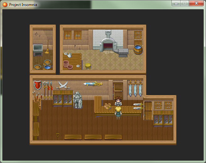
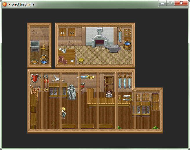
Testing out some overhead ceiling effects. If I did use them, it would be sparingly, not in every map. Maybe even just this one. Anyway I need some opinions, which looks better:

Small beams
weaponshop2_zpsed57a20b.png


No beams
weaponshop_zps087abd32.png
Smaller beams or no beams I think...
 
Id say smaller beams... but NOT so many of them.. maybe 2 or 3.. I've been doing similar
things with my game too, using ceiling beams.. ALSO cave ceilings that I edited with the
4 cave rtp tilesets.

cavepicture.jpg

cave's a little dark in the picture, i've lightened it since that picture was taken.
 
The small beams add a nice touch, especially with opacity-- just not so many at once! Without them, you'd probably need to make the interior smaller, as it looks a bit empty.

@decanos: nice effects, but you might have overdone the purple/light glows; a fainter tinge would be more aesthetic. Also, one of the corner tiles of the wall in water looks odd perspective-wise with the square patch of ground (the one in the middle with the purple orb).
 
@regi.. yeah I actually changed that whole dungeon, basically i was photoshopping a
whole transparent layer and doin angled light shines ect.. but soon realised if i done
that for every dungeon and place I had lighting effects i'd have a picture folder FULL
of photoshop pictures and an even bigger game in size.. probably 2gig lol by the time
I actually finish this game.. So i decided to delete all those pictures and just use a
normal lighting script instead to keep the games finished size down.. belows a new
look at that cave in my last post.. also a few other areas I been working on.

The cave re-done (i think maybe the pink lighting needs to be toned dwn slightly more, not sure)
darklakecave_zps927bbf6e.jpg
The bridge into castleton city
castletonbridge_zps2bea87d2.jpg
Castleton cathedral area
castletoncathedral_zpsa3cf1119.jpg
West castleton (daytime)
westcastletonday_zps104dd5ac.jpg
West castleton (night time)
westcastletonnight_zps0930cdf5.jpg
A torch lit dungeon (the lighting actually flickers like candle lighting)
thecatacombs_zps66ac0259.jpg
Wychhaven (i know the doors are missing on the buildings, i took that picture whilst in edit mode)
Wychhaven_zpsa8f6c679.jpg
Part of the Yolkfolk tree village (not sure if i posted a pic o this b4)
daisyshut.jpg

Just a few maps I been working on lately, but taking my time. Getting the tourch light in the dungeon to
flicker was a TOTAL pain in the @ss.. lol
 
@decanos78: Looks pretty cool, the cloud fog/overlay is the first couple screens beyond the redone mine/cave thing is cut off though.

Welp, now its time to show my picture eventing gloves, check it:
http://www.youtube.com/watch?v=D4gJLYkewo0
 

onzephyr

Awesome Bro

Finally finished my January game for Onegameamonth.com. This is a quick game play video of my final entry BEAR BALLIN'.
Hell of a time uploading my entry as my hosting provider went down today. I do not suggest Bluehost.com for hosting I've had so many issues as of late.

Anyway Link to play the game can be found on my Onegameamont.com profile . It uses a few WebGL effects so Chrome or Firefox work best.

http://www.youtube.com/watch?v=esQwdKDUscw
 
Procrastinating, but put a little bit of work into Odyssey the past few weeks. Here's a quick pic of the fortune teller; both a big part of the story, as well as a clever way to integrate a 'hint' system in the game, in case some players get stuck on some of the tougher puzzles later on.
fortuneteller.png


And a sneak peak at a cutscene early on. Still a WIP, but things are starting to shape up.
mountainpeakcutscene.png
 
Not really a screen-shot, but here's the first render of my main character's sword:
diamond_blade_3_stages.png


It's supposed to be a blade made of solid diamond with a brass handle, held with two hands.

In the game's opening the sword is damaged by magic piercing through it, which created the hole, another character in the game slides the rings down it to hold it together, this is used to explain why the attack power drops after the opening dungeon where the sword does insane damage so the player can learn the combat system without fear of losing.

In the texture is pre-baked ambient occlusion and I added the rim shadow to emulate a shader I've been working on. The nearest-neighbour texturing is something I've had for a while, I might change in in the future.

The top-half of the sword is my website's favicon
favicon.png
 
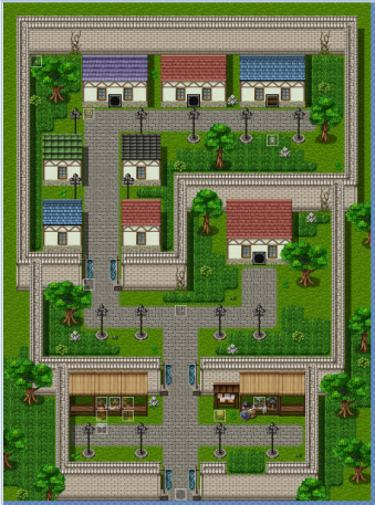
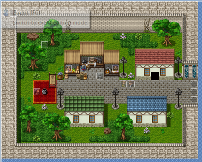
Wow as a new guy her I feel intimidated by the sheer amount of high grade stuff here D: but hey, you learn by doing and observation right? :P Anyway here are soem screen shots from my WIP game in RPG Maker VxAce, looking for some opinions on the maps. (I'll try to not take up a lot of the page D:)
Norlean :D
Town_zpse239ee6b.png


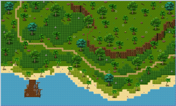
Norlean Coast
Coast_zps8c4a6677.png


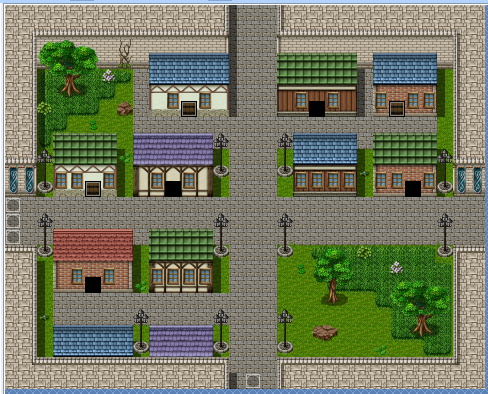
Lorou: Residential District
LorouResidentDistrict_zps2fd9f254.png


Lorou: Market District
LorouMarketDistrict_zps95de277a.png
\

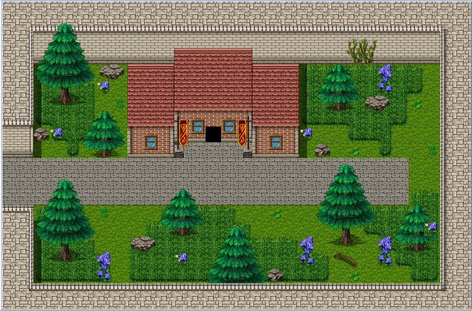
Lorou: Embassy District
Embassy_zps70dd98ed.png


Phew, thats a lot of images huh? ono
 
@ Xenophil
Welcome to HBGames, now.. dont feel intimidated by others projects here, a lot of us have been around using makers for a good few years so we've had plenty of practice at what works and dont.. so Im sure a lot of us around these forums will help with any questions you have or if you need us to look at maps for ideas/thoughts. Anyhows, nice maps there, I really dont know the mechanics of rmvxA or how the mapping works or how many layers you have available to use as I use rmxp, its similar but not THAT similar if you get my drift. Here's a few things i've spotted taking a look over your few pictures.

1. 1st pic - norlean - bottom right lower wall has a part missing, where patch of grass is.

2. 2nd pic - norlean coast - i'd remove the bright green grass off of the sandy beach areas, it looks
really wierd and clashes.

3. 2nd picture - norlean coast - id try and put more trees around eachother, they are too spread apart
at the moment, try clumping the trees up a bit more so they are more gathered together.

4. 5th picture - lorou: embassy district - I'd change the name or atleast remove "district", (unless ur gona add more houses into that map), as a district describes a place/area of many house/gatherings.. ect.. see my idea below for this map.

Idea: You could post guards around the lorou maps, then you could add a guards house in the embassy area, and maybe a small jail house.. 3 houses could be classed as a small district then I suppose.

Hope these few things help you out with these maps you've done, in any case.. I wish you luck with your project.
 
@Decanos78
Thank you for the response! ^ ^ and I managed to fix most of the problems but rmvxA doesnt have 3 mapping layers like xp does so i cant get the trees any closer than they are not without using a lot of events to get them to look right. And I will add somes guards and citizens into the residential district.
 
@ Xenophil..

theres a few ways you could go about doing clumped trees without events.. here's one example..

http://forums.rpgmakerweb.com/index.php ... x-mapping/

or better still.. this guy has a tileset there with a clump of trees in it thats edited..
maybe u could add it to Tile-Set: E. (those mack tilesets are awesome ^.^)

http://wasabi-n-sushi.deviantart.com/fa ... s/48570081

Same type of clumped trees above but re-colored for seasonal effects..

http://telles0808.deviantart.com/art/RP ... -204799093

hope these help.. if you DO use.. make sure you credit the correct artist/scripter, OH! you
might wana add this page to your favourites if ur gona use scripts in RmvxA..

http://rmvxace.wikia.com/wiki/RPG_Maker ... cript_List
 
Xilef":dnnxnx4c said:
Not really a screen-shot, but here's the first render of my main character's sword:
diamond_blade_3_stages.png
Hey man this is neat.
At first it really confused me in an esher-esque way (like the top has a different orientation compared to the bottom), but then I focused and figured the blade was cut-off. I can imagine it's better in-game when it's in 3d space with context.

cool beans
 
Tomas":1v6oq4jv said:
Hey man this is neat.

...

cool beans
Thank you, I'm still trying to model the character that holds this, unfortunately I can't get the hair right and need to keep redoing the head, when I'm done I'll post a shot with this sword in hand
 
Status
Not open for further replies.

Thank you for viewing

HBGames is a leading amateur video game development forum and Discord server open to all ability levels. Feel free to have a nosey around!

Discord

Join our growing and active Discord server to discuss all aspects of game making in a relaxed environment. Join Us

Content

  • Our Games
  • Games in Development
  • Emoji by Twemoji.
    Top