Envision, Create, Share

Welcome to HBGames, a leading amateur game development forum and Discord server. All are welcome, and amongst our ranks you will find experts in their field from all aspects of video game design and development.

The Screenshot Thread

Status
Not open for further replies.
I'm getting a perspective headache looking at that lighthouse and the cliff to the left of it on that first image, is differential shading an option? Or lengthen the height of the cliff steps, after writing that I realised shading probably won't help
 
^Thanks for the tip. I've increased the height of the cliffs on the left a bit, hopefully it'll help improve the perspective. I know it's a bit off, but in the interest of making progress I'm calling it complete for now.
 

onzephyr

Awesome Bro

Continuing work on my January game for Onegameamonth.com
not a whole lot changed from last week. Shooting to have a demo level done by tuesday.
onzephyr_GB_1gam003.png

onzephyr_GB_1gam002.png
 
New lighting flags:
lightingnew.png


Also: Battle Swirl
http://www.youtube.com/watch?v=1VwAu8NAXZ8

This swirl effect is made through rotating, resizing and darkening the video buffer, so I can take the rendered 3D world and chuck it through this swirl effect.

The steps are:
Draw render rotated to buffer
Darken the buffer a bit
Draw a shrinked version of the render to the buffer
Draw the buffer rotated over the render with some fading
Draw the buffer rotated over the render ever further with no fading
If duration of swirl is over a certain time, fade entire screen to black a bit
Repeat

Took a lot of video analysis and testing (Like, lots of testing) to come up with this formula (With no graphics shaders used, not sure if that's a good thing or not).
The only thing it's missing is the contrast increase, but that will require graphics shaders.

Added Cinematic blur as well, which renders the frames at 50% transparency over each other for a cheap motion blur effect, useful for making summons, flashbacks or fast-paced scene look even more awesome.
 
Jesus, so much talent, why are any of you even using rpg maker anymore, ahahahaha.

Anyway, I brought this, been working on Menagerie and I've done another hours worth of progressive content.
http://www.youtube.com/watch?v=zTDxwjsqRPs
I'm now working on space exploration and tidying up some gameplay stuff, then I'll post that here too.
 

onzephyr

Awesome Bro

http://www.youtube.com/watch?v=bhNzfCxdqR4

Quick video of some of the game play for the January entry into Onegameamonth.com.
Going pretty well so far still got a whole lot to try and finish by the end of the month.
 
@ onezephyr - that game demo looks amazing and so much fun.. whilst watching that demo
I was taken back to a game years old called "Arkanoid", it was a fun game pretty much similar
to your game, cant wait to play this.
 

onzephyr

Awesome Bro

decanos78":27bfs2w1 said:
@ onezephyr - that game demo looks amazing and so much fun.. whilst watching that demo
I was taken back to a game years old called "Arkanoid", it was a fun game pretty much similar
to your game, cant wait to play this.
unicorn_test1.png

Yup it's a brick break style game. like Arkanoid or breakout or a bunch of others. It's playable right now. it's just lacks sound and a GUI. Well that and it still has a ton of placeholder or missing animations.

I plan on making a WIP thread about it once I have a demo level to play. Which should be soon. Heck has to be as the games deadline is the end of the month.
 
Thank you for the encouraging words, it's hard to stay motivated on something you've been working on for so long. I recently remapped all the work I had previously done, I'm glad it paid off. At this point I'm trying to make cuts so I can actually finish what I started.
 
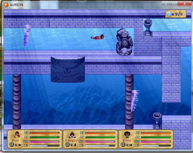
Hi here is some pic of my A-RPG : Aurion : Enzo Kodiodan's legacy

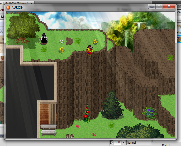
Thats some picture of the "exploration mode" the demo is almost ready (no combat for now) but only in french for the moment
coded4-3b5048f.png

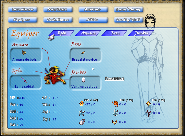
Here is the menu you can check the hero sprite for the batle mode

demo3-3b50611.png

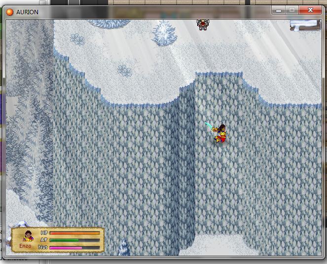
Thanks to Zeus81 script you can jump from hight in the game

im6-3b5065d.jpg

im7-3b506b7.jpg

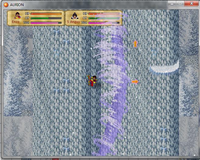
" the -Climb- gameplay, yout must climb fast and manage the timing to avoid tempests"

nage0-3b50702.png

He re is the underwater phase where you must manage the air of you and your alllies

I will post the gameplay and complete presentation soon, hope you like the pictures already, thanks :biggrin:
 
I'm not sure if any of you saw, but I announce my game in PWOYM.
I wanted to show some face with it though, so I thought I'd show you what I have got currently.

There isn't much to look at in the actual game since I have yet to get a spriter and someone to work on some tiles.
Instead I'll show you the events page and talk about what I'm planning.
So without further ado, I present the events page of Drægon: Unlikely Hero
DUH%20Event%20sheet.PNG
So I've got basic movement and NPC movement down. I've also got character attacking there too.
What I'm working on currently is enemies attacking, I'm finding it somewhat difficult though, so if you have any idea please let me know.
I'm also going to start work on the zelda type scrolling after that. The ones that Coyotycraft and onzephyr (I think) suggested to me are good and I think I'll take elements from them, but try to tailor it to more something I feel comfortable if that makes sense.
The list of other features I will have in the game is not yet complete however I have a general idea of what I want.
I want the general zelda items such as Bow, Hookshot, shield. I might get rid of the boomerang since I've never seen any point in it...
I want to add another item. A magnet that can pull metal things towards it. I guess I'll have to give everything that is metal a variable called "Metal" and set it at 1 or something.
When magnet is equip > "Metal Objects" var "Metal" = 1 > Pull towards Player
&
When X pressed
Something like that.
I have a boss already set that you have to use the magnet for, it's a load of metal balls around a "Core." you will have to use the magnet to strip away these balls and slash at the core.
I'm planning 3 main types of enemies:
Random: Those that shoot randomly
Turret: Monsters with a turret behaviour.
Walking Turret: a moving monster with the turret behaviour
I'm also planning to have NPCs walking around in dungeons that can either help or attack you.
That's all I can be bothered to write right now. Lemme know what you think.
If you would like to help, please contact me.
 
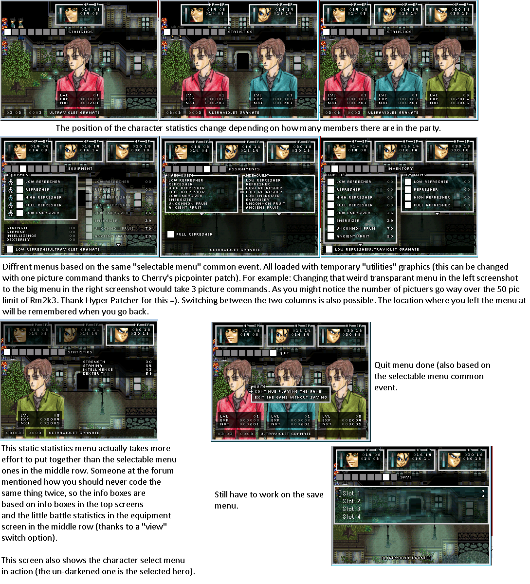
Hey guys =) I'm trying to get some feedback on this on diffrent forums and I thought: why not post it here. I wasn't sure in which topic to post it, so please excuse me if this is the wrong one. I'm working on a menu in rm2k3 and thusfar I didn't have to duplicate any event "scripting". All the dynamic selectable menu's you see are based around one common event which I load the data in. After loading it it just forms the menu according to those variables.

Big thanks to Cherry and all his patches, without them I could not have made this, so big credit to him. Next to that, the screenshots are all in-game material (no mock-ups) and as you might notice I'm still pondering about the setup of certain menu's (wheather to put key items in the inventory or the quest log section for example). The character graphics (faces and portraits etc) are still temporary though, I got them from my old game folder (lol to marle and vegeta edits).

Anyways, feel free to comment on layout choises etc. I'm still thinking about changing the abstract backgrounds to normal tiled backgrounds again (it's a modern/futuristic game btw).

Menuwip.png
 
Trujin I don't see the difference between the pictures... only that in some there is one man and others there is 3 (the same guy)

[update 5 min after] ha ok I see the differences now... isnt'it a little bit "charged" think that you are someone who don't create your game it can be too much detail. the guys in background take all the "oxygen" of the menu I think. You already take the "black path" for the ambiant color so make some "aeration" of all that # I know my englis sucks I am french speaker in fact lol :cry:
 
fenryo":1ug9al6d said:
Trujin I don't see the difference between the pictures... only that in some there is one man and others there is 3 (the same guy)

[update 5 min after] ha ok I see the differences now... isnt'it a little bit "charged" think that you are someone who don't create your game it can be too much detail. the guys in background take all the "oxygen" of the menu I think. You already take the "black path" for the ambiant color so make some "aeration" of all that # I know my englis sucks I am french speaker in fact lol :cry:

Sorry for replying so late. I don't understand exactly what you ment, so I'll just reprase what I got out of your post and if I was wrong, please correct me:

1. The different placing of characters based on the party size seems a bit to much detail for people who didn't create the game:
Awnser: Allthough without any patches this would take loads of time to achieve, the picpointerpatch makes it possible to do this with 3 conditional branches.

2. The character pictures are colourfull and stand out a lot compared to the rest of the menu, which is darker by nature.
Awnser: They are temporary, the later design will be much darker in colour and style.

Thanks for the feedback! =)
 
Testing out some overhead ceiling effects. If I did use them, it would be sparingly, not in every map. Maybe even just this one. Anyway I need some opinions, which looks better:

Small beams
weaponshop2_zpsed57a20b.png


Large beams
weaponshop_zps520845ec.png


No beams
weaponshop_zps087abd32.png
 
Status
Not open for further replies.

Thank you for viewing

HBGames is a leading amateur video game development forum and Discord server open to all ability levels. Feel free to have a nosey around!

Discord

Join our growing and active Discord server to discuss all aspects of game making in a relaxed environment. Join Us

Content

  • Our Games
  • Games in Development
  • Emoji by Twemoji.
    Top