
You are using an out of date browser. It may not display this or other websites correctly.
You should upgrade or use an alternative browser.
You should upgrade or use an alternative browser.
The Screenshot Thread
- Thread starter Ellie
- Start date
- Status
- Not open for further replies.
StrawberrySmiles
Sponsor
Just wanting more opinions on the icons in these screens (since hardly anyone says in the actual topic):


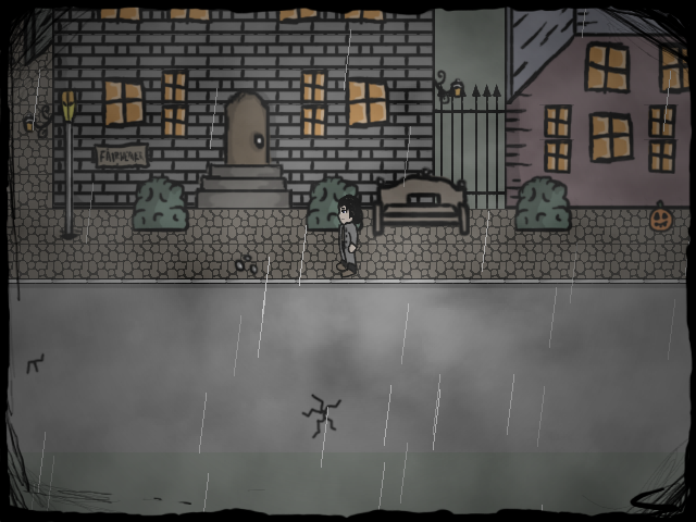
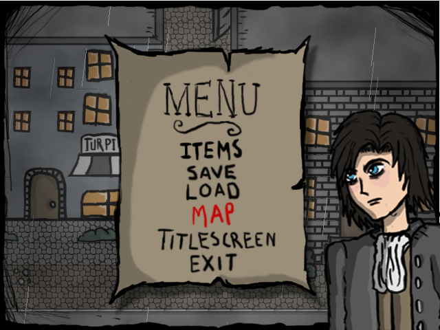
Actually the tileset is made in Adobe Photoshop along with charactersets and other stuff. I'm making the game in RPG Maker XP! And Strawberrii that looks AWESOME!Xhukari":15hps4nj said:What are you making this game in, Bats?
It looks like the graphics were done in Flash, to me...
I like it though!
The tile needs work on its...tiling, though!
StrawberrySmiles
Sponsor
And about which icons look better...?
LaDestitute
Member
What you're working on looks nice, Gerrtunk. Quite nice, actually...gerrtunk":1vgwki3d said:-snip-
BizarreMonkey
Member
Oh my, all of this is really good! I feel sort of like I'm a newbie posting in a professional board, I cant hope to compete, but maybe I can still entertain you all with this trailer. Some of you aren't even using RPG maker, or if you are, it could have fooled me!
http://www.youtube.com/watch?v=P3fPgRHjUas
I feel like a noob for using VX Ace. :B
Batman, I like that you are making custom graphics, it looks really gritty and down to the grim soil of earth and I really like that. I really enjoy making custom graphics as well, tilesets haunt my dreams though. :[
http://www.youtube.com/watch?v=P3fPgRHjUas
I feel like a noob for using VX Ace. :B
Batman, I like that you are making custom graphics, it looks really gritty and down to the grim soil of earth and I really like that. I really enjoy making custom graphics as well, tilesets haunt my dreams though. :[
Haha thanks dude...I do this on my spare time down in the Batcave when Gotham doesn't need me, Alfred showed me all I needed to know.
However your trailer was excellent and I can't say anything about VX Ace because I haven't use it...I think most of us still use XP because it's what we're used to haha :P I tried using VX once, didn't like it much so I went to back to XP. But still, you're doing awesome work so keep it up!
The bat is out.
BizarreMonkey
Member
To be fair, this site was called rmxp.org way back in the day, so the assertion that ya'll are fairly used to XP isn't all that uncommon.
Thanks for the feedback too, I've gotta sleep now but I'll just leave this here, Item tooltips, woo!
http://www.youtube.com/watch?v=RU1PrJTRBKQ
Thanks for the feedback too, I've gotta sleep now but I'll just leave this here, Item tooltips, woo!
http://www.youtube.com/watch?v=RU1PrJTRBKQ
rey meustrus
Sponsor
@Batman: Nice art style. Work on the vertical tiling on the cobblestones. The outline on the character sprite is thinner than the rest of the style, but it should be consistent. Maybe add some shading. You've got great atmosphere.
@Strawberrill: I think the single icon colour looks better but the yellow/white is pixellated and the outlines don't look good. Do you have photoshop? I know how to give instructions for Photoshop and what I'd do is put all the icons in one file and do Hue/Saturation, Colorize, change hue to yellow, then maybe mess around with brightness/contrast and layer blending options > outer glow/inner glow for outlines.
@Strawberrill: I think the single icon colour looks better but the yellow/white is pixellated and the outlines don't look good. Do you have photoshop? I know how to give instructions for Photoshop and what I'd do is put all the icons in one file and do Hue/Saturation, Colorize, change hue to yellow, then maybe mess around with brightness/contrast and layer blending options > outer glow/inner glow for outlines.
BizarreMonkey
Member
I have just too many of these silly vids, here's one displaying the alchemy system.
http://www.youtube.com/watch?v=yUejJy1q0PY
Enjoy fellas, its a little outdated, but who cares. ^.^
http://www.youtube.com/watch?v=yUejJy1q0PY
Enjoy fellas, its a little outdated, but who cares. ^.^
StrawberrySmiles
Sponsor
rey meustrus":3s6ibqh6 said:@Strawberrill: I think the single icon colour looks better but the yellow/white is pixellated and the outlines don't look good. Do you have photoshop? I know how to give instructions for Photoshop and what I'd do is put all the icons in one file and do Hue/Saturation, Colorize, change hue to yellow, then maybe mess around with brightness/contrast and layer blending options > outer glow/inner glow for outlines.
People think that one looks good, and that the colored ones look good. D=
No, I don't have photoshop, and I don't plan on getting it either.
It's pixellated because it's a pixeled icon?
BizarreMonkey
Member
I've found that generally things like pixelated icon outlines most fellas don't even notice, What jumps out at me is the font, actually. I'm not sure its probably just personal preference but I see the font used in the item windows and it gives me vivid imagery of killing things.
There's probably nothing wrong with it, it just seems jarring to me. :I
Also, another vid, much shorter this time, this is the skippable splash screen pre-title.
http://www.youtube.com/watch?v=yAQI-ma0fas
Enjoy. :3
There's probably nothing wrong with it, it just seems jarring to me. :I
Also, another vid, much shorter this time, this is the skippable splash screen pre-title.
http://www.youtube.com/watch?v=yAQI-ma0fas
Enjoy. :3
StrawberrySmiles
Sponsor
I don't care about the font, as we haven't even decided on what to use anyway.
I care more about the icons right now so I have something to do.
I care more about the icons right now so I have something to do.
Did you try it with the style I suggested? High colour with white comic outline?Strawberrii":n3y4s3zn said:I don't care about the font, as we haven't even decided on what to use anyway.
I care more about the icons right now so I have something to do.
StrawberrySmiles
Sponsor
Right now, it's half and half on whether people like one or the other, so I haven't tried yet, lols.
BizarreMonkey
Member
Well shucks, I can't help much with the icons thing, since I don't have a very good pixel eye and in general it isn't a thing typical fellows notice, if it makes you feel better my icon looks like rainbow barf scattered all over.
Anyway, I brought this.
http://www.youtube.com/watch?v=HHagWq51wz8
It's from my VX Game, Intelligence, and is currently all I really have to show for Act 3 (Patch 1.2), but shown within is the power events can have even in a limited engine like VX.
Anyway, I brought this.
http://www.youtube.com/watch?v=HHagWq51wz8
It's from my VX Game, Intelligence, and is currently all I really have to show for Act 3 (Patch 1.2), but shown within is the power events can have even in a limited engine like VX.
BizarreMonkey
Member
Hehe, thanks. It isn't RMXP though!
Its RMVX and RMVX Ace, I've opened my copy of XP probably once, but I'll take the compliment instead of being an asshat about which engine I'm using.
For once it seems I'm fresh out of thing... oh wait.
Literally just made a new title screen for Menagerie.

All by me and a few small tricks in photoshop, the only thing I can't take credit for is the Font, but that's fine.
Its RMVX and RMVX Ace, I've opened my copy of XP probably once, but I'll take the compliment instead of being an asshat about which engine I'm using.
For once it seems I'm fresh out of thing... oh wait.
Literally just made a new title screen for Menagerie.

All by me and a few small tricks in photoshop, the only thing I can't take credit for is the Font, but that's fine.
- Status
- Not open for further replies.
Thank you for viewing
HBGames is a leading amateur video game development forum and Discord server open to all ability levels. Feel free to have a nosey around!
Discord
Join our growing and active Discord server to discuss all aspects of game making in a relaxed environment.
Join Us

