
You are using an out of date browser. It may not display this or other websites correctly.
You should upgrade or use an alternative browser.
You should upgrade or use an alternative browser.
The Screenshot Thread
- Thread starter Ellie
- Start date
- Status
- Not open for further replies.
Delmaschio
Member
What you said is very true and I already meant to fix it, but the softness doesn't bother you guys at all?
I'm glad you're liking it Gravija.
EDIT:
These were made using a different approach, better?


I'm glad you're liking it Gravija.
EDIT:
These were made using a different approach, better?


RadethDart
Sponsor
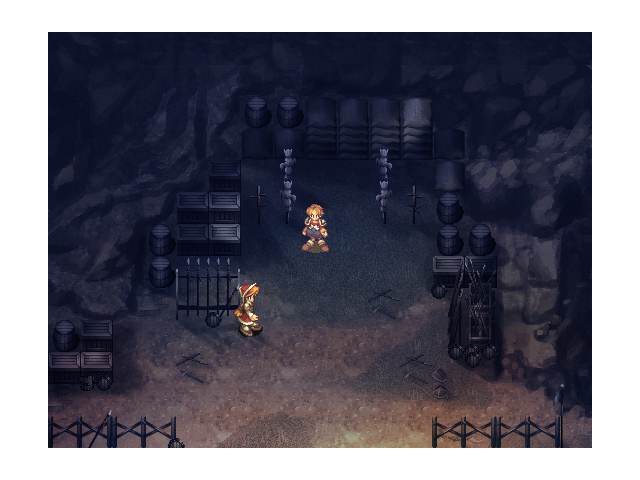
This looks pretty cool and all, but the sprites do not fit the scene. I really like the graphic work.
Delmaschio
Member
Why exactly do you think the sprite don't fit it?
@Delmaschio: I think it's because the custom light effects that are affecting the color of the environment doesnt change the character, it kinda looks like it's just placed on top of the map without fitting in/blending in. Also the style used for the environment is laot different from the style of the sprite
Delmaschio
Member
RadethDart
Sponsor
action":1fh53vy9 said:@Delmaschio: I think it's because the custom light effects that are affecting the color of the environment doesnt change the character, it kinda looks like it's just placed on top of the map without fitting in/blending in. Also the style used for the environment is laot different from the style of the sprite
Exactly, this is troublesome to the eye when trying to admire the feel of the map. The character's colors are too vibrant to the map shadows.
Edit:
That recent one actually doesn't look too bad, but the colors are still too bright for the maps. I really really love the maps, and it might different in-game.
Juan J. Sánchez
Sponsor
I love the last screenshot. The style kind of reminds me of Skyward Sword, you know, as in large brush strokes. And the lightning is superb.
Delmaschio":1lrzzw3k said:
The map and the sprite don't clash at all, but I still think you should desaturate the sprite a little bit to go with the map? That's just what I would do hahaha
RadethDart
Sponsor
swick":1ymrhzpu said:Delmaschio":1ymrhzpu said:
The map and the sprite don't clash at all, but I still think you should desaturate the sprite a little bit to go with the map? That's just what I would do hahaha
Haha, that might be it! The sprite just looks too colorful for the environment.
It's good to have character sprites and points of interest stand out from the background, a little. The sprite with the softer shading is, I think, the sort of thing you should aim for.
I do think it could stand to fit the style a little better, though. One of the things about a more painterly aesthetic is that you're going to have to pay a lot more attention to colour, contrast, and shading with your sprites. In the case of the clothing, I'd personally try making the colours a little bit warmer and more neutral to suit the soft colouring style you have for the backgrounds.
I do think it could stand to fit the style a little better, though. One of the things about a more painterly aesthetic is that you're going to have to pay a lot more attention to colour, contrast, and shading with your sprites. In the case of the clothing, I'd personally try making the colours a little bit warmer and more neutral to suit the soft colouring style you have for the backgrounds.
RadethDart
Sponsor
This looks like the characters belong more into the scene! I think something like that would work (even the sprites look nice). Good illustration, Daria.
Delmaschio
Member
Thanks for all the feedback guys, I appreciate.
We're working on new sprites, I'll come back later with them.
We're working on new sprites, I'll come back later with them.
Delmaschio
Member
I just decided to increase the height a little bit and I'll see if I can make the lighting effects as a different layer and see if with some programming we can make the effect actually affect the characterset sprites.
RadethDart":32j5tpn8 said:(even the sprites look nice). Good illustration, Daria.
Thanks.
The sprites are from Saga Frontier 2, which used entirely water painted environments. This project reminds me of the game. Although hopefully it turns out to be less boring. :P
Just another ace game I'm making called Hadonis. Cuz I like testing out the animated poses and shit. :fap:
No, that default character isn't the main character, he's just a average npc who meets his end with the mysterious stranger, who I presume is a main bad guy. :box:
Does it look better without the road lines or not? (I don't mean the dialogue) :haha:

No, that default character isn't the main character, he's just a average npc who meets his end with the mysterious stranger, who I presume is a main bad guy. :box:
Does it look better without the road lines or not? (I don't mean the dialogue) :haha:

- Status
- Not open for further replies.
Thank you for viewing
HBGames is a leading amateur video game development forum and Discord server open to all ability levels. Feel free to have a nosey around!
Discord
Join our growing and active Discord server to discuss all aspects of game making in a relaxed environment.
Join Us

