
You are using an out of date browser. It may not display this or other websites correctly.
You should upgrade or use an alternative browser.
You should upgrade or use an alternative browser.
The Screenshot Thread
- Thread starter Ellie
- Start date
- Status
- Not open for further replies.
You find public restrooms scary? Whah! Haven't seen a shower yet? xD
I love showers in horror games. Once you stand in front of it an hand touches the other side of the shower window. When you open the shower it is only blood. xD
I will look at the stall. :3
EDIT:
Crap, does an mod can combine my dubble post? xD
Sure, not that we really care if you double post as long as each has a separate thought.
I love showers in horror games. Once you stand in front of it an hand touches the other side of the shower window. When you open the shower it is only blood. xD
I will look at the stall. :3
It displaying some stats in test play mode. :3Amy Pond":1zldb4v0 said:Looking good, what are all the bars at the bottom?
EDIT:
Crap, does an mod can combine my dubble post? xD
Sure, not that we really care if you double post as long as each has a separate thought.
they make me super uncomfortable
there's no telling how many asses previously occupied the toilet seat you're thinking of sitting on and what condition they said asses were in (toilettalk itt)
as for the stalls, it's just that everything else has a very grungy, dirty texture, and they almost seem shiny in comparison which makes them stand out a bit
sorry i don't know anything about 3d stuff so i don't really know what terms to use to make the critique clearer ;p
Ace of Spades
Member
Looks interesting, I like the character sprite for the boss. To keep in the same spirit of boss fights:

Right before the boss fight after the first dungeon. I'm really satisfied with the way it came out: she shoots webs at you, spits venom around you in puddles that disappear shortly after, and she also lays an egg sack which will hatch baby spiders if you don't destroy it in time. Oh, and the Odyssey thread is updated, go check it out!

Right before the boss fight after the first dungeon. I'm really satisfied with the way it came out: she shoots webs at you, spits venom around you in puddles that disappear shortly after, and she also lays an egg sack which will hatch baby spiders if you don't destroy it in time. Oh, and the Odyssey thread is updated, go check it out!
@shiwt
Looks good but maybe you got too many types of things going on. The trees aren't as noticeable... but the ground is all over the place. Maybe just pick a few and go from there?
@ŊŒRIJ∑
I like the winged cloaked dude. He's like beefy and dark magical at the same time X3
@Ace of Spades
How do you fight that spider? Because that guy with the sword really looks like he's gonna lose unless it either walks over to you or you gotta throw his sword just right.
Ace of Spades
Member
@Ace of Spades
How do you fight that spider? Because that guy with the sword really looks like he's gonna lose unless it either walks over to you or you gotta throw his sword just right.
What ŊŒRIJ∑ said, but thanks for the most epic idea ever. I'll have to alter the hero's finishing move and add that into the boss death sequence. Throwing your sword at the spider once it's down would be pretty amazing.
Juan J. Sánchez
Sponsor
Is it me or are you using RPG Maker 2000 graphics with RPG Maker XP. The problem with this is the fact that there's a noticeable difference between the resolution of the map and characters, and the resolution of other elements, such as windows or text. In summary, it looks strange.
candle":3e5bttqm said:rekiem, that's way to dark. you can't even see the ui (the number 1 thing the player should be able to see.) if anything, either lighten it up a bit, or add some mnore ambient lighting.
I don't know why.. the screen looks way darker than ingame D: ... It's not that dark ingame...
Juan J. Sánchez":3e5bttqm said:Is it me or are you using RPG Maker 2000 graphics with RPG Maker XP. The problem with this is the fact that there's a noticeable difference between the resolution of the map and characters, and the resolution of other elements, such as windows or text. In summary, it looks strange.
I know, i still have to change windows and things like that... and put them more.. low res.. and how the text resolution is different? i mean.. the text is pixelated as hell! xD
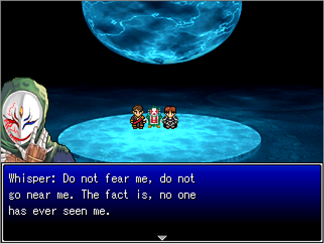
Still working on this dreamer aka Dreamwalker. Just a testshot of a character in a testing event area. Special thanks to InfectionFiles from rpgmaker.net for editing the part of his shoulder, looks well more improved .

Don't worry, I'm a little confused too. WIP Dialogue, so not final version. I actually have to fix the masked guy's eye to match the pictureset. And properly fix the charset more.

Don't worry, I'm a little confused too. WIP Dialogue, so not final version. I actually have to fix the masked guy's eye to match the pictureset. And properly fix the charset more.
- Status
- Not open for further replies.
Thank you for viewing
HBGames is a leading amateur video game development forum and Discord server open to all ability levels. Feel free to have a nosey around!
Discord
Join our growing and active Discord server to discuss all aspects of game making in a relaxed environment.
Join Us


