Envision, Create, Share

Welcome to HBGames, a leading amateur game development forum and Discord server. All are welcome, and amongst our ranks you will find experts in their field from all aspects of video game design and development.

The Screenshot Thread

Status
Not open for further replies.
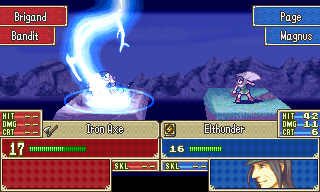
@Necrile: Wow, thats a serious feat of eventing. I know how much work that must have taken. Lol, yeah Last Man's Stand's still around, I've just lost intrest in it for a while. It's not abandoned (I've done too much work for it), it's just taken a back seat for the time being.
@Regi: Cheers. The battleback is temporary for the time being. All the battlers will use custom graphics like those on display there. But where do you recognise the bs from? The HUD I copied from another script but the rest I've done myself (with help like I said).
 

fbu

Member

I didn't like the draw of the battler, but I liked the battleback and that window. Very good. :)

---

Now, the intro of my game:

Introduo-7.png


Special thanks to:

- Kaos (Screenshot of example)
- Vincent (Rip from Demon's Crest of Capcom)
- Fluxtah (Road texture)
- yumedust (Brushes)
- CaelestisTrucido (Sky)

Hope you like it!
 
@fox5: oh, I meant the HUD looked familiar (from some japanese script I used in my first abandoned game).

@fbu: Very cool! I would love to see an animated version (wheels spinning, lines/background moving). I'm not too sure I like the lighting (light would disperse more (with a lowered opacity) rather than just stop at the base of the triangle), though. And is that car pixeled? It looks almost too realistic to fit with the other graphics.
 

fbu

Member

Nice, I just didn't like the way you made that transition of the map with the black panorama. I guess you could put some fade in/out between the forest and the exit. Do this and the map will be more good loking.

Look, you're the admin, you probably have seen this, but I guess you should try this script: viewtopic.php?t=19861

It changes the resolution from XP (640x480) to 2k3 (320x240) just like this:

25rkwsw.jpg


Map designed by Megalukes
 

fbu

Member

Better, much better. Now try just had a fade effect beetween the forest and that black panorama and post here to see what It looks like.
 
I'm not a big fan of the kind of random wobbly line. :/ I think If you had the map fade out to black, something like this (excuse the quick edit):

borderedgething2.png


It would look better and more, I dunno, controlled? Just a thought
 

Jason

Awesome Bro

Hmm yeah, I actually have to agree with fox, I'd say either the first one you did where it's completely squared, or completelly blurred.
 
I too prefer fox's. It looks like its more fading into the unknown, rather than being a page from a storybook. It looks more natural for a game, for sure.
 
ǝןıɹɔǝu":s7o9h53e said:
I too prefer fox's. It looks like its more fading into the unknown, rather than being a page from a storybook. It looks more natural for a game, for sure.

That was the look I was going for; but I think we've reached a concensus here so... changed. :)
 
Status
Not open for further replies.

Thank you for viewing

HBGames is a leading amateur video game development forum and Discord server open to all ability levels. Feel free to have a nosey around!

Discord

Join our growing and active Discord server to discuss all aspects of game making in a relaxed environment. Join Us

Content

  • Our Games
  • Games in Development
  • Emoji by Twemoji.
    Top