Envision, Create, Share

Welcome to HBGames, a leading amateur game development forum and Discord server. All are welcome, and amongst our ranks you will find experts in their field from all aspects of video game design and development.

The Screenshot Thread

Status
Not open for further replies.
@MCSepiroth13 - It looks much better. Definitely more like a prison. And I like what you did with the pots. ;) The only thing I'd try to change is make the sheets all white or any other color besides pink. Now that everything else fits in, the beds stand out. And I don't think a prison would have pink sheets, but I wouldn't know, so...
 
I've been fine-tuning things. I've finally started tinkering with my project again and one of the newer additions I've tweaked is that every battler now has a shadow, which opposed to before when they were shadow-less. I know it seems miniscule, but this little addition made me quite happy. Another little tweak is the Ying-yang symbol in the character HUD is GREATLY changed and looks a lot better then previous versions. Also, I finished Bubbo's animations lol. I'm not completely sure if Cella's design will remain the same; I've revamped a few characters now, and since I've decided to go with a more asian-esque tone for my game, I'm not sure if her design clashes or not. But anyways, enjoy:

Cellascreen1.PNG
 
Looking good I like the hud menu and sprites as well but on monsters they're kinda jagged or squarish compared to your character sprite makes me think theyre just for testing right?

Heres my recent sprite I have just tested on the map still need to work on the rest any suggestions?

a11ijr.png
 
Oh gawd, is that a MKR fangame I see? Nice to see a fellow fan! *points at avatar*

Hmm, I don't really use VX and I have no exp with it at all, but this looks really empty. o.o
 
Haha the avatar? anyway glad you recognize the game even though its been for a long time ago. I was only working on the sprites and text box as of now(map shot) but gradually moving to tilesets too in the coming weeks.
 
Oh I meant my avatar. lol

Anyway, I like the text box a lot. It gives a nice fantasy feeling. The sprite is...tiny, really tiny though and looks rather bulky. O.O
 
coyotecraft":38p9a5y7 said:
Screenshot.png

Something I've been working on the last couple days. A small animated sequence. Everything is digitally painted, I need to clean up some things still. But I don't want to get hung up on perfection that I don't finish on time.
Vegnagun! - cool! I wonder what's it be?
 
MCsephiroth13":cj2ae85s said:
JPEG should be banned from all computers.
Hope you're kidding...

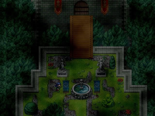
Woocash - It looks good and all, but I suggest you learn to make a house properly. It is very small, and highly un-realistic.

megatronx - That is freakin' sweet, but the background looks disconnected.

MCsephiroth13 - Looks pretty cool, but I don't like how the roof auto tile is chopped off at the bottom, unless it's a cutscene? At why have you placed an axe right next to the cells?
 
006":13ok2dmq said:
MCsephiroth13":13ok2dmq said:
JPEG should be banned from all computers.
Hope you're kidding...
When used improperly, I mean.

006":13ok2dmq said:
MCsephiroth13 - Looks pretty cool, but I don't like how the roof auto tile is chopped off at the bottom, unless it's a cutscene? At why have you placed an axe right next to the cells?
Yeah, the bottom part is a widescreen picture. And about the axes, good point.
 

mawk

Sponsor

woocash, your mapping's good and all, but things look seriously washed out. it's difficult to see much detail in that map; it looks like it's being covered in mustard gas.

if you're going to go with a different colour scheme, you have to go a little further than just ramping up a screen tone. contrast is an important visual tool, and it looks like you're really ignoring it.

also please don't use that cloud fog. that cloud fog has no reason to be there. I don't know when it became standard to use that fog in every outdoor map, and it gives the illusion of greater detail, but it's incredibly played out and I wish people'd stop using it arbitrarily.
 
That fog can get pretty incentive, but as mawk said, it looks like shit.

Imo, I think the fog01 should be the only fog that should be used because it's actually a fog and it really makes a map look a lot better and more interesting.
 
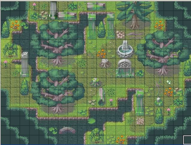
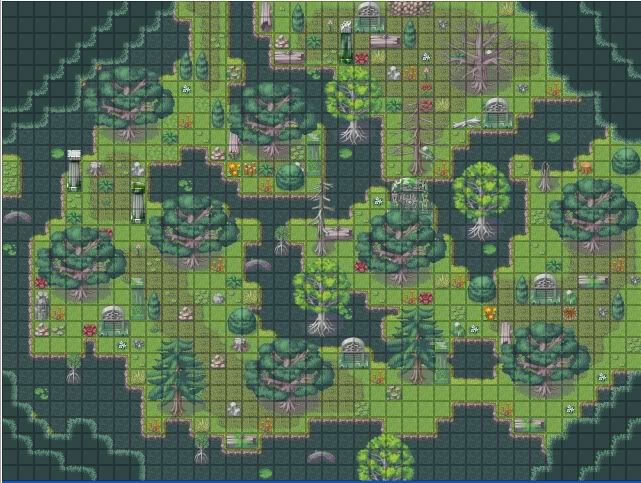
Here's a couple of little test maps I made in essence of a concept I recently whipped up:

V1.jpg
V1-2.jpg
V1-3.jpg

Nothing too fancy, but oh well XD
 
@ adonight:
1st map - there are some graphical glitches here and there (example: top right of the platform, a tree just stops in mid-air). Other than that, is that fountain really necessary? otherwise, nice concept :}
2nd & 3rd maps - two things: THE CORNERS. why oh why? you are ruining a perfectly alright map with those corners. get rid of them! second, overusage of the tombstone? tile. plants can be repeated but unless you have a good reason to have hem I would suggest cutting down on tombstones.

other than that, nice work :]
 
@antico:
I think the pillars may be better fit on the side of the road instead of on the road itself. The lay out looks pretty organized, which makes sense for a town, but I can't help but feel that some slight curvature in the road may bring more life to it. c:

@adon:
Visually the swamp looks pretty natural and nicely overgrown, but I think walking in it would feel way too cluttered. Try to leave at least a 2-3 squares wide passage for the common trail while putting the decorations on the side should help (you can still decorate the trail with passable tiles). Good luck~
 
@anticomotional - You maps are kinda bland. Your plants are in rows you have used almost no variation in the ground and everything is in lines. Try making things less symetrical and play around with the tilesets a bit more.
Other than that your characters sprites look really cool, Did you make them yourself?

@Adonight - Your first screen looks kinda weird to me. The auto tile you have used around the edges stands out and doesnt appear to do anything. The stone path under the grass is over used too. The way it looks is that the grass has grown over the stone ground, only its done is alot in same places and not at all in others... And where it hasnt overgrown, doesnt even form a path like it would from being walked over too much.
And with the other two, are you trying to map a swamp are a forest like area?
The whole maps is green accept for the long grass which doesnt look right, and if it is a swamp the water looks pretty clean.

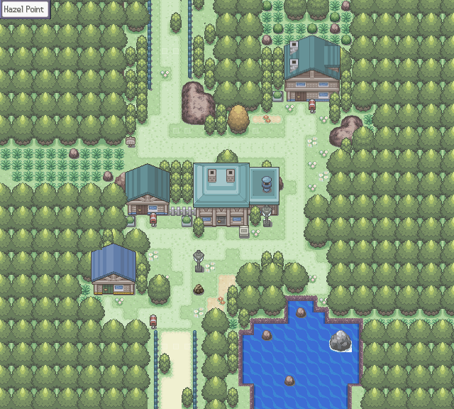
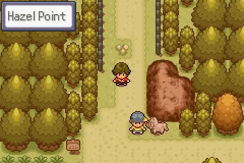
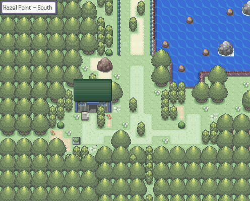
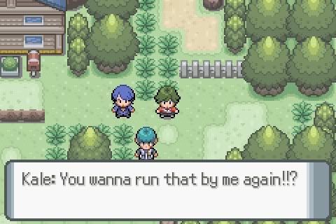
@xSionx - Those are awesome, and look very well made. Very pokemon looking.
What are you making this game in, is it RPGmaker or something else?

Good luck all.
 
Status
Not open for further replies.

Thank you for viewing

HBGames is a leading amateur video game development forum and Discord server open to all ability levels. Feel free to have a nosey around!

Discord

Join our growing and active Discord server to discuss all aspects of game making in a relaxed environment. Join Us

Content

  • Our Games
  • Games in Development
  • Emoji by Twemoji.
    Top