Envision, Create, Share

Welcome to HBGames, a leading amateur game development forum and Discord server. All are welcome, and amongst our ranks you will find experts in their field from all aspects of video game design and development.

The Screenshot Thread

Status
Not open for further replies.
The_Shadow":37nr2hfz said:
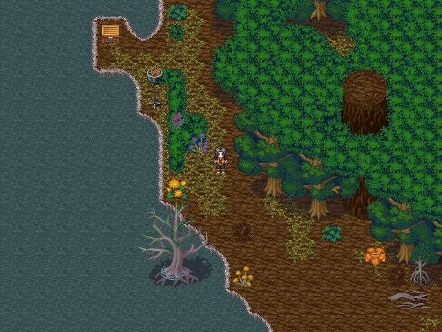
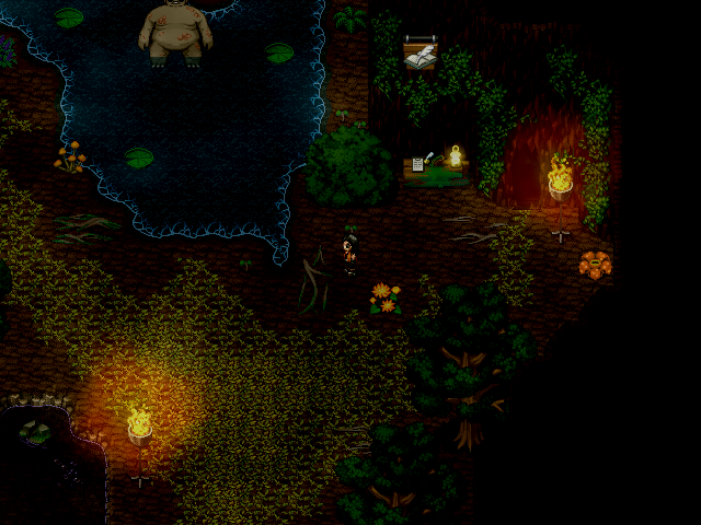
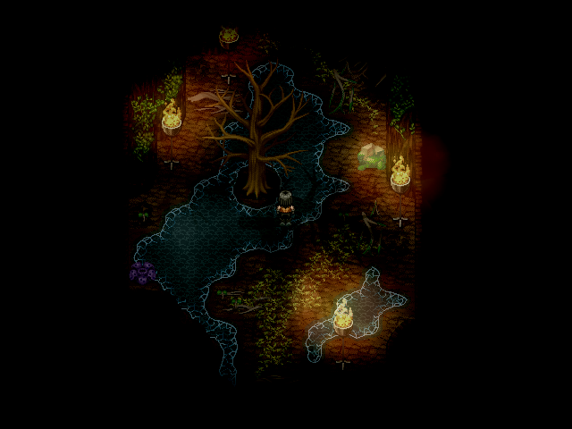
Looks interesting. However, it looks like the big tree is floating on the flowers in the first screenshot.

There might be a small mapping error somewhere on this map, but I think the resultate ended up pretty well. Everything that's missing now is some fog effects and animals.(For those who have sharp eyes, you can see there's a cat in one of the windows.)
Thanks, I will change that..

You're map is nice, not exclusive, but nice,, in particular the cat.. :)
 
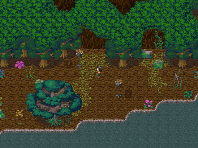
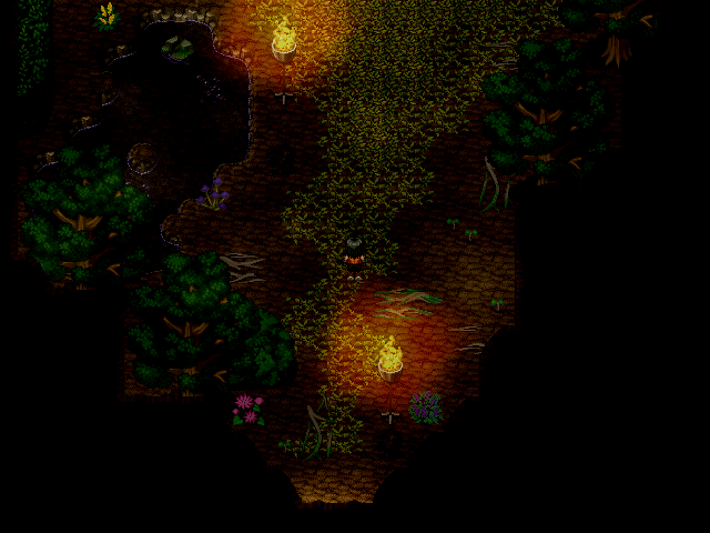
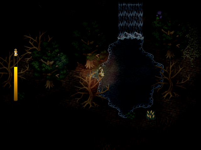
Thios: I'd use less flowers in that forest map. It's pretty loaded with flowers right now. The random bits of brown path may be used too much as well. And you've misused the "grass with beige dirt around it" autotile. (a lot of people do it, I used to misuse it as well) It's supposed to be used on those beige dirt paths to look like weeds growing on the roads. I like the light on the map though, very soft and subtle.

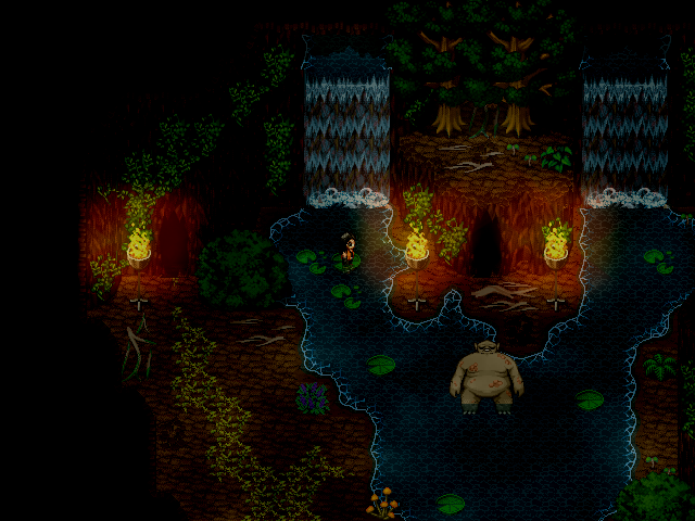
The_Shadow: Yeah, it's a very good map, not too cluttered and easy to navigate. The pond is a nice touch, but you have some depth issues as the cliff with the waterfalls seems to go several feet underwater yet the ground on the left side doesn't. (also, kitty!)
 
Twirly":25heccit said:
get-3-2009-upload2world_com_sbmp.PNG

I changed the room a bit and edited some colors, especially of the sprite, so the colors fit together.

That looks nice and simple, I like it. Although you may want to have an outline around your characters, maybe you could post a screen contrasting outlines and no outlines to see what people think.
 
@Thios:
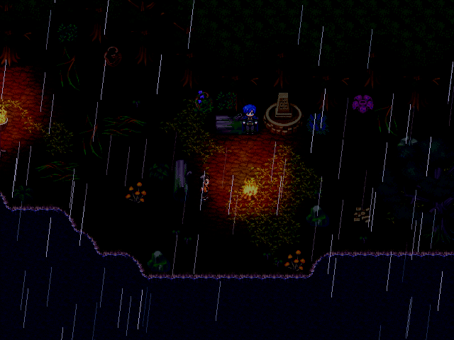
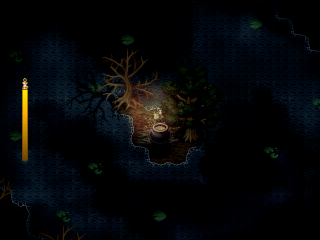
At first the structure of the second screenshot confused me, since the upper wall's bottom looked a bit awkward given its lift and lighting. But when I realized what was going on I found it to be an awesome concept. I'm very tempted to utilize a structure of similar concept, in fact! The lighting is a bit strange since it's random, but given the ethereal setting, there's probably some fantasy-esque suspension of disbelief to let that pass. c: Good stuff.
 
Dadevster":pgx4pptn said:
Thios: I'd use less flowers in that forest map. It's pretty loaded with flowers right now. The random bits of brown path may be used too much as well. And you've misused the "grass with beige dirt around it" autotile. (a lot of people do it, I used to misuse it as well) It's supposed to be used on those beige dirt paths to look like weeds growing on the roads. I like the light on the map though, very soft and subtle.
These flowers are a little to much, I agree. Also that brown path. Thanks for you're feedback. I will change these.
Reives":pgx4pptn said:
@Thios:
At first the structure of the second screenshot confused me, since the upper wall's bottom looked a bit awkward given its lift and lighting. But when I realized what was going on I found it to be an awesome concept. I'm very tempted to utilize a structure of similar concept, in fact! The lighting is a bit strange since it's random, but given the ethereal setting, there's probably some fantasy-esque suspension of disbelief to let that pass. c: Good stuff.
Feedback from the master.. Thanks! You're screens are always as my computer background.. :)

These guys having a meeting. There is something wrong in fantasy land (the table of nine). This map is set in my icecastle, I will post that screen soon. I love it, to make maps which you must consider how it was made and why it is made. I'm glad you liked it.
 
@Thios:
Heheh, thanks. By the way, it may be cool to try and put enlarged round RTP light char-sets on "add" mode to the torches, just so that the shadows from the twilight-esque lighting don't shade it (as much).

@Twirly:
The new version looks much more refined! Great stuff, nice and clean. I think the characters could use more of a pop in contrast to the background, although I think it may just be WIP right now.

~

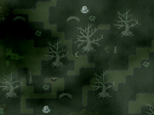
A little "Where's Waldo" -esque thing for fun:

 
@Reives: That where's waldo thingy is quite tricky. You gotta think outside the box for some of them. :P

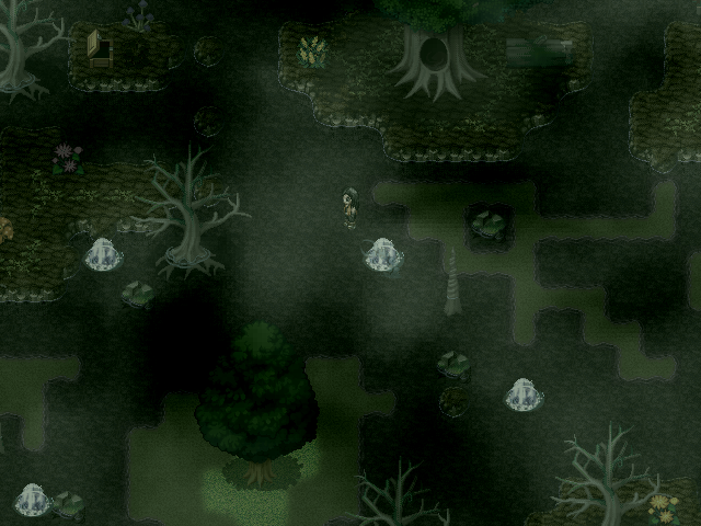
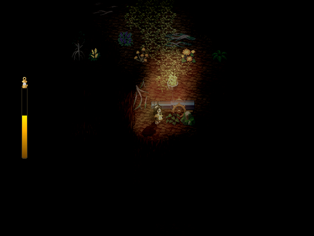
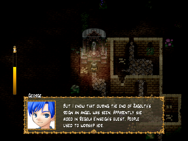
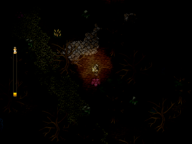
Hello you lucky people of RMXP-land. I've been working very very slowly on Loz Chapter 2, but rest assured it is in the works. Here's some pics of the first dungeon of the game, Varrutocko. A creepy, zombie-infested forest.


Reives":2t0zfasu said:
@Thios:
Heheh, thanks. By the way, it may be cool to try and put enlarged round RTP light char-sets on "add" mode to the torches, just so that the shadows from the twilight-esque lighting don't shade it (as much).
It's looks really great, thanks Reives. Greetings from the Netherlands.. :toot:

Edit: About you're screen, there is a piece missing from a three, above, in the middle, before the cave..
 
Already commented on yout screen on the othe forum Nessiah, so I won't repeat myself. :)
WIP of an almost finished tileset, HEAVILY inspired from the Secret of Mana series.
untill I find a good SoM battlesystem, I'll keep doing graphics for it. (ignrore the out of resolution top right sword)


Enemy_Attack_Range.png

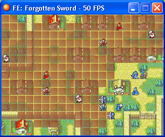
Something I thought I should work on since I've planned it for a while. Testing out showing multiple enemy move ranges concurrently, like in FE9/10. Currently it uses the same array that holds general attack range data so it can't persist when you move your own units around, and I might change the graphic to something less vibrant and more flat, but it's a start and gives a visual representation of where any enemies can do things.
 
Ynlraey":u2klb4eg said:
Uh yeah, dialogue not final.
TheAirship.png

A bit of a perspective error here.

The base of the ship is one tile in length.
The building is one tile in length.
The building is one tile away from the bottom most edge of the base by one tile, meaning it's pretty much floating on nothing.

Not only that, but one tile is incredibly thin. It looks like the airship would tear in two if it happened across a gentle breeze at just the right angle. You need to make it a lot bigger.

Unless this is meant to be a sidescroller of some sort, in which case you need to remove the deceptive perspective.
 
Sailor Taurus":3l9uvnqe said:
Ynlraey":3l9uvnqe said:
Uh yeah, dialogue not final.
TheAirship.png

A bit of a perspective error here.

The base of the ship is one tile in length.
The building is one tile in length.
The building is one tile away from the bottom most edge of the base by one tile, meaning it's pretty much floating on nothing.

Not only that, but one tile is incredibly thin. It looks like the airship would tear in two if it happened across a gentle breeze at just the right angle. You need to make it a lot bigger.

Unless this is meant to be a sidescroller of some sort, in which case you need to remove the deceptive perspective.
It is a side scroller, with a unique perspective. And Ynlraey, please, please fix the right side of the base of the ship, it is very off.
 
Status
Not open for further replies.

Thank you for viewing

HBGames is a leading amateur video game development forum and Discord server open to all ability levels. Feel free to have a nosey around!

Discord

Join our growing and active Discord server to discuss all aspects of game making in a relaxed environment. Join Us

Content

  • Our Games
  • Games in Development
  • Emoji by Twemoji.
    Top