Envision, Create, Share

Welcome to HBGames, a leading amateur game development forum and Discord server. All are welcome, and amongst our ranks you will find experts in their field from all aspects of video game design and development.

The Screenshot Thread

Status
Not open for further replies.
Wyatt: Ah, that tileset sure brings back the memories. I'm not a big fan of the trees though, the roots don't seem to spread out very much and the solid brown behind them contrasts with the rest of the tileset. Also, there's an area just to the right of the church that's fenced off and there's nothing in it, seems a bit redundant.
 
I'd say that's a pretty good job. It still has the VX graphics style, which I would describe spur-of-the moment as "bulbous shading," if that's what you were asking about, but I'd consider it a decent amount and use of detail. I won't look at layout, though, and please tell me you won't use RMVX style characters, they look like shit IMO.

I missed that Magus vs Magus thing the first time...wtfomg? When do I get to play that?
 
This screenshot of Hopeless Peak isn't wholly about mapping...I'd need some advice to improve a couple of things:

immaginekf2.png


1-I tried to make the ground a bit uneven...but I have a feeling I either overdid it or did it the wrong way...how should I do it?
2-I made an event-based COLLAPSING window:holding a button while not fighting or talking will show the group's HP, MP and Status.Is it okay, improveable, or should I just leave it and make it another way?
 
Zoro the Gallade that window is very big and would obscure a lot of the map. However if its triggered by a player command chances are they would want to see something like that, as long as its not permamently on screen I'd stick with it. As for the map you could prehaps have the characters on an elevated section of ground, then it would make them seem higher up and could possilby give it a bit more depth.
 
mmm... i agree whit desecration... that windows are too big... also i think you can improve the PS bars, and the layout... an image under the stats would be better of a simple windowskin don't you think? the mapping is to squared... the area is too much regular... try to modify it a little, whit a little stairway, some difference in the terrain (not only that hole and craps)
 

mawk

Sponsor

in reference to making the ground uneven, it's still pretty straight for a jagged cliff. if that one inexplicable jutting section of rock in the bottom left was also intended to go towards the "uneven ground" thing you should get rid of it -- it stands out too much and doesn't fit with the shape of the cliff. I'd rough up the edges a little more if you're really going for "jagged"
 
Juicy!(Dam, how many times do I say it? :p)
Thanks, I'll try that then.

@Desecration:Yeah, it's my first experiment with Common Events, as long as the key Z is pressed the window appears, and then disappears as soon as it's released.
 
@Bloodrage: Doesn't look bad, but some clashing going on. Some graphics like the pig-man statue and the lightposts doesn't really have shading, while the trees and wood do. I forgot the name of the style of the pig-statue thing (am thinking stella-something) but yeah, a little more shading on the objects should do the job.
 
I really don't know what you're talking about MukanshinBlack. The tiles are all consistent.

Also do you mean "stemixing"? Because I'm sure that the statue is pixel art.
 
Yeah, they mix beautifully. Those trees especially are done extremely well. The only problem I have here is that it's a little hard to tell the pig is actually a pig. Other than the face it looks very human-like. Great tileset though. We always get all the good pixel artists. :smile:
 
At last, I've continued some work on LoZ, kay. And I've got some lovely overworld for you.

WARNING: This is a very big file.
http://www.quintessence-tbv.com/harry/FatenoCliffside.jpg
Thanks again, Reives!

That's a very small community in the eastern part of the map. Goblins who have abandoned Keseenth have fled and made their homes in the mountains.

I wouldn't count this as a "proper" town. I never really intended it to be. It's just a stopping-off station because there's a dungeon nearby. All that's in the caves are an Item shop, a weapon shop, an Inn, and a main cave. A sort of "Mayor's house" if you will.
 
@Bruno.

The wall on the building that controls the bridge (I assume) has grass on it. Lose that. The stone doesn't line up on the bridge perfectly either but that's really not a big deal. Upper left hill is very empty but I don't think your player can see that. That very big tree on the very left edge looks awkward

Your water could use a few rocks from the event characters. Make it less bland. It's really big so I may have missed a few errors.
 
the island next to the chest in the middle lower part has the trees layered wrong.

personally, I don't find big maps attractive, it's alright though.
 
Need some feedback on this...
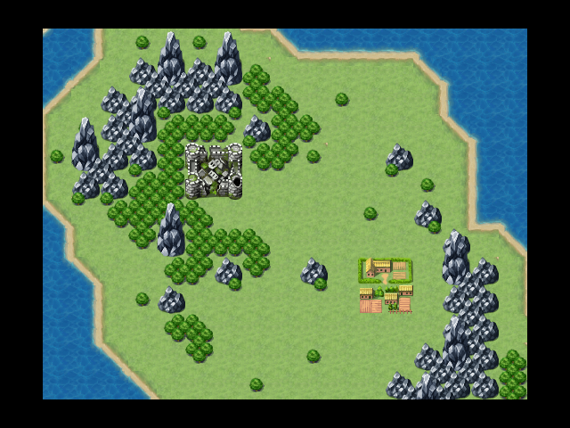
I have been playing around with the mountains autotile... but now I`m not sure if they even look like mountains ...
mountainsns21.png
 
I've been making an RTP tileset for a while (as well as LMS) and I thought it was time to post some screenshots of what it can do. I don't intend to use the tileset, so I guess I'll be releasing it soon. I'll be working on an Exterior soon. I want comments on the tileset not the mapping.

Screen1.png


Screen2.png


Screen3.png
 
Status
Not open for further replies.

Thank you for viewing

HBGames is a leading amateur video game development forum and Discord server open to all ability levels. Feel free to have a nosey around!

Discord

Join our growing and active Discord server to discuss all aspects of game making in a relaxed environment. Join Us

Content

  • Our Games
  • Games in Development
  • Emoji by Twemoji.
    Top