Envision, Create, Share

Welcome to HBGames, a leading amateur game development forum and Discord server. All are welcome, and amongst our ranks you will find experts in their field from all aspects of video game design and development.

The Screenshot Thread

Status
Not open for further replies.
craybest":htgj9n1i said:
I think B looks better, but I would move the face more to the left, I feel there's not enough space for text otherwise.
I say make it appear above the message box, but in the 1st picture position.
Yeah, I agree with this exactly.
 
Sonata - The sand and the rocks look good but the tree and the plant look very out of place. Desert trees don't really show the bottom roots cause the sand has been blown over them. Your branches and twigs look like different shape triangles, it all seems very unnatural. The trees should look a lot more dead, and sort of a creamy grey, but by the palette your using with the rocks and sand I say give it an orange-y brown colour. The tree also has no texture, it needs more of a rough wooden look, dithering may help. Here are some reference photos of desert trees.
http://gallery.photo.net/photo/3383991-md.jpg
http://upload.wikimedia.org/wikipedia/c ... _2004a.JPG
The bushes perspective seems of, it seems like it belongs in a platformer. It needs to come down a bit, if that makes any sense. Also the bottom of the smaller rock needs to be more flat, right now it looks like its floating above the ground. Hope that helped at all. Its a great start, better then the desert stuff I was making.
 
A little test of RTP mapping and Face message (Event based)...
how did it go?
immaginekz5.png
Ps:I know the charset has a jacket instead of the cloak, I'll fix that asap.I have so much on my hands right now...
 
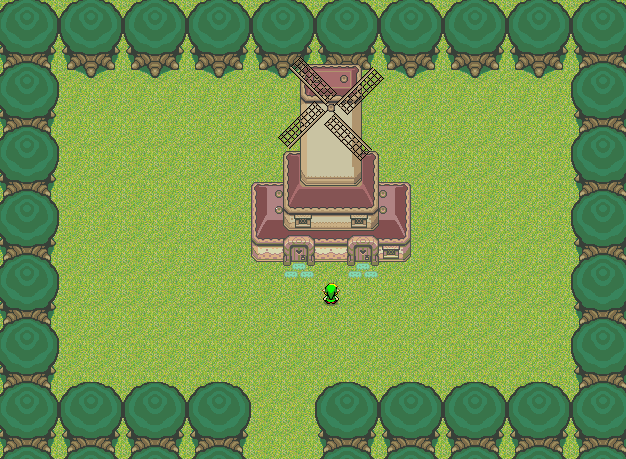
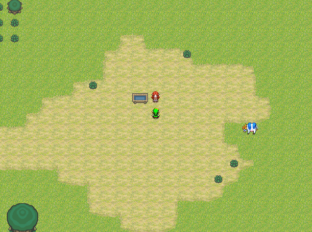
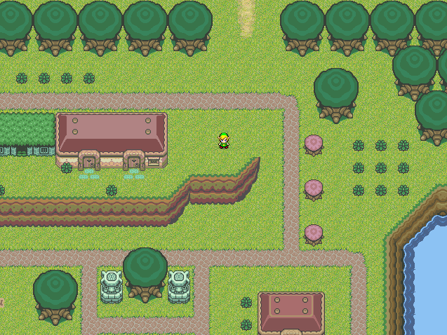
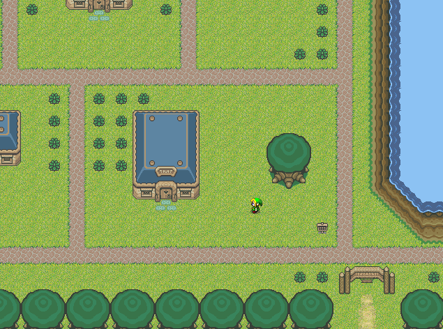
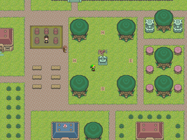
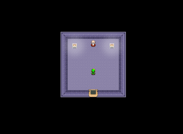
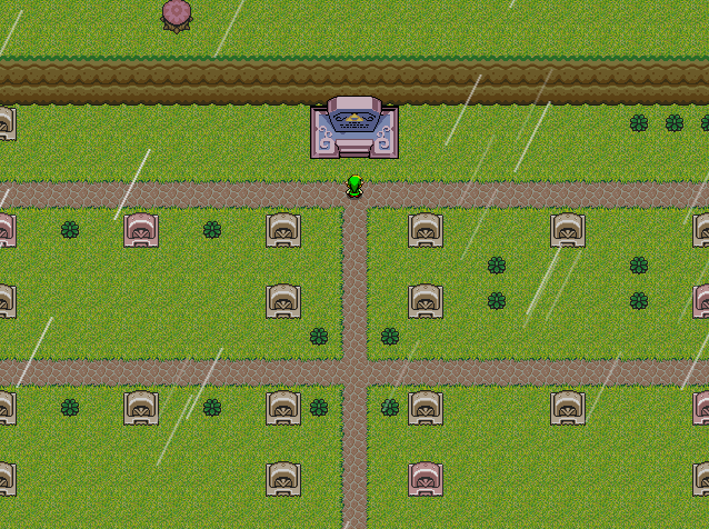
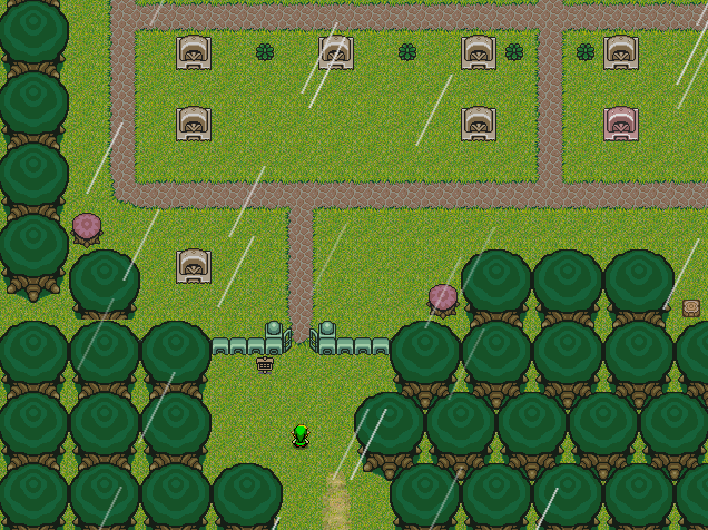
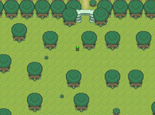
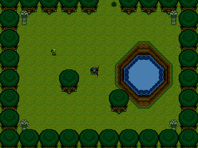
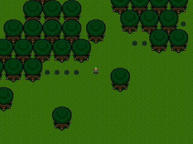
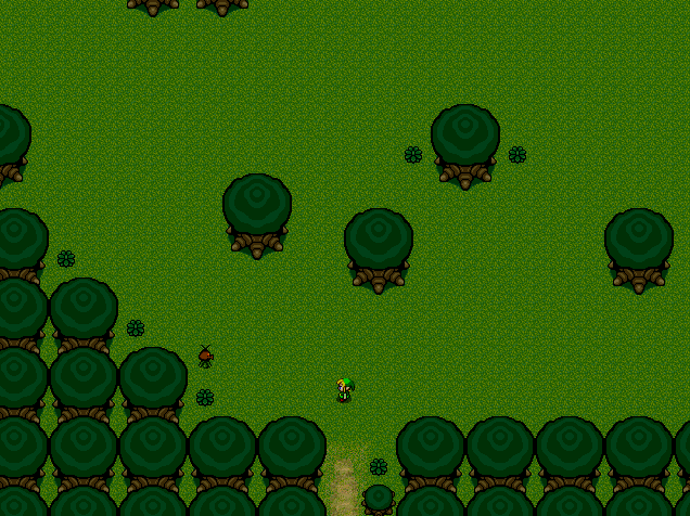
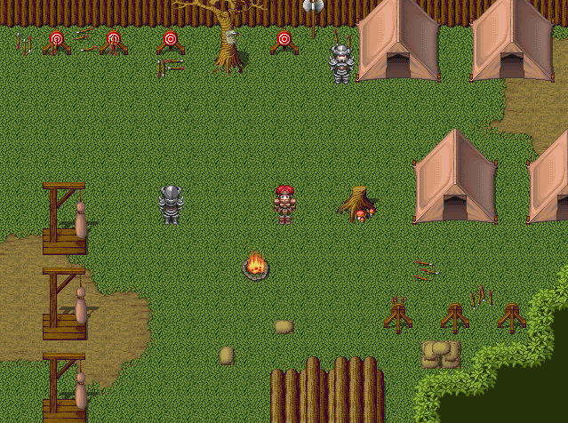
So, these are some screenies of me just playing with the program, I'm not really making a game, just seeing what I can make I guess. All of these are Zelda inspired maps I created, except for the last which is actually some barracks I made for fun.

Windmill.png

LonLonRanch.png

Karkariko.png

Karkariko3.png

Karkariko2.png

House-1.png

Graveyard.png

Graveyard2.png

Forest.png

Forest4.png

Forest3.png

Forest2.png

Cave.png

Barracks.png
 
Here are some extremely beta maps done for my game... Perhaps i can get opinions on them? <:

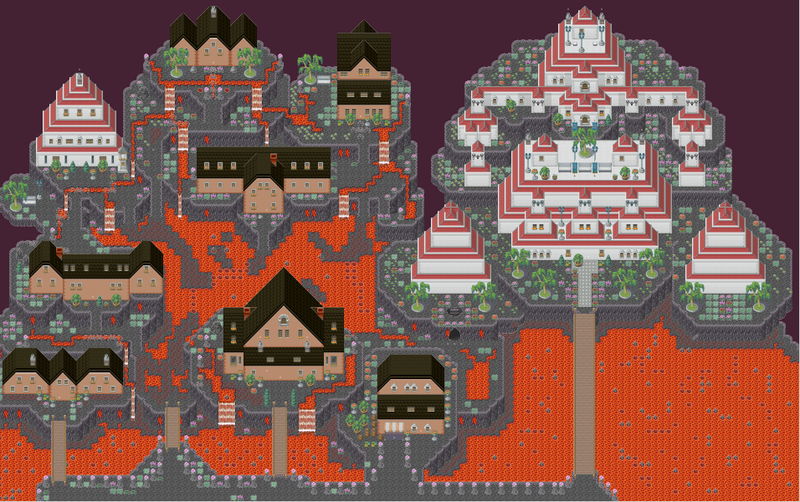
First there is the first city in my game, It's basically a city carved out of a volcano in honor of the Queen's first born daughter, Athame. (The city is actually named Athame). The city is the home of the Queen herself, and some of the most important and richest families in the world. The houses aren't very big, considering only so much can be carved out of the volcano. The city is kept alive by constant magic being cast by 6 wizards.

allofathame.png

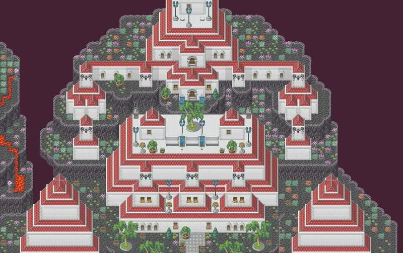
Next is a closeup of the Queen's castle.

athamecastle.jpg

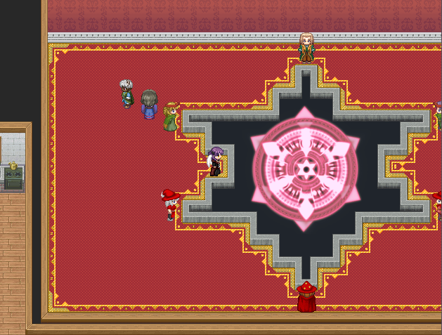
This is the magical circle that keeps Athame from falling. It is constantly kept by 6 wizards, which take shifts casting the spell.

athamespell.png

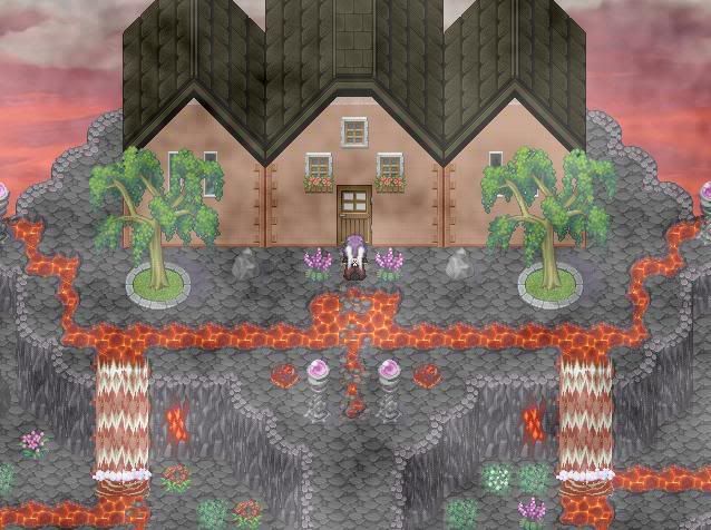
This is the outside of the Wizards house. It overlooks an almost constant sunset, and is surrounded by a firewaterfall. (I hope the fire-fall doesn't look too... Odd. although i may redo it.)

house.jpg

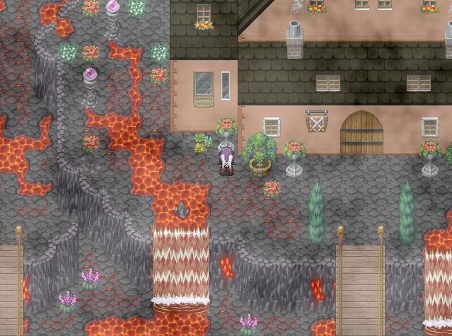
This is a nicer looking house

house2.jpg

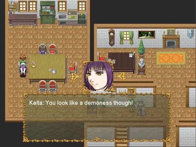
An example of the dialog system, where the character speaking's portrait (conveying whatever emotion) is viewed above the message.

portraitexample.jpg


Something you may have noticed: Obvious lack of people. As i said Athame is a city for the rich, and the rich rarely leave their house.

I also worry that it looks too... plain? Any suggestions? I can't seem to make roads look right though
 

Cait

Member

@American Hero My biggest problems with your maps is that they are far too open. The trees in some of them look unnatural, and that the village is also too open, with hardly anything in them. I swear I remembered that Zelda game had stone walls, with green stuff on top.... I don't think the grass goes too well, with the Zelda trees, to be honest. You might have to either change the tree color, so it don't look too odd or change the grass. Not sure which would be easier, though.

@Amber Dragon Your mapping is good, but I only have a single issue. What's up with all the crazy plant life in the city? You have WAY too much in my opinion, and it is standing out. Plus, it would be really hot and I'm not sure how plants would do in that environment. I think you've filled it up nicely, otherwise. Actually, it's your game, but I don't see people living like this, because it would be a pain the butt to do.
 
Hm, I agree with Cait.You should try to "frame" the maps more, maybe by making the environment a bit tighter but more detailed.As for the trees...well, from a village built on active volcano, you'd expect it to be different, how about you edit the tileset to make the tree stand in, like, ash dark soil?It would look good and more logical...
 
Cait":183o4rer said:
@Amber Dragon Your mapping is good, but I only have a single issue. What's up with all the crazy plant life in the city? You have WAY too much in my opinion, and it is standing out. Plus, it would be really hot and I'm not sure how plants would do in that environment. I think you've filled it up nicely, otherwise. Actually, it's your game, but I don't see people living like this, because it would be a pain the butt to do.

Live what way? In such a "hot" environment? Keep in mind that this particular city is kept alive by magic, and with the addition of magic in a world, virtually anything is possible.

As for the plant life, thats due to me wanting to fill up deadspace with details. although i'll see if i can find something else.

There are a few thingsi still need to modify, such as the trees having different colour leaves and the such.

But thanks for the critisism :3
 

Cait

Member

@Amber Dragon In a volcano, where you have to depend on the use of magic to make it so you can live there. Not sure if it would happen, because of how complicated it would have to be. Fantasy places have to give in to some reality at some point, but it is your game, and if you can get it to work. It would show how good of a game maker you are, because I couldn't, unless I could see it in my mind as a possibility.
 
Oh well one of the best parts of an RPG is finding maps representing "exotic" and strange places...a volcano is kinda classic, but a good mapper as Amber seems to be can easily make it look really interesting from many points of view.
 
I have a new screen from Sabriel. These show Wyverly Colleage, the school that Sabriel grows up at. I've spent ages tweeking the tileset. I'm working mostly on the maps at the minute, so there isn't much gameplay yet.

screen6ee6.png


Another thing that I have done for the game is giving NPC's 'brains'. They walk around like normal people, and interact with other NPCs. Comments please.
 
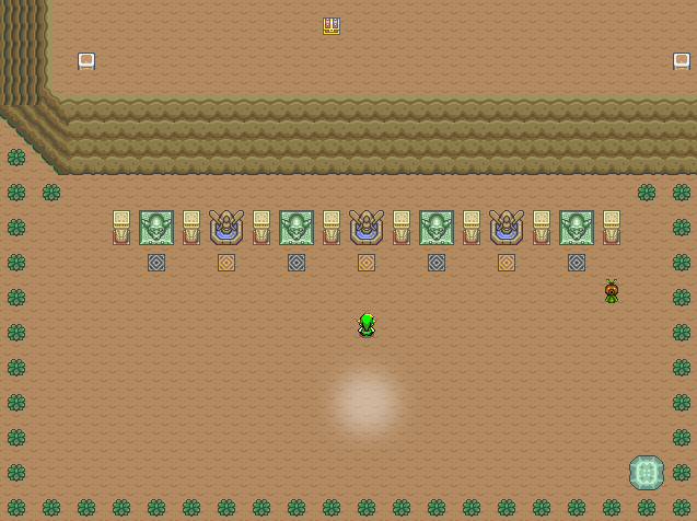
I un-spoiled my screen...can you comment it too?
immaginekz5.png


By the way, the academy looks fine...just, the windows maybe look slightly too high/small and the carpets under the stairways...uhh,look a bit strange.
 
Zoro: There's a lot of different contrasting colours going on there that is kind of distracting. The window skin is a tad too bright, and the green and red monsters don't look good right beside each other like that. Tone down the saturation a bit.

The carpet underneath the statues is kind of uneeded as well, the bright yellow and red doesn't look good in a single straight line.
 
@Fox5 : i would put the railings on the stairs on the opposite side, other than that it looks nice.

@zoro: I'm a little confused about the wall thing in the upper section. It almost looks like its indented. I would get rid of the border if you can.
 

Puffy

Member

@ Zoro: As somebody who spent WAAAAAAAY too much time messing with FE portraits...well, nothing. Just nostalgia. :3

Anyway, nitpick is nitpicky: Because the outline for those portraits is a medium purple, darker colors (especially reds and blacks; the hair being suspect) inside of it look awkward when they're right up against it. Do whatever looks good, but you can always steal a palette from another sprite, since they're so uniform. 'N the charset that represents said character has hair hanging out the sides in a way that looks impossible, if that's a hood, and doesn't really match.
 
Dadevster":2wea9vlq said:
There's a lot of different contrasting colours going on there that is kind of distracting. The window skin is a tad too bright, and the green and red monsters don't look good right beside each other like that. Tone down the saturation a bit.

The carpet underneath the statues is kind of uneeded as well, the bright yellow and red doesn't look good in a single straight line.

So you basically say to remove the border from the tower, use a bite darker colors for the skin and remove the carpet,huh?
Ok, I'll start working on it, thanks.

Puffy":2wea9vlq said:
@ Zoro: As somebody who spent WAAAAAAAY too much time messing with FE portraits...well, nothing. Just nostalgia. :3

Anyway, nitpick is nitpicky: Because the outline for those portraits is a medium purple, darker colors (especially reds and blacks; the hair being suspect) inside of it look awkward when they're right up against it. Do whatever looks good, but you can always steal a palette from another sprite, since they're so uniform. 'N the charset that represents said character has hair hanging out the sides in a way that looks impossible, if that's a hood, and doesn't really match.


I've redone the charset, does it look a bit better this way?
immaginecb3.png


Ok, I gave all of the advice a test, here's how it worked out:
immaginexf8.png
 
@Zoro:
Two things.
First, that map is looking bad. It's too empty and the tiles are all messed up. Near the girl with angel wings, close to the statue, there's something there. There's also a lot of misplaced tiles (e.g. near the first statue to the right).
Second, rips are bad. It doesn't fit the RTP style. The portrait is okay, I think, but those monsters (gargoyles?)... just don't. You could try to edit them so they have a RTP-ish look.

Keep it up, and good luck. ;)


SEE YA!!!!!
 
Status
Not open for further replies.

Thank you for viewing

HBGames is a leading amateur video game development forum and Discord server open to all ability levels. Feel free to have a nosey around!

Discord

Join our growing and active Discord server to discuss all aspects of game making in a relaxed environment. Join Us

Content

  • Our Games
  • Games in Development
  • Emoji by Twemoji.
    Top