
You are using an out of date browser. It may not display this or other websites correctly.
You should upgrade or use an alternative browser.
You should upgrade or use an alternative browser.
The Screenshot Thread
- Thread starter Ellie
- Start date
- Status
- Not open for further replies.
Feldschlacht IV
Member
Hey guys.


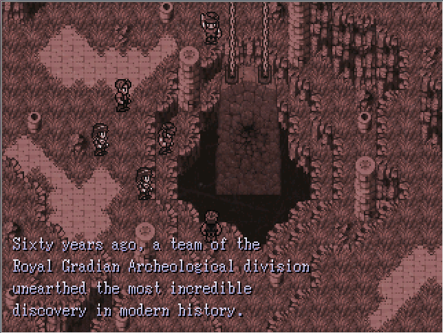
I can't tell very well from the lack of colour but your character sprites don't seem to match the surroundings, just going by contrast. the inconsistency in palette shades really seems to stick out, at least in monochrome.
if you're going to mix rips from different games the first thing you do is make sure the graphics are consistent. that is the only thing that matters.
if you're going to mix rips from different games the first thing you do is make sure the graphics are consistent. that is the only thing that matters.
Feldschlacht IV
Member
I see what you're saying, but they match well enough for me. Too late to go back now.
MukanshinBlack
Member
Feldschlacht IV":1fr6a25v said:I see what you're saying, but they match well enough for me. Too late to go back now.
The characters really, really, really stick out in a bad way. Unless you make their contrast lighter or less black more dark color corresponding to what it's the outline of (dark red for a red shirt, dark blue for a blue shirt).
It's never to late to better an element in a game thats not released. And so what if they match well enough for you? Is this game going to be released publicly?
Feldschlacht IV
Member
Well yeah, I see what you're saying, but I respectfully disagree! I mean I've received other complements about the map, and I've decided to weigh those against you and every berries, and I've decided not to change it.
often people give compliments without putting any thought into the actual quality of the thing they're complimenting
"hey nice map" is not critique, nine times out of ten it is just someone who didn't care or pay attention but wanted to post something anyway.
your graphics are inconsistent. this looks bad. you can pretend the problem isn't there and justify it with whatever bs you want (come on ignoring actual critique because of hollow praise is like the oldest trick in the book you can do better) but in the end your game will be a bit worse for it
and if you don't want to hey that's okay it's kind of minor but don't pretend this decision is anything but "I don't feel like putting this kind of effort in."
Feldschlacht IV
Member
every berries":3nsro9eg said:often people give compliments without putting any thought into the actual quality of the thing they're complimenting
"hey nice map" is not critique, nine times out of ten it is just someone who didn't care or pay attention but wanted to post something anyway.
your graphics are inconsistent. this looks bad. you can pretend the problem isn't there and justify it with whatever bs you want (come on ignoring actual critique because of hollow praise is like the oldest trick in the book you can do better) but in the end your game will be a bit worse for it
and if you don't want to hey that's okay it's kind of minor but don't pretend this decision is anything but "I don't feel like putting this kind of effort in."
Wow that's not fair at all to assume that the other complements I've been getting are hollow and baseless compared to yours. They weren't. Your critique is well meant and intelligent, but I don't think that it looks bad and I respectfully choose to decline it. I added the 'other people think its good' line simply as an addendum to something I already feel. I just don't think it looks bad and I choose not to take your advice. Would have rather me told you to fuck off?
Feldschlacht IV
Member
I apologize for that and any other misconception, and I thank you for the critique, but I respectfully choose to decline.
MukanshinBlack
Member
If you say so, Feldschlacht the IVth, but I'm sure most people who sprite their own characters and tilesets would side with me and miek.
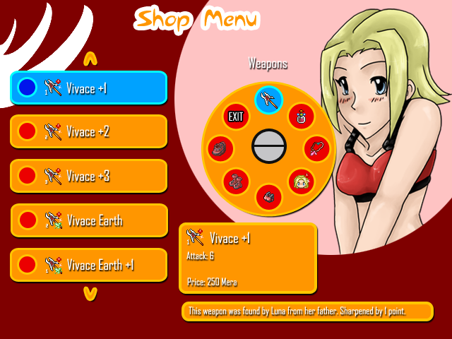
This is a shop system I designed and am having made currently, felt I could share 

Most of this is pretty self explanatory. The selection wheel rotates the icons to the blue circle to show what you have highlighted to view. the side tabs scroll up and down to choose what you want to view. The bottom boxes show the item stats along with the item description which scrolls to allow for long item explanations.

Most of this is pretty self explanatory. The selection wheel rotates the icons to the blue circle to show what you have highlighted to view. the side tabs scroll up and down to choose what you want to view. The bottom boxes show the item stats along with the item description which scrolls to allow for long item explanations.
MukanshinBlack
Member
Pretty cool Axe, although the girl (forgot her name) standing there like that is kinda random.
- Status
- Not open for further replies.
Thank you for viewing
HBGames is a leading amateur video game development forum and Discord server open to all ability levels. Feel free to have a nosey around!
Discord
Join our growing and active Discord server to discuss all aspects of game making in a relaxed environment.
Join Us