Envision, Create, Share

Welcome to HBGames, a leading amateur game development forum and Discord server. All are welcome, and amongst our ranks you will find experts in their field from all aspects of video game design and development.

Pixel Art WIPs/Small Things Thread

To admit, I'm using the Half Kaizer palettes and hey, do you have White Ties charsets? [I'm actually looking for ccoa's and someone from RRR's Szalony-WT]

Back to thread, I'm also using RTP as my reference.
 
A jar

jar.png
 
muffin- as much as I'm bad at spriting, I think it needs shading, but I like the shape though, it really gets the jar feel. ^^

greenraven- well, I couldn't say much on a bunch of nude sprites on a checkered island, but I think there's nothing to critique since it's perfectly shaded.

anyway:


they are melty blood styled, well since it's the first sprite I made in this thread. C&C go! ^^
 
@hellhound: Yeah it definitely needs more shading thanks, cool stuff.
@Ynlraey: Hey that looks cool on DS! cant wait to see more.

93049639.png


Poiizu

Member

Ahaha Please don't slaughter me, I'm a noob here D:

But my boyfriend just introduced me to RMXP and since I'm an artist (mostly anime. Go figureXD), he wanted me to do some sprites for his game. I've never (sprited?) a base before, but here's my try D:


This is the (RTP?) base?


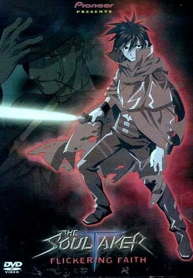
Supposed to be based of this character here
Soulataker.jpg

The dithering on the back probably wasn't a good idea D: And I will probably change it. But whatever, I'm a noob, So C&C away XD
 
Poiizu, The sprite looks great, but please do fix the dithering on the cloak and hair. I think the holes will look bad in game, I suggest you use dark brown/black spots instead. Another thing: the lines on the cloak are too thick, when doing pixel art, lines should be 1 pixel wide (mostly).

muffin you're joking, right? If not, you need serious help. o.o; look here:
pixellines.png


Finnally, what I came here for :D :
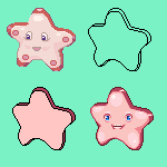
which is better?
1.
seastar7copy.png
2.
seastar9copyb.png
 

Poiizu

Member

silver wind":1l2sqlmq said:
Poiizu, The sprite looks great, but please do fix the dithering on the cloak and hair. I think the holes will look bad in game, I suggest you use dark brown/black spots instead. Another thing: the lines on the cloak are too thick, when doing pixel art, lines should be 1 pixel wide (mostly).

muffin you're joking, right? If not, you need serious help. o.o; look here:
pixellines.png


Finnally, what I came here for :D :
which is better?
1.
seastar7copy.png
2.
seastar9copyb.png


Lol finally, thank you so much for the feedback! Ill fix the dithering and the lines. (although i know about keeping it 1 pixel, but i guess i mess up D: )

oh and, I like the second one better :3
 
I like the first one better Silver wind, the second one looks high. Also to me, the pink-red outline on the second one is too dark for my taste.
 
I like the idea of the second one more, regular eyes don't look right on a starfish, but the execution is much better with the first one. The paler colors on the first one are better too.
 
@sliverwind:
muffin you're joking, right? If not, you need serious help. o.o; look here:

I havent been able to make decent sprites these days due to my work and yeah i indeed need some serious help, heres one.

 
heh I didn't notice you fixed the perspective already ^^'
the colors are still pretty pale though and it could use some more contrast. Also, try to avoid pure white or use it for "extreme" highlights.


Hey hellhound, I'm guessing only the head and shoes are done? As for the arms
RedKnight.png


if you want some more help just ask.

And muffin untill you listen to the advice people give you and practice the basics, your pixelart will keep crappy. :)
 

izze

Member

So, yeah, this'll be my first post in a while.

I've started making a game, and to make a appealing game, you will need good sprites. So I've decided to start learning to sprite. i've been working with game-makeing for about 2 years, but I've never been a good spriter.

So now, I'll need som comments about some sprites I've made.


This is supposed to be a bottle with a red potion in it. Is there any way to make this look better?


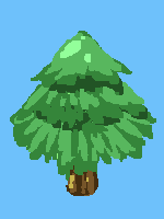
I need some serious help with that pine tree, I guess.
 
hey izze,

check this out, I hope it'll help you


the colors in your potion are pretty flat and they don't have enough contrast imho. Furthermore the "bubbles" are some unecessary detail. They only make the image look bad. The lines were good and clean, but you should try and stop the gradient shading.

gradient+gradientshade
gradient.png


Last but not least you should give the tree some valume to start with.
pine.png

it looks more like a christmass tree air refreshener.
 

Thank you for viewing

HBGames is a leading amateur video game development forum and Discord server open to all ability levels. Feel free to have a nosey around!

Discord

Join our growing and active Discord server to discuss all aspects of game making in a relaxed environment. Join Us

Content

  • Our Games
  • Games in Development
  • Emoji by Twemoji.
    Top