Envision, Create, Share

Welcome to HBGames, a leading amateur game development forum and Discord server. All are welcome, and amongst our ranks you will find experts in their field from all aspects of video game design and development.

Pixel Art WIPs/Small Things Thread

There needs to be more contrast between the hair and the face-it's hard to tell where one ends and the other begins. Try making the hair on the head a bit darker to make it stand out more.

xshadow76x, human faces are really complicated, moreso than people think, but yours looks pretty good. The dark under the eyes makes him look very tired or exhausted, unless that is intentional. Is there a reference picture you could give us?
 
trees.png


Its a storybook like tree. Its supposed to look like cartoony and sort of Hand Drawn, kinda like a Zelda, Minish Cap sort of feel

^_^
 
I think you should consider the perspective you'll be playing from. Right now you've got a side-view look. RM graphics have a top-down view. The Zelda graphics have a higher view then most games.
perspective.png

Using the shape of your tree I reformed the trunk so top of the tree covers most of it; and shaded it with the point of view in mind.

Besides the perspective, I think you should limit yourself 3-4 shades per color. A shadow,mid-tone, and a highlight are all you need. Cartoons usually have a thick outline too, but I wouldn't go too bold since you don't want your background graphics to over power the sprites.
 
littlesquall.png


I used the Paradigm template because it's small and I'm lazy. Kick me if you will.

If it sucks so badly you can't tell who it is, it's Squall from FF8 with a slight costume edit (belts across his chest, a small armband on his right arm). I made the palette myself so it probably sucks >.>.
 
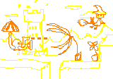
Making a random sidescroller mockup for practice with different styles and perspectives. This is not going to be turned into a game; I just wanna try pixeling different things. Anyway, this is obviously just a sketch, but I wanted to put it here for...idk, idea feedback?


You are the roboctopus! You get new abilities in the form of modules that hook into your robotic body, e.g a gun or a shield or an umbrella that you spin to make you fly. Currently you're raiding a witch's tower, which they don't really appreciate. The witch there doesn't actually fight you, but she sprinkles witch dust that turns flowers into KILLER ROBOCTOPUS-EATING FLOWERS!!!, so you gotta kill her or something, idk.
 
Here's a small character from me, i'm trying to make a game yet again (a remake my way) and i want to work with a smaller characterset.
I'm just having trouble with this monitor and lights and darks, so it's still a wip.
ZOOOOOOOM!
 
Holy shit on a stick that's freakin adorable. I usually have a really hard time making out small sprites, but I can distinguish this little guy very easily. Nice!
 
@Heinze: I think some of your purples are too similar which isn't necessary in a small area. It's one of those things where having a low color count makes great pixel art.
Don't ask me why that is. :mystery:
 
Heinze, yeah, I agree with Coyote. I like the hair, but in general your outlines don't quite match the outlines of the template. Maybe use darker outlines.

piggman, I like it, but it's hard to see the backlighting. I recommend using a much stronger color and doing a bit more than the very edge.
 
You are pillow shading it.
More contrast and interesting colours would be good. such as instead of going to light blue, maybe a bit of green in to spice it up.
maybe have the eye facing forward rather than sideways.

Less dithering. Not a good idea for characters.
 
Yes, that looks a bit better. but continue that idea for the darker shades with a tad of purple.
Shading still needs work.

Don't shade each lump on the shell individually. Treat it almost as one piece. Also more light would hit a surface like that if the light is coming from top left corner.
 
Old:New:

Perihelion's suggestion helped a lot; I also adjusted the palette and shading in a few places.

I think I'll use it as an avatar for a little while.
 
Beetle: Personally I think the hair looks too dark. For the most part the sprite looks alright, but the lines on the faceset are blocky. It just needs some cleaning up in some spots.
 

Thank you for viewing

HBGames is a leading amateur video game development forum and Discord server open to all ability levels. Feel free to have a nosey around!

Discord

Join our growing and active Discord server to discuss all aspects of game making in a relaxed environment. Join Us

Content

  • Our Games
  • Games in Development
  • Emoji by Twemoji.
    Top