Envision, Create, Share

Welcome to HBGames, a leading amateur game development forum and Discord server. All are welcome, and amongst our ranks you will find experts in their field from all aspects of video game design and development.

Pixel Art WIPs/Small Things Thread

I'm in some need of help with this building. I'm trying to make it look like the building in the two smaller pictures to the left. My problem is the back part. >_< I've got it a bit different than the picture because no matter what I did, I just couldn't get the back to line up right. :( Something just seems off? Is it my building or the way they were drawn to begin with?
building1.jpg
 

Twirly

Sponsor

So I found a good tutorial, made a sprite, Perihelion helped me to improve it and this is the result:

Tell me what you think, open to sharp but constructive critisizm :D
PS:
This is an rm2k sprite ;)
edit:
added a hat!
also, go Purple Perihelion Party
 
Okay, .org was down when I wrote this, so I'll post the original critique I did for Twirly now.


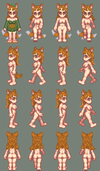
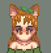
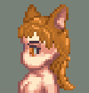
Couple things, Twirly. Stronger outlines and more contrast on the hair, and I'd tilt the hat a little to make it closer to 3/4 perspective. Your palettes in general need work, but the hat and skin in particular bother me; a good general tip is to make highlights yellower and shadows bluer and move across the spectrum incrementally as you change brightness. In general your palettes need a lot more contrast, and the shading's off on the body, too. The torso looks flat, whereas the pants are pillow-shaded. Also, you probably want to lower the saturation on the red, and grays look much better if they have bits of other color in them (in this case, you'll probably want warm tones to match the red). The solid black outlines are also pretty unattractive.

Okay, I did a quick edit so you can see what I mean on some of this.

I didn't change the outlines of anything but the hat and the hair, but you can see what a difference even a palette swap and shading makes. Your basic shapes are fine.

A note on palettes: I got lazy and just recycled some ones I already made for Paradigm, but in addition to the blue-yellow transition thing, I used exclusively warm palettes. In general, if you have black/white/gray on a sprite with more vivid colors, you should pick grays that match the warmth/coolness of the other colors. Makes it look more unified. Also note that nothing is at full saturation, although some of my lighter shades might be close to it.

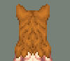
As for shading, the trick to it is to kind of pillow shade except move the highlights up and to the left. Of course that's grossly oversimplifying, but bodies are composed of rounded shapes, so you can do a lot if you can figure out how to make things look round. In general, light things are closer to the foreground, so keep that in mind when shading. Um, look at the edit to see what I mean. And then to make things look textured, I just used more random placement of pixels instead of smooth highlights.

I hope that was helpful!
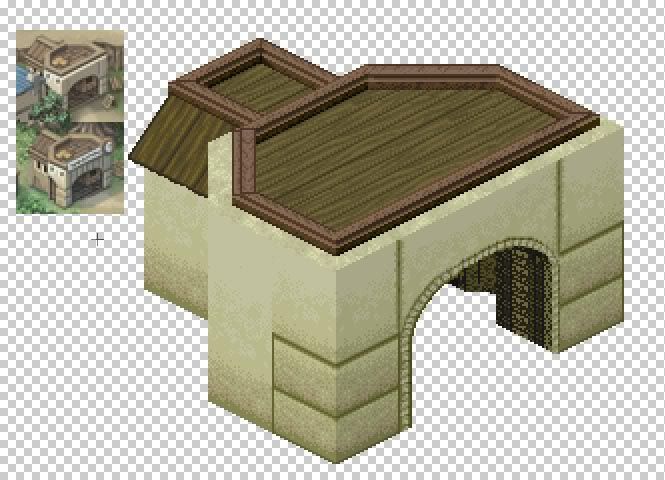
 

Twirly

Sponsor

That was very helpful, Peri.
Thank you very much, my sprite looks
a lot better now! :lol:
Also I noticed how a palette swap can make your sprite look
a lot better (even if my palette still needs improvement)...
Right now, I am making a char sideview,
which is in terms of shape a total pain in the ass :mad:
But I will be sure to ask here or on irc for help :thumb:
Edit:
Here is an edit of my sprite (it should look more like a ronin)
 
Lunar: You're pillow shading. Getting lighter toward the center makes it look glossy and lit from in front.
Shade it with the light source above the sprite. Don't try to blend from one shade to another.
Your clothes need more contrast. I used black because it was already on your sprite but a darker brown would have been better.


Personally it think it's wrong to do the whole body in one color. Native Americans have red, white, yellow, and blue. Fur coats, beads ect... dress him up a little.
 

Twirly

Sponsor

Today I started making sideview sprites for my char,
and I am having trouble, because I draw the chars from scratch!

Any advice? :blush:
 

Twirly

Sponsor

coyotecraft":2h14it0o said:
@Twirly: The head looks flat. Give the hair more body.
I still need to shade things, I know.
I am asking how to make the rest of the body which looks horrible...
Edit:
I edited it a bit:
 
@lunar: I think the best thing for you to do is take it in steps. Pick a dark color and do an outline over the template and pick a lighter color for the fill. Then ask for help placing your lighter shades.
The clothes are very plain and you've still got that pillow shaded look around the boarders.
I've been making a HK spriting tutorial that I hope will help.

@twirly: Idk, I think the body looks fine. Maybe place it next to the front view so it's easier to compare.
 
Haven't been here in a while.

kitsunetest4a.png

hairbackenlarged.png

hairfrontenlarged.png

hairsideenlarged.png


An HK Kitsune... Or more like an attempt at one.

No shading under hair, or on clothes and the tails are giving me grief like you wouldn't believe!!
Also the way I've shaded there's not really a 'halo' but I couldn't get it to fit well without losing detail in the strands? of hair. *shrugs*

(Looking at it from the forum instead of photoshop, it looks like it needs more contrast?..or shading w/e)

Should I bother to keep trying or just give up? lol

Oh Pallette is HKCP and ears are modified from the HKCP anthrocat, (doesn't say the artist on the site?) And the leaves are from zanyzora's tileset I think.
 
that a fox girl? she looks cute. like the leaf in her hair

three tail does look like trouble. maybe its better to just give her one? easier to sprite in side and back views. eyes dont stand out either at all may want to change color for them
 
She's supposed to be a kitsune, a Japanese fox spirit...thing lol.

They're generally portraid as having nine tails :| Three was the most logical I could think of, nine would be well...messy.

I think the parts that bug me the most are the tail movement and that they seem low from the front, but if raised they well..dont look like tails. That and the back view hair, which doesn't have any of the brightest highlight colour in it, but for the life of me I couldn't seem to add any without it looking strange.

I'll change her eyes tho :biggrin:

Thanks for the C&C. Guess I can carry on trying now.
 
Ok I'm going to post my newbish pixel pictures I made. (NOTE: The grouped grass I edited in Web Plus 10 (C) and the meteor picture I made in Web Plus 10 (C). Please help me make this junk into something good. Remember, one person's junk is another person's treasure! :angel:

Some simple line of grass. Maybe cel-shading is for me instead of realisticness.
grasssingle.gif

A group of grass. (lol some mistakes)
grassclumped.gif

A canister I made in maybe a half an hour lol. I think there's something wrong with the lighting though. Hey notice my cool dithering lol (zoom WAY in to see)?
container.jpg

This cool meteor is hopefully going to be the start of the logo for my future web site. I even used it as a background for my desktop for quite a while!
Please comment and help me make things better :grin:
cosmicgames.png

Please comment and help me make things better :grin:

P.S. (besides the meteor thing) These are my complete FIRST sprites lol out of randomness. So bear with me. :barf:
 
Whenever I try to view your pictures Ludichris1, photobucket says that they've been moved or deleted...
I also made a mushroom icon for critique.
 

Thank you for viewing

HBGames is a leading amateur video game development forum and Discord server open to all ability levels. Feel free to have a nosey around!

Discord

Join our growing and active Discord server to discuss all aspects of game making in a relaxed environment. Join Us

Content

  • Our Games
  • Games in Development
  • Emoji by Twemoji.
    Top