I see thanks. But... I forgot to tell you; my game is a side-view platform game! That means the perspective on that tree you drew would be totally wrong. Sorry for not mentioning this earlier. D:green raven":2pa4zv1u said:hey izze,
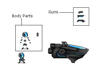
check this out, I hope it'll help you
the colors in your potion are pretty flat and they don't have enough contrast imho. Furthermore the "bubbles" are some unecessary detail. They only make the image look bad. The lines were good and clean, but you should try and stop the gradient shading.
gradient+gradientshade

Last but not least you should give the tree some valume to start with.
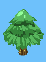
it looks more like a christmass tree air refreshener.

So, this is what I should think of in the future: Not using too flat colours, with more contrast, skip unnecesarry details in small sprites, and to avoid gradient shading.
Thanks!!


") , photobucket would not update the picture for me before.
, photobucket would not update the picture for me before.