Envision, Create, Share

Welcome to HBGames, a leading amateur game development forum and Discord server. All are welcome, and amongst our ranks you will find experts in their field from all aspects of video game design and development.

Pixel Art WIPs/Small Things Thread

lucht pecht":1zecwgge said:
Xilef":1zecwgge said:
I desperately need help developing this scary monster sprite:
scary-2.png
scaryani.gif

read my post above yours about walk cycles it shoul;d help a lot with the animation.
The engine only handles 2 frame animations in 4 directions, so it doesn't really help all that much.

This image here:
gun.png

Will be rendered at 2x size in game.
 
imo change "thein" to "the", but you can keep the "presseth" it works, but readability and function should come first.

it looks really good. i mean the cracks along the bottom the tablet look sort of cheesy and the highlights at the top—in fact imo the borders of the tablet could use a lot of polisihing (and put some more padding in there—the text is too close to the edges, especially if you'regoing to keep the cracks and stuff.
 
In the style of FFIV (small overworld sprite) and FFVI (larger sprite), here is the first playable character for my current project, please C/C...
Small sprites and sideview large sprites are a recolor/tweak of Edge from FFIV. Up and down on the large sprites are recolors/franken of FFVI NPCs.
 
In the style of FFIV (small overworld sprite) and FFVI (larger sprite), is the second playable character for my current project, please C/C...
Large sprites are a recolor/tweak of Shadow from FFVI, small sprites were from scratch.
 
I personally dislike the final fantasy 6 sprites due to the fact that I see them everywhere now and edits of them annoy me, but that's just my personal feelings.
The head band is a little low on the overworld sprite too, makes it look like a eye mask.

I made this whilst being rather sleepy, I don't remember it looking so good, so going to get it in-game and see how it is there.
shotgun-1.png
 
I think you should make the front of the shotgun a bit longer, but if not it's fine it could pass for a sawed off, I do however think you should curve the edges a bit more by a pixel or two it looks two square on the top, the middle looks fine it just the outer edges, the thumb could be a bit longer as well, but those are just minor edits I would make it does look fine tho..
 

Raze

Member

I feel really embarrassed to post this here, yet I have no idea how to shade these clothes or how to find good shades for the colors I want :x The lines for the jacket also look off to me. I think I did a good job on the head though :]


Bleh... Help please?
 
I'm like a total newbie compared to most of the stuff I've seen on this thread but you need something like grey between the legs to represent the back of the jacket otherwise it looks like the jacket doesn't go round his body.

The face looks fine but the goatee is a little low and the little hair going between it makes it look like a double-chin or something weird.

Apart from that that's an awesome sprite, the shading might lack just a little contrast but its still really sick! :thumb:
 
In the style of FFIV (small overworld sprite) and FFVI (larger sprite), here are the third and fourth playable characters for my current project, please C/C...
Large sprites are a recolor/tweak of Galuf from FFV (sideview), up/down large sprites and small sprites were made from scratch.
Large sprite is a recolor/tweak of Terra from FFVI, small sprites were made by frakenspriting FFIV/FFV sprites.
 
Raze":1s0qvnjf said:
I feel really embarrassed to post this here, yet I have no idea how to shade these clothes or how to find good shades for the colors I want :x The lines for the jacket also look off to me. I think I did a good job on the head though :]


Bleh... Help please?
I think what is throwing you off on the jacket lines is the dark shades that are right inside the corners. If you replace those with one of your medium shades, it may help. Personally, I would start from scratch by filling it in with your base color and redoing the highlights and shadows. I do like the look of this sprite, so keep working it until you're happy with it.
 
hahaha whoa that is an amazing concept :eek:

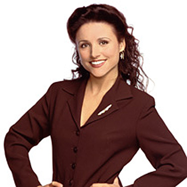
though i'll admit, even though kramer and seinfeld are totally SPOT ON, elaine doesn't super look like julia lewis-dreyfuss, and george is only really distinguishable as george b/c seinfeld and kramer are next to him. otherwise those two would be just any old business-looking chick and fat balding nerd dude.

(also who is that on the right? george's dad? jerry's weird uncle? i've seen p much all of seinfeld but i can't place him)
(oh shit wait is it larry david? b/c that would be awesome except the ONLY thing that makes me think of larry david is his being bald/white-haired.)

elaine-benes-picture.jpg

http://static.tvfanatic.com/images/gall ... icture.jpg

So like to make it more obvious,:
- she'd have a bigger pouf in the front of her hair
- her lips would be thinnger
- her nose would be obviously pointy
- her eyebrows would be arced semi-circles
- she'd have some obv eyelashes/eye makeup
- move eyes down 1 pixel? or something. for some reason her sprite looks hispanic to me and i feel like it's the eye placement for some reason (hispanic chicks have big cheeks)
- ears less pointed outward at the tops; plus she ALWAYS wears earrings. like, always

george_costanza029.jpg

http://www.seinfeld-fan.net/pictures/ge ... nza029.jpg
that ones a lot tougher.
-in this version, it looks like his eyes are closed anime-style, so all i see is an azn dude.
they should be squinty but obv not closed.
- jason alexander's chin is quite prominent; in the sprite, i cant see the chin.
- his ears should be longer. theyre pretty big irl. and this is a caricature so you have to make big features look bigger.
- forehead wrinkles maybe? jerry has one; why not george? (esp since george's expression is more shocked)

also imo kramer should be a liiiittle squintier or else crazier-looking (smaller pupils?). but i LOVE his hair.

and if they were to have other poses for some reason, there should TOTALLY be one of jerry doing a gigantic white jewwy smile like he does. it's pretty iconic for him.
 

Cait

Member

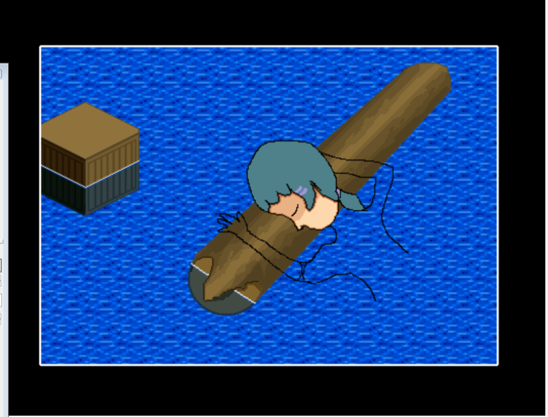
:blank: I've been working on some intro pictures for my game, but sigh, having a bit of hard time with the girl laying on the pole. I know floating debris could be, er, better, but to be honest, the girl looks awful even in wip. My lines are all wrong, and I know I'm pillow shading. ._. sigh, any advice?
wip.png
I've never been able to do people, objects have always been easier, they have straight lines and such, or more than humans do at any rate.
 
magician.png

when i opened that up to take a look at it, it's a lot better than i first thought. the biggest problem by far is the color choice—notably you need MORE CONTRAST. the contrast between your black outline color and your darkest shades is nearly non-existent when zoomed out, especially the way you're shading. Your darker colors are hugging up right against the outline but imo you shouldn't be afraid to show planes by using large spaces of color.

as for anatomy you get a lot of freedom because of your cartoony style, but imo remember that you should still keep a sense of plausible balance—that guy's head is huge.

anyway i have been practicing walking animations (again)

wawk.gif
 

Thank you for viewing

HBGames is a leading amateur video game development forum and Discord server open to all ability levels. Feel free to have a nosey around!

Discord

Join our growing and active Discord server to discuss all aspects of game making in a relaxed environment. Join Us

Content

  • Our Games
  • Games in Development
  • Emoji by Twemoji.
    Top