

You are using an out of date browser. It may not display this or other websites correctly.
You should upgrade or use an alternative browser.
You should upgrade or use an alternative browser.
Pixel Art WIPs/Small Things Thread
- Thread starter Perihelion
- Start date
LaDestitute
Member
Well, it's a SNES sprite so there isn't much room for detail besides the detail I can add. I used Jeff as a base, and used a colorpalette from Ness's nekkid sprite for his skin.
LaDestitute
Member
Anyhow, here are some new Sven sprites. I redid Sven's skin to look better, and I did a little bid of light shading to give it a litttle detail but I tried not to go overboard. Also, the yellow line on his casual shirt is a thunderbolt.
From top to bottom: Nekkid, Casual Clothes, School Uniform


From top to bottom: Nekkid, Casual Clothes, School Uniform


Eriol Clowphengire
Member
@Sekai: There's nothing wrong, but you can use darker colors on the other hand swinging away from the waist, to indicate distance.
Eriol Clowphengire
Member
Good job :3. By the way, I liked how detailed your sprite's face.
SteelReserve
Member
My first attempt pixling a cliff!

Any comments?
@Sekai: it looks really good. I like how she has noticeable hips.
Any comments?
@Sekai: it looks really good. I like how she has noticeable hips.
I got bored like 10 minutes ago and made... this? Seriously I have no idea what I'll use it for, although I fancy colouring it sometime, maybe adding onto it etc...

Also yeah I did recycle and reuse the legs and arms, just did a few quick "deformations" to make 'em look slightly different (Well, for the legs...)
Also yeah I did recycle and reuse the legs and arms, just did a few quick "deformations" to make 'em look slightly different (Well, for the legs...)
@ SteelReserve: Wow.  : That's really your first attempt? That's pretty good. It's a little awkwardly shaped, but then nature's never really "perfect" in appearance. d:
---
Taking into account a few things a couple of people over on another forum told me:
Old / New


Made the arms more parallel to the body. (Also fixed up the shading a bit.)
Old / New


Jutted out the lower legs to make them less perpendicular to the ground. Should look more natural.
---
Taking into account a few things a couple of people over on another forum told me:
Old / New


Made the arms more parallel to the body. (Also fixed up the shading a bit.)
Old / New


Jutted out the lower legs to make them less perpendicular to the ground. Should look more natural.
SorceressKyrsty
Member
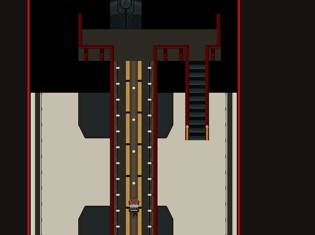
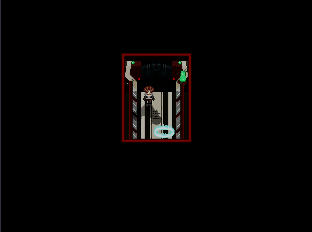
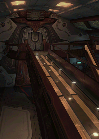
Been working on a tileset lately since I'm working on a fangame/crossover/parody esque thing and there's no way I could find this one in the depths of the internet.
It's the inside of the Ragnarok airship.
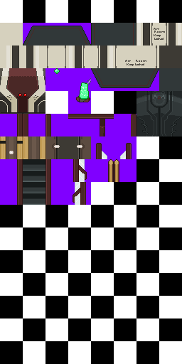 In use:
 Reference:
(I also used the airlock, but I don't have that uploaded :/)
And I also did some height comparisons for the male leads:
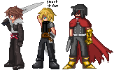
And I got it right. XD.
It's the inside of the Ragnarok airship.


(I also used the airlock, but I don't have that uploaded :/)
And I also did some height comparisons for the male leads:

And I got it right. XD.
SteelReserve":grbf7o31 said:
Don't forget to use imgzoom! It can be hard to critique pixel art without it. Aside from that, I would say you might want to push your colors a bit more. They look a bit dull at the moment, like you just used lighter and darker variations of the same hue - maybe try to mix blues into the shadows, yellows into the highlights, etc.
LaDestitute
Member
Working on a battle arrow for the default windowskin for my game, and if anybody's curious, I used complimentary colors theory.

hi, ive warned you about this like, I dont know, three or four times and its in the above post so how about you use the

hi, ive warned you about this like, I dont know, three or four times and its in the above post so how about you use the
Sekai":2tkh0tw7 said:Finally finished my female temp. How's it look?
I really like the size. That seems like to perfect size to be able to have nice, detailed sprites without having to work insanely hard to animate them.
Something about the arms and the way they animate bugs me - they look noodly I guess? Maybe you could use some lines to denote muscles and shape them up. I don't mean "beef her up" or anything, I just think they could maybe use definition. The neck seems like it might also be too visible to fit the 3/4 view, and the head too far up.
Hah. To be honest, the arms bug me too. Been trying to find a way to fix them, but couldn't really find an actual solution. I'll try your suggestion and see if it looks better.  And about the neck: right now, it's only really 1 pixel in height. If I move her head down 1 pixel, it looks like she has absolutely no neck at all.
Lionel Tabris
Member
I thought of a small 20x32 pendant sprite.

im the imgzoom police weeoh weeoh weeoh~
im the imgzoom police weeoh weeoh weeoh~
Sekai":23viwu6p said:Hah. To be honest, the arms bug me too. Been trying to find a way to fix them, but couldn't really find an actual solution. I'll try your suggestion and see if it looks better.And about the neck: right now, it's only really 1 pixel in height. If I move her head down 1 pixel, it looks like she has absolutely no neck at all.
I know how you feel, that's one of the things I'm having problems with atm. :/

Trying to get shapes/posture right before I move on and start trying to animate it and then ultimately shade it but damn, pixel art is hard for me.
Thank you for viewing
HBGames is a leading amateur video game development forum and Discord server open to all ability levels. Feel free to have a nosey around!
Discord
Join our growing and active Discord server to discuss all aspects of game making in a relaxed environment.
Join Us


 Old / New

