

Pixel Art WIPs/Small Things Thread
- Thread starter Perihelion
- Start date
LaDestitute
Member
I noticed the Amy Chao character chao lacked directional sprites, so I whipped some up:


LaDestitute
Member
*Slaps Twirly* More contrast? You obviously don't know how Chao sprites look.
AzorMachine
Member
@miles: I just didn't figured out that army, but it looks good.
Alypt: the body seems stout and stubby. This may be the problem. Extend her out, especially with the legs, and you might find the result you are looking for. c:
Twirly: those
are
adorable. This may be just me, but I think it could use a little bit more contrast with the dark green, mainly because the shades get lost in the lower shirts and sleeves.
Azor: The dino's perspective seems odd, but I really cant determine what direction you are going for until you finish it. Also, make sure to use
Perihelion
Sponsor
Azor, I really recommend you finish planning out that dinosaur before detailing it. Work on a good silhouette and mark the limbs in different colors, then animate the silhouette, THEN detail it.
Alypt, that sprite is adorable. Agree with Bacon that the legs are a little short.
Twirly, very nice work! Make the shadow on the face lighter, and yeah, more contrast. Use bright, light colors with tinysprites so they're readable at 1x.
Alypt, that sprite is adorable. Agree with Bacon that the legs are a little short.
Twirly, very nice work! Make the shadow on the face lighter, and yeah, more contrast. Use bright, light colors with tinysprites so they're readable at 1x.
Eriol Clowphengire
Member

Koemushi Template has to be changed. Still has its Koemushi features but it's straying away from its RTP-sized former.
Twirly: I think looks a bit better but all i can notice is the pants being different, but it does look sharper...
I don't know if this goes here but it's a small wip, and I would like it to be critiqued, it's a really heavily edited idle pose of a battler I'll be using for my game...

Look at image before putting mouse over black rectangle please!
It started out as Arshes/Aluxes if you didn't noticed, then i did a good job.
I have some work to do...
Thank you and have a nice day...
I don't know if this goes here but it's a small wip, and I would like it to be critiqued, it's a really heavily edited idle pose of a battler I'll be using for my game...

Look at image before putting mouse over black rectangle please!
It started out as Arshes/Aluxes if you didn't noticed, then i did a good job.
I have some work to do...
Thank you and have a nice day...
Well first of all your inside lines don't have to be dark as out outside outline. And Unless your character is extremely top heavy it's a little bulky on top. And Abs don't work that way on sprites. A little less detail would be better cause it's not a real life drawing but a smaller sprite..
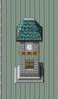
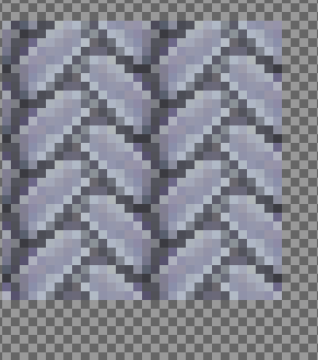
I've been working on my own semi-custom look, but I am not someone whose done this for a long time. I've recolored things, but mainly that's it. I started working with crafting or making two things into one. I decided to make my own things with more pieces. These are it: one is a clock tower created from VX and Mack tiles and not sure what I could do to make it better. It just might be beyond what I can do. The next is a tile, which I am having trouble recoloring. Any helpful suggests would be appreciated.
d(^_| Thanks!
EDIT: I am concerned about size, in relation to this size of building. Although it might be a little too wide, but let me know what you guys think; since I'm just really getting into pixels. d(^.^)
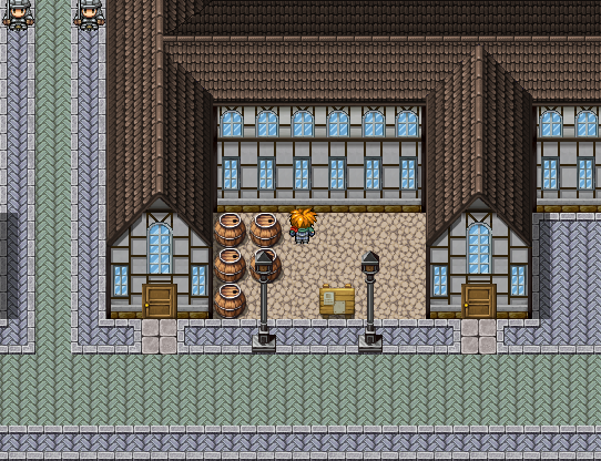
Update: I did this, and I'm not sold on the roof.


d(^_| Thanks!
EDIT: I am concerned about size, in relation to this size of building. Although it might be a little too wide, but let me know what you guys think; since I'm just really getting into pixels. d(^.^)

Update: I did this, and I'm not sold on the roof.
@Cait: As far as size goes, it's a simple matter of logic: You got a house that looks two-stacked with an attic (the frontal high windows seem out of place though... you sure they belong there?), and you got a clocktower that looks three-stacked plus attic with a horribly misplaced cellar door ^^ So yeah, in theory, this isn't all senseless, as it might just be a big house... however, your tileset kind of limits you in the way to create single-stacked+attic houses, so yeah... if you want the giganormous tower effect, increase it's size!
In general, VX's shadow is really messing things up for you... try to draw shadows yourself, and disable VX's, as it doesn't work on anything but stiff 90° angles (meaning it sucks for many many tiles).
For your second tower attempt, it's another logical thing to bear in mind: Especially higher buildings need to be supported from underneath, meaning a string tower with a bulky, made-of-stone block on top won't work out too good in real life. I mention this because it's unlikely the tower will crash down in your game by itself, but it's still a very wonky thing to see for the regular people that live in the regular world. That said, as soon as you tell the player why something is like that, it's alright to use it, as you defined ingame logic.
The roof itself looks alright, but what might be bothering you is that it had an edge instead of a tip.
For the recoloring part, as you're apparently using Photoshop (and a very strange method to export images out of it ^^" ), you have a lot of methods up your sleeves to recolor something. The probably easiest and fastest way is through the Hue/Saturation dialog (Ctrl+U), which lets you adjust different values to change your colors, as well as allows you to completely recolor them (by checking the respective checkbox). This is by far not the best, but definately the fastest and easiest method. Feel free to try out some of the other color management tools Photoshop offers you by looking through the Image > Adjustments submenu.
At the end of the day, you want to use your own palettes though, in order to maintain a style throughout your game as well as to tell yourself you did something right. Finetuning sprites that aren't palette-based can be a pain in the ass, however could save your game's appearance in the end. Make sure that at least when you draw sprites, you try to stick with the same color range for the same project!
LaDestitute
Member
My prototype sprite for my recently created Mother series (Earthbound in US/UK) fan character Sven:

Don't mind the fact he's naked, I have yet to sprite him some clothes or even come up with a concept up for them. Probably a set of casual clothes and a sprite for his school uniform.
~Use ImgZoom Tags

Don't mind the fact he's naked, I have yet to sprite him some clothes or even come up with a concept up for them. Probably a set of casual clothes and a sprite for his school uniform.
~Use ImgZoom Tags
Thank you for viewing
HBGames is a leading amateur video game development forum and Discord server open to all ability levels. Feel free to have a nosey around!
Discord
Join our growing and active Discord server to discuss all aspects of game making in a relaxed environment.
Join Us


