Envision, Create, Share

Welcome to HBGames, a leading amateur game development forum and Discord server. All are welcome, and amongst our ranks you will find experts in their field from all aspects of video game design and development.

Pixel Art WIPs/Small Things Thread

Holder, the sprite seems a tad thin in the 2nd and 4th frames. Maybe moving the limbs farther apart would help.

missingyes, the fingers are somewhat difficult to tell apart. If you're going to go with a black outline, might be nice to outline the fingers too. Also, check that the lineart is perfect. Some part look like they could be rounded more, but it's hard to tell without imgzoom.
 
How about trying to take the light shading up to or just before the knuckles?

EDIT: Ah thanks Regi, I never considered doing that. I'll give it a go and see how it works out.
 

zchin

Sponsor


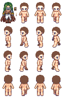
I got a little help from No ID on this, so I changed the mask... And, well this is going to be the goddess of nature... So this person looks goth, this is my main problem, have no idea of what to put :crazy: ... Any suggestions or Critisism would be appreciated.

(you know I was going to say this)
Thank you and have a nice day!
 
Doesn't look natural to me.. the green/red/purple makes me think of poison.
I suggest a pallete change to green, white and brown/ orange. Other than that, try something wider for the trousers or even a dress.
 

zchin

Sponsor


Ummm, this doesn't look much better, it fits nature more and all thanks, but it's... Somethings wrong... Any help here?

Thank you and have a nice day!
 
First, you should move the bangs over to the left a pixel.
Second, make the brownish cape go up another 2 pixels.
Third, Make the gray a bit more purple or red. Also, for that white part, make it less of a gradient, and use only one darker shade.
Lastly, add more contrast to the hair. It feels flat.

Other than that, you're on the right track ;)
 

zchin

Sponsor


Umm is this better? I see the differences though, I guess it has improved a lot... But I still think somethings missing, your suggestions are really appreciated.

Thank you and have a nice day!
 
The gray blends into the brown in the neck area, maybe use a darker shade of gray there. The hair: make the lighter color more yellow (definitely not blue), and try adding a third, lighter color.
Other than that, it looks great.
 

zchin

Sponsor


Ok, so I changed the color of the gray, I sucked most of the red out and did some changes in selective outlining, and I changed the hair tone, any comment on this?
 

Star

Sponsor

@zchin

It looks like you're doing better, but you should stick to a more simpler version of it, sprites aren't meant to hold a lot of detail. I'm mainly talking about the shades or mask or visor thingy. It should be toned down a bit so it doesn't stick out like a sore thumb. Also the shoes are flat at the bottom, round those babies out.

@missingyes

Looks a heck of a lot better than the finger I made a long time ago.

Mn_Sel.png

LOOOOOLOLOLOL

Failsprite.png


Here's a fail sprite I did a while back I decided to revamp it into a new template

Corinne_Big_Ani2.png


Here's a breathing version WIP

Corinne_Big_Ani.png


And here's just some random front animations thrown together
 
Even more contrast between the gray and the scarf:
You can use the gray pallete for the dress, there's no need for 2 new white colors.

I changed the shading of the hair and the mask a bit.
 
Siewnik, interesting pic, but a little hard to tell what's going on. Is that a fire burning by someone's house with constellations in the sky? The ground is shaded strangely though, I'm not sure you should start outward in.


Working on editing (elongating) the default RTP torch. I have the basic shape down, I'm just not sure how to go about shading the bottom. Do I need to add another color? (palette is stolen from RTP torch)
 
Regi":chc1ubq2 said:
Siewnik, interesting pic, but a little hard to tell what's going on. Is that a fire burning by someone's house with constellations in the sky? The ground is shaded strangely though, I'm not sure you should start outward in.
I was thinking when someone wrote this. :) I was trying to make a sky with dark clouds but I think now that non-clouds sky have too much contrast compared to cloudy sky.

Sorry for probably bad grammar, English isn't my first language. :)
 
Not bad. I noticed the railings are uneven at a few points, but the rest will obviously be cleaned up soon.

Any comments on how to shade my tiny torch? :cute:
 

Thank you for viewing

HBGames is a leading amateur video game development forum and Discord server open to all ability levels. Feel free to have a nosey around!

Discord

Join our growing and active Discord server to discuss all aspects of game making in a relaxed environment. Join Us

Content

  • Our Games
  • Games in Development
  • Emoji by Twemoji.
    Top