Envision, Create, Share

Welcome to HBGames, a leading amateur game development forum and Discord server. All are welcome, and amongst our ranks you will find experts in their field from all aspects of video game design and development.

Mapping Improvement Thread 4

Luv, I do really like that map. The main point I have is the same Ares has, you shouldn't use two colours for the same roof.
To give the map a more towny feel, I think it helps alot if you add NPC's, so it gets busy. Other than that, maybe add some market stalls? And it seems that flowers and bushes can grow everywhere it wants, which is a bit weird in a town imo. Maybe give them certain areas to grow in.
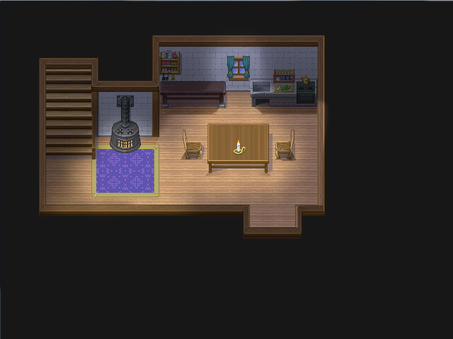
I too have a map I would like some help on, it's made with Inq's indoor tileset. I really like that one for the detail it has, but it seems quite hard to make a nice house for people to live in. One of the things I noted is the lack of couches. Other than that it doesn't have that much variation like the RTP has, and with that I mean the amount of different objects. It has a great deal of varations of the same objects however, like bottles.
Can someone help me? If I am ever to make a game I would really like to use this tileset, but I don't want the quality of the maps to be restricted because of the points I just said.
inqin1.png
 
The rooms looks good, along with the whole house. One of the main issues here, as you stated, it variation. Usually a good way to counter this is to shrink up your maps. While this is the mostly the appropriate size, some rooms can be smaller, in order for it to look better using these sized you would need more objects. If you make the rooms smaller, you can create the busy affect with smaller room. Not only that, if you dont overload your map, you can make a map look busy without making it looks cluttered.
 
I see what you mean, shrinking the maps would make them more busy. However, I only think I can make the kitchen, the bookcase-room and the room with the table a bit smaler, but not that much.
This is, I think, the maximum that can be attained doing that and keeping everything in the map.
inqin2.png
 
@Mr. Smith: Thanks for your comment. ^^ I changed the roofs' colors, and added NPCs. :D However, although I understand what you mean by the market stalls, I don't think it's possible to do that except in a little amount since the big building in the middle is the main market for the town. ^^

As for your map, I think it's looking much better shrinked now. There is a mapping error in the library corner, however, the carpet is overlapping the books. Otherwise, I think it's good, and you should follow bacon's advice on busying your maps by making them small in size. ^^
 
Thanks for your response, Luv. I noticed that mapping error before, but didn't fix it before making the screenshot :) Thanks for pointing out though.

As for your map, that's cool, I didn't know that, of course. I really LOVE the tileset however, it would be great if it was released in public:D However I can understand if that can't be done.
 
That's really a great map Mr_Smith, but one thing bugged the hell out of me:

Mr.%20Smith%20fix.png


On the side the upper are and the lower area shared the same height roof: which doesn't make sense cause upper area gets extra height to its roof in the middle


...or you could just remove the stairs
 
The stairs are going up, so IF they share the same roof height the walls down below should be six high, not those on the upper floor. But a roof can also change in height, so that the roof at the higher part of the house is higher then it below. And I really like having complete innderhoues on one map with different heights, so I think I will just leave it there.
 
no I didn't mean they were suppossed to be six high, just that they are in theory six high because they're three high and the have the three high walls holding up the floor, lol sorry.

and yeah its all a matter of taste, I just found that that kind of usage, though common, really bugs the hell out of me, and though I should share
 
Nice job Smith.

A prototype version of the Chao Race Stadium, using references from the one from SA2B. Note the cream orange/light yellow floor tile and wall, as their actually from the game. Still a WIP as I still have the final touches to add in such as the statues, Chao button, and torches. Everything is custom made by me except for the Chao, the ceiling, and the carpet; which I edited as well.

http://img835.imageshack.us/img835/8600 ... tadium.png
 
Mhm...I knew the carpet would be a problem. I really just want an opinion on the current stage of it. Still waiting for the statue sprites from Crowleyism.
 
Castea, your post would be better suited for the Screenshot Thread. Im pretty sure I have already told you this countless times, but this thread is for mapping critique. If you are looking for people to comment about how it looks with the custom stuff, its better to post it in the SS thread. This thread is for mapping purposes, like the placement of objects and structure of maps. Considering your map does not seem to have anything in it, I think its fair to say that it belongs in the SS thread. Next time please remember this. If you have any questions or need more clarification, feel free to PM me.
 
very nice map. It seems that there is actually room to walk good sir. o;

Few things:

I think you should change the giant tree to brown. The reason being is that I think you could achieve a more rustic sense but thats just me. the wide trees stand out as well, epecially with a different palette of green. Again, you want things to flow, not stick oit.

I still think you add too many different types of objects and if you follow a color scheme you are able to get across an element of emotion. But different boats for different folks.
 
ok, so It's been awhile since I've been to one of these threads but here is the first map I've made in a long time. It's supposed to be a little emptier and darker. It's night and raining. Mostly I was trying some lighting effects. Do they work, do they not? What do you think??

SareoHouse14YAWIP.png
 
I find it a bit weird that there is light above the window, if it means to come from the window I think it shouldn't go up, and a candle also doesn't have that big of a range.
 
Is that HUD always there, or is it the menu that is opened? If it's the last thing, it's fine, but if it's always open it takes up way too much space.
As for the map, I quite like the map, however you should watch out for making things linear, like putting that mushroom next to that bush in the ruin. I also think that those do not belong there, but rather in the garden of a house or anything other man-made. Apart from that, I think it's a good map with a nice fog and screen color tone. Good job!
 

Thank you for viewing

HBGames is a leading amateur video game development forum and Discord server open to all ability levels. Feel free to have a nosey around!

Discord

Join our growing and active Discord server to discuss all aspects of game making in a relaxed environment. Join Us

Content

  • Our Games
  • Games in Development
  • Emoji by Twemoji.
    Top