BizarreMonkey
Member

i cant stop laughing h e L P.. .
OMG YESSSSSSSSSScoyotecraft":1gusg0qj said:
SO COOL
thank ye coyote!


OMG YESSSSSSSSSScoyotecraft":1gusg0qj said:


It doesn't matter, I personally love the design, and it's a break from the typical 'Fyori-esque dress and undershirt with sash combo'.coyotecraft":21zi5d4i said:Don't take fashion advice from me. I probably committed some fashion crime. That top? With that dress?
I don't have any sense for women's clothing. Or any clothing. I'm not even good with armor.
Case in point. :0I was only trying something different because a lot of your characters wear the same baggy sleeves and sash thing. I felt like there were more things to try. Expand my visual vocabulary or whatever you call it.

https://i.gyazo.com/b56603038e0e8b8d834af4355789d05a.mp4StrawberrySmiles":2qrqervd said:I know I shouldn't as an artist, but other than pixel art, I give up digital art. My hand just isn't steady enough.


Welcome to the MindFields font.coyotecraft":kh2f4bco said:I thought I was just looking at decorative alien computer language
I had to stare at it a while to decipher "Exist" and "Neither"


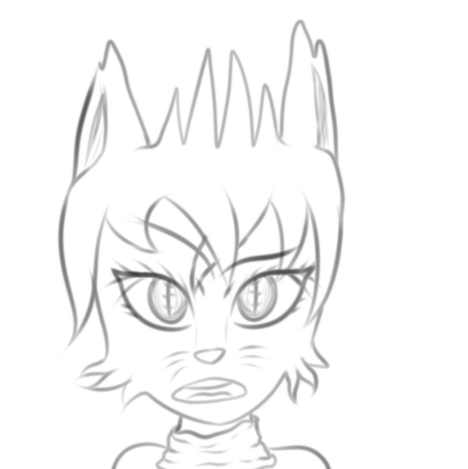
Truthfully I hate it as well, everything feels off.Jason":4989rack said:Seems like she's in the middle of doing something while pulling faces... I don't know, just seems a bit weird to me, since if I were drawing a bust it'd just be stood stil, lol.
The eyes are indeed meant to look abnormal, but I agree, the rest looks bad. I was trying to find a style which I could draw quickly, but alas-- 'twas not to be!Jason":4989rack said:Either way I do like the choice colours and the linework is an improvement over some of your other stuff... the hair seems a little... unnatural if that even makes sense, not sure how but it just doesn't seem to sit right. Also the eyes really stand out since they don't match the rest of it, although that seems intentional, so y'know, can't really complain there, lol.

