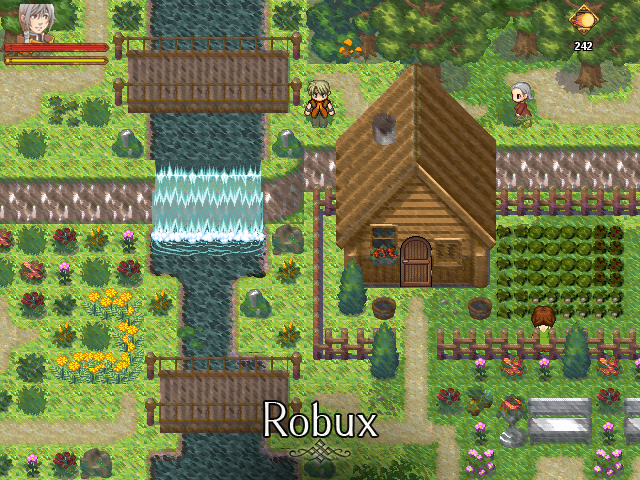
I'm not ready to show anything on my RMXP project right now- that is to say, there's now much to show on my RMXP project right now- so I thought I'd show off the other game-makey stuff I do with my time. I like making custom Ragnarok Online maps for fun. here's some of my better finished stuff and works-in-progress.
I'm not sure if anyone here has ever been into RO, or if that would affect their appreciation of this sorta custom work, but I put some good time into this stuff and it's been a lot of fun. The game I'm planning to make in RMXP right now is something of a reboot of the setting i was putting together in these maps. maybe i'll go more into that later. shit that's a lot of screenshots now that i look at it.
This is a big city I put together. Sorry for the grainy screenshot- That's just sorta the nature of a 10+ year old game engine.

Here are two in-game screenshots from the town, which look a fair bit better than those in the editor. First, a slummy area!

This one's taken on some street in the southwest quarter, near a pair of vending machines. The game doesn't have any 3D vending machine assets so I just whipped these together through carefully positioning/resizing steel pillars, individual bottles, a glassy window and a control-panel-looking-thing together.

some kinda observatory thing. The landscape on this map was a real pain.

A closer in-editor view of the nearby village. I'm pretty fond of this set of buildings!

the entrance to a mine, seen in the background of an above screenshot:

A bridge overlooking an arid little creek. Can creeks be arid? whatever man.

In-game screenshot of this region. What a sunny day!

Not too far away is a 'dock' for a magic-powered boat that glides across the dirt and dunes beyond. neato!

A miscellaneous screenshot from a different town in the same region. I mostly tossed this in because I like green.


Here are two in-game screenshots from the town, which look a fair bit better than those in the editor. First, a slummy area!

This one's taken on some street in the southwest quarter, near a pair of vending machines. The game doesn't have any 3D vending machine assets so I just whipped these together through carefully positioning/resizing steel pillars, individual bottles, a glassy window and a control-panel-looking-thing together.

some kinda observatory thing. The landscape on this map was a real pain.

A closer in-editor view of the nearby village. I'm pretty fond of this set of buildings!

the entrance to a mine, seen in the background of an above screenshot:

A bridge overlooking an arid little creek. Can creeks be arid? whatever man.

In-game screenshot of this region. What a sunny day!

Not too far away is a 'dock' for a magic-powered boat that glides across the dirt and dunes beyond. neato!

A miscellaneous screenshot from a different town in the same region. I mostly tossed this in because I like green.

This is a BIG OVERVIEW IMAGE of the arid island I'm putting together! The two west-most maps are finished, and can be partly seen in a few of the above screenshots. Everything east of those is a work in progress: I like to get the landscaping and texturing of the fields done before I really get down into tougher things like placing objects and defining the height/passabilities of tiles. Lightmaps also take all fucking day to render so many of these maps lack true shadows.

There's a railroad here with some interesting security systems!


A little way-station...

Here's a cliffy area with the sand dunes spill over! Some of the cliffs are terrain, others are models. Lighting looks a bit odd in the editor, so they'll be a bit more cohesive ingame. probably.

A shrine in the middle of nowhere! hrmm!

this one's a good example of how lighting is strange in the editor: Some objects get really dark when resized, and others don't seem affected by the lights at all, so these willow trees I whipped up out of multiple smaller models seem really light/dark here. Ingame they're fine. usually. old engine problems.

Same place without lighting shown, for clarity's sake. Each individual board on these walkways is a singular object, and you'd think this looks amazingly tedious to put together, but it's not so bad with the lovely, lovely duplicate tool.


There's a railroad here with some interesting security systems!


A little way-station...

Here's a cliffy area with the sand dunes spill over! Some of the cliffs are terrain, others are models. Lighting looks a bit odd in the editor, so they'll be a bit more cohesive ingame. probably.

A shrine in the middle of nowhere! hrmm!

this one's a good example of how lighting is strange in the editor: Some objects get really dark when resized, and others don't seem affected by the lights at all, so these willow trees I whipped up out of multiple smaller models seem really light/dark here. Ingame they're fine. usually. old engine problems.

Same place without lighting shown, for clarity's sake. Each individual board on these walkways is a singular object, and you'd think this looks amazingly tedious to put together, but it's not so bad with the lovely, lovely duplicate tool.

I'm not sure if anyone here has ever been into RO, or if that would affect their appreciation of this sorta custom work, but I put some good time into this stuff and it's been a lot of fun. The game I'm planning to make in RMXP right now is something of a reboot of the setting i was putting together in these maps. maybe i'll go more into that later. shit that's a lot of screenshots now that i look at it.


