
You are using an out of date browser. It may not display this or other websites correctly.
You should upgrade or use an alternative browser.
You should upgrade or use an alternative browser.
The Screenshot Thread
- Thread starter Ellie
- Start date
- Status
- Not open for further replies.
what are you saying, exactly? I can't tell what this means.gRaViJa":gs6mjvbn said:However, it is also possible that everything looks great and the gameplay is fun great from the start?
Yeah i kinda rushed that lol. What i meant is that i don't really understand why people are saying that Mundane shouldn't spend so much time on the aesthetics of his main menu. It's not because you spend much time on that part of your game that the gameplay will suck, does it? 
gRaViJa":gsh4e0b7 said:Personally i think a well designed title menu can be important, by the way. It's the first impression the player get's from your game, and you never get a second chance for a first impression.
Thanks. I agree with what everyone has said thus far - I just don't see why you would assume that I'm going overboard with menu elements when I simply said that I was working on them. Either way, you're correct about needing to focus on gameplay.
Juan J. Sánchez
Sponsor
Mundane":17l1fvgr said:Thanks. I agree with what everyone has said thus far - I just don't see why you would assume that I'm going overboard with menu elements when I simply said that I was working on them. Either way, you're correct about needing to focus on gameplay.
You're not. You're simply making pretty menus. And while a gorgeous looking custom menu system might not go with RTP character sets, as long as you keep that very same high standard on all aspects of your game, it will look fine.
Testing my new distance-lighting technique

This second one is to test the horror aspect if I wish to use it.

I had to swap out the pixel-editing for this new method (Increased the FPS from 40 to 60 for me), with this new method comes other benefits, each texture now has a number of copies of itself, each one progressively darker, with each distance, the picture is swapped in or out. I can use this to edit the dark images so they have glowing lights, which would be perfect for my computer-monitor opening of the game, the player will see the monitor in the darkness to guide them. I can also give enemies glowing eyes in the dark, or make items light up.
I further optimised the rendering by having the renderer stop when it goes beyond the farthest light-level, it looks seem-less currently, but I'll have to watch out for it when expanding the engine. This locks the frame-rate for wide-open areas, so it doesn't drop below 30.
I'm expanding this so lighting is controlled in the same way, so a cube of map could have the image brightness of 4 amongst the darkness, which would be good for illuminating corridors.
I also had to drop the GDI+ hybrid, I'm looking into using direct draw again but apparently simple drawing a 2D image is a complete nightmare. Dropping the GDI+ hybrid moved my frame-rate from 60 to 125 but reduced the rendering quality significantly.
For poor-CPUs, there is now an option to drop the floor rendering, which takes my frame-rate from 125 to 200 in closed-in environments and to a maximum of 333FPS in open environments, with the floor-rendering dropped and the torch turned-off there's quite a dark feeling to the environment and you have to stick close to the walls to navigate, so that could be used for sections in the game when the lights suddenly cut out and the player needs to find a switch.

This second one is to test the horror aspect if I wish to use it.

I had to swap out the pixel-editing for this new method (Increased the FPS from 40 to 60 for me), with this new method comes other benefits, each texture now has a number of copies of itself, each one progressively darker, with each distance, the picture is swapped in or out. I can use this to edit the dark images so they have glowing lights, which would be perfect for my computer-monitor opening of the game, the player will see the monitor in the darkness to guide them. I can also give enemies glowing eyes in the dark, or make items light up.
I further optimised the rendering by having the renderer stop when it goes beyond the farthest light-level, it looks seem-less currently, but I'll have to watch out for it when expanding the engine. This locks the frame-rate for wide-open areas, so it doesn't drop below 30.
I'm expanding this so lighting is controlled in the same way, so a cube of map could have the image brightness of 4 amongst the darkness, which would be good for illuminating corridors.
I also had to drop the GDI+ hybrid, I'm looking into using direct draw again but apparently simple drawing a 2D image is a complete nightmare. Dropping the GDI+ hybrid moved my frame-rate from 60 to 125 but reduced the rendering quality significantly.
For poor-CPUs, there is now an option to drop the floor rendering, which takes my frame-rate from 125 to 200 in closed-in environments and to a maximum of 333FPS in open environments, with the floor-rendering dropped and the torch turned-off there's quite a dark feeling to the environment and you have to stick close to the walls to navigate, so that could be used for sections in the game when the lights suddenly cut out and the player needs to find a switch.
Pokémaniac
Awesome Bro
Bluxxon <3


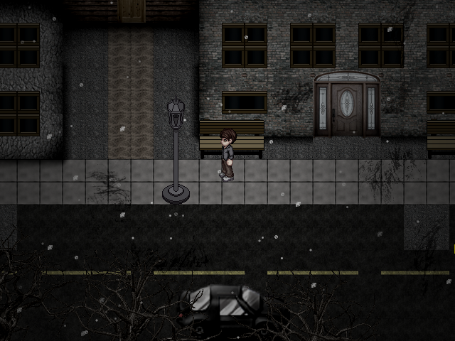
dude swick that is super interesting. there's a nice sense of balance in the character, with a sort of casualness that seems hard to really sprite out. Additionally, the complimenting textures of the background let it stand out without making it weird.
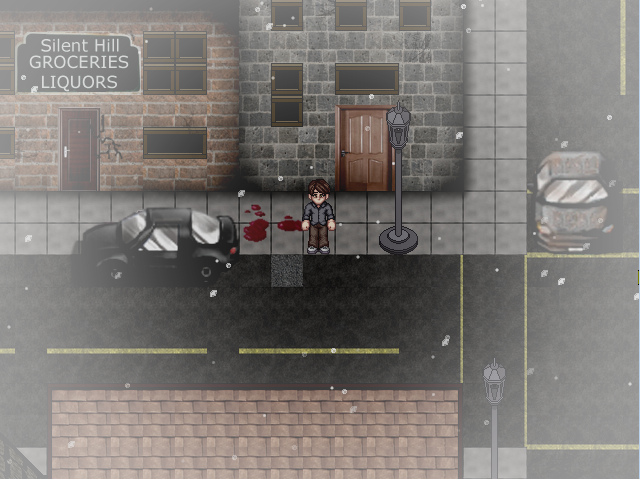
However, I think the objects, notably that lamppost, are undertextured, at least in comparison to others. Also, the usage of white in the first shot isn't really that great, and i'm not even sure if it's really centered in the screen. Feels like you're trying to do either a flashback or snow effect, and if it's flashbacks, they are generally sepia-ish, and if it's snow... it's not done right.
However, I think the objects, notably that lamppost, are undertextured, at least in comparison to others. Also, the usage of white in the first shot isn't really that great, and i'm not even sure if it's really centered in the screen. Feels like you're trying to do either a flashback or snow effect, and if it's flashbacks, they are generally sepia-ish, and if it's snow... it's not done right.
Thanks very much! It's fog with falling ashes :P it's a tileset based on the Silent Hill series. Not sure if you ever played it. Silent Hill is basically a ghost town, so there wouldn't be any lighting of any sorts (other than your own flashlight or something), and the buildings need to have a "burnt" look to them, and vision is limited due to the amount of fog, hence all the white. And yes, the lamposts are incomplete. I plan on finishing this tileset though!
AzorMachine
Member
Wow, very good swick, it's in the style of SH.
But I think the first screen seem like it is without depht. As you already said, it needs to be finished, and I wait to see it done, congratulations :thumb:
Well everyone, here it goes a image of one of the reigns of my steampunk game. I removed all the vehicles and chars of the map cuz' they aren't finished.

Sorry for the bad english, and Best Regards.
But I think the first screen seem like it is without depht. As you already said, it needs to be finished, and I wait to see it done, congratulations :thumb:
Well everyone, here it goes a image of one of the reigns of my steampunk game. I removed all the vehicles and chars of the map cuz' they aren't finished.

Sorry for the bad english, and Best Regards.
rey meustrus
Sponsor
Very nice steampunk! It looks straight out of early industrial England. Love the street, it's very well done. The pipes and steam add to the atmosphere. If you're serious about steampunk, you might want to add even more pipes and steam. Also, you might consider compressing the space a bit. Put the houses a little closer together. Actually, I think that if the buildings were bigger with the same space between them, that would accomplish the same effect without reducing the amount of space the player has to move in (which can be important if you have NPC's moving around, because you don't want them getting in the way of one-person passages).
AzorMachine
Member
Thank you Meustrus!
About what you said, this is a part of the reign, that don't have too spteampunk aspects, let's say that. But there will be, and a lot, of places with big gears moving, pipes with a lot of steam coming out, and a lot of metal. In "Aore - A queda de Ballústica" [The project's name in english would be something like "Aore - Ballústica's Fall"] I tried to give a loyal organization of reign, since from arquiteture, to culture. And as in our world, one Reign can have a lot of diferences in these fields.
I would like to post the concept I'm creating for the menu too, if you can evalue it.
It isn't finished, needs a big gear in the back of the semi-circle, e a status screen in the side of the character. The bottom of the image needs to be finished too. Sorry for the bad english again, I woke up now, and can't think very well haha.

Best Regards
About what you said, this is a part of the reign, that don't have too spteampunk aspects, let's say that. But there will be, and a lot, of places with big gears moving, pipes with a lot of steam coming out, and a lot of metal. In "Aore - A queda de Ballústica" [The project's name in english would be something like "Aore - Ballústica's Fall"] I tried to give a loyal organization of reign, since from arquiteture, to culture. And as in our world, one Reign can have a lot of diferences in these fields.
I would like to post the concept I'm creating for the menu too, if you can evalue it.
It isn't finished, needs a big gear in the back of the semi-circle, e a status screen in the side of the character. The bottom of the image needs to be finished too. Sorry for the bad english again, I woke up now, and can't think very well haha.

Best Regards
Juan J. Sánchez
Sponsor

It's really nice, but it's too empty. Also, you might consider it may be too brown. Level down a bit the parchment paper.
AzorMachine
Member
It's really nice, but it's too empty
As I said, it isn't finished. But thank for the color suggestion, I'll try it later.
- Status
- Not open for further replies.
Thank you for viewing
HBGames is a leading amateur video game development forum and Discord server open to all ability levels. Feel free to have a nosey around!
Discord
Join our growing and active Discord server to discuss all aspects of game making in a relaxed environment.
Join Us


