Envision, Create, Share

Welcome to HBGames, a leading amateur game development forum and Discord server. All are welcome, and amongst our ranks you will find experts in their field from all aspects of video game design and development.

The Screenshot Thread

Status
Not open for further replies.
Harry, i would change the water...
Give it some more inconsistancy by adding light and darker in the big one's...
Especially darker one's, but if it's not that visible in-game than maybe it will work..

Other than that, it look's great ;D
 
houseudania.png
 
/*
function draw_screen_tint(args) {
name: draw_screen_tint(x, y, w, h, c1, c2, c3, c4, a1, a2, a3, a4);
arguments:
[0] = x - x coordinate of start of tint | integer[recommend 0 - 2000];
[1] = y - y coordinate of start of tint | integer[recommend 0 - 2000];
[2] = w - width of tint | integer[recommend 0 - 2000];
[3] = y - height of tint | integer[recommend 0 - 2000];
[4] = c1 - rbg colour of top left of tint | rgb colour];
[5] = c2 - rbg colour of top right of tint | rgb colour;
[6] = c3 - rbg colour of bottom left of tint | rgb colour;
[7] = c4 - rbg colour of bottom right of tint | rgb colour;
[8] = a1 - alpha value of top left of tint | real[0 - 1];
[9] = a2 - alpha value of top right of tint | real[0 - 1];
[10] = a3 - alpha value of bottom left of tint | real[0 - 1];
[11] = a4 - alpha value of bottom right of tint | real[0 - 1];
returns: void;
description: draws a rectangle at a depth of -1000 at coordinates (x, y) dimensions (w x h) with colour values rgb[1-4] and alpha values [1-4].
*/
you'll see a diagonal line if you have anything high but if you use the right colors for blending you won't notice it.

Edit: Here's a full on demonstration of the screen tint, I decided the light should come from the left so the lightest color(being yellow) would be top-right, and orange top-left. The other 2 colors were black.
For night time you're going to be using a mix of pretty much any dark color mostly blue or a nice blue-green.
2cd8g3p.png

©hanzokimura for the map
 
Looks pretty cool, for not being RMXP or VX. Well done :)

Here's a screenshot from me:
2m79chs.png

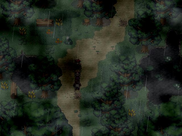
I've been trying to find a new colour for the trees and the grass on the RTP graphics. Screenshot may be a bit dark.
 
Saw it before on i think rmxpunlimited :)
It has a good atmosphere though i think the mapping is a bit to squary. Great job with the panorama and light effects.
 
The_Shadow":31f3u0k7 said:
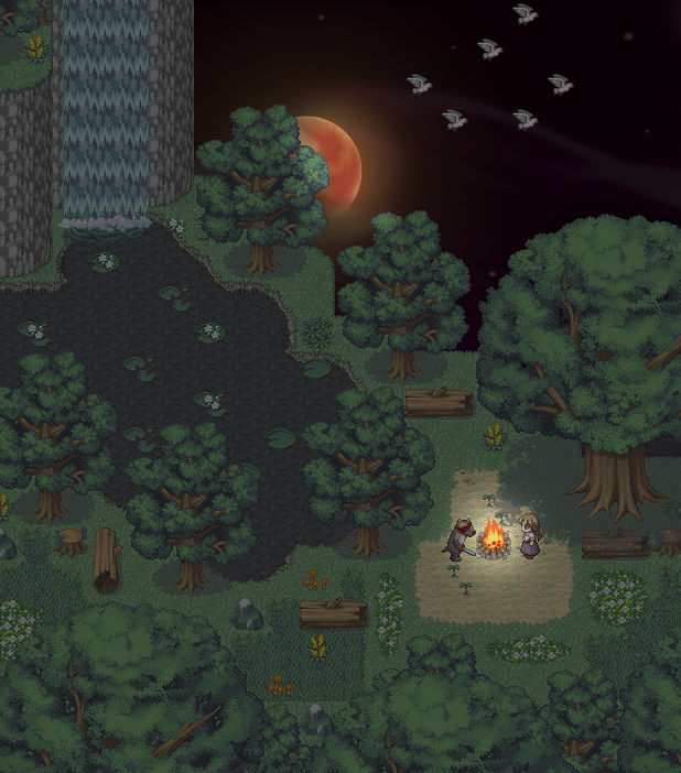
Here's a new map from me:
2m79chs-2.png

I think there are far too many trees near the lake. I'm not saying trees don't grow near water supplies, but that's like five in a row. Also, I think the flock of birds at that time of the night is a bit strange, isn't it? Finally, I'm not a fan of your background image.
 
epickakolaboracjaftw.png

Still WIP (some elements are missing or need fix) but take a look and critique.
Background was made by me (it need some fix too) and other graphics was made by my friend Amakuro.
 
antialiasexample.png


I've been testing out anti-aliasing in software rendering.
antialias.png


This is also the first preview of a bitmap/gdi software-rendering hybrid i finished up this second.

Anti-aliasing won't be used in-game, it takes the frame-rate right down to 4 frames from a steady 70 on my super computer.
 
Yes those, but I meant the ones on STILTS.
Brown roof, has lots of flowers on the windows.

Actually your perspective is off on a lot of it, let me load gimp...

perspective.png
 
Status
Not open for further replies.

Thank you for viewing

HBGames is a leading amateur video game development forum and Discord server open to all ability levels. Feel free to have a nosey around!

Discord

Join our growing and active Discord server to discuss all aspects of game making in a relaxed environment. Join Us

Content

  • Our Games
  • Games in Development
  • Emoji by Twemoji.
    Top