Envision, Create, Share

Welcome to HBGames, a leading amateur game development forum and Discord server. All are welcome, and amongst our ranks you will find experts in their field from all aspects of video game design and development.

The Screenshot Thread

Status
Not open for further replies.
LusiferNazi":23bb43cu said:
regi":23bb43cu said:
@LusiferNazi: I like it! You did a good job merging and editing tiles for the sci-fi/modern feel. What are those floating orange signs? The bottom brick part of the chimney doesn't really fit, though. The bridge is nice, but I would try making it one tile thinner (to match the stairs, like this image):
Quick_Bridge_Stairs03.jpg
Those floating oranage signs are holoboard used for broadcasting news, directions and propaganda from the emperor.

Screens look good :) But isn't Arcadia a city from Final Fantasy XII? (and it's a reference to an utopian paradise as well if i remember right).
 
Just a minor issue with that town screenshot: medieval buildings were built with the tops sticking out because they were built so close together. There was no room to expand the bases, as the street went there, with a sewer, however they could make them overhang (often unsafely). (This is why the great fire of London happened)
 
A video of my F-Zero engine WIP
http://www.youtube.com/watch?v=R208TBhstDU
It now has acceleration based on mass and top speed and a calculated acceleration rate.
Mouse is used for steering.
Added sprites, the player's vehicle is the same sprites/entity as any other vehicles on the track, the only thing special about the player is that the camera is locked onto their butt.
 
Hello ive been working on a new type of theme for my game a more sharper type of tileset, its only edited to be sharper...and bring an overall original feeling towards my game, this tileset is a tileset ive been playing around with abit, and it's a part of my game, aswell as the new Message system which is overall simple and not to over fancy. Also i present Gamba ABS, you can overall see how the gameplay is going to be in the screenshot a kinda Kingdom Hearts/MMORPG feeling, so tell me what you think guys

Comparison:
Old Tileset: (btw thats dashing effect being used, credit to??, i kinda forgot, will put it in full game)
dctdc1.png


New Tileset
dctdc5.png
 
If you're going for an underwater look, the first one is better imo :)

http://www.youtube.com/watch?v=V-sN__OBi34

It's just a video of different screenshots and custom music for my game, so it qualifies as "a bunch of screenshots", right? :p
 
I'm making a gameplay video and a trailer now, i'll post them when i finnaly make a project thread here. Anyway: another screenshot :p

Mark1707 is helping me with mapping. He's one of the best mappers out there and his work really is amazing. It's a part of a village of a nomadic tribe. They stay at this place in the winter and move away during spring. (Yes i know most nomadic tribes do not farm, but these guys look like they do).

ascension.png
 
Very pretty! Edits like that to the RTP really bring out originality to aesthetics. Only complaints are that the lily pads look odd without a shadow, and the second tree's color tone in the lower left seems off.
 

SPN

Member

gRaViJa":33y5o9s1 said:
I'm making a gameplay video and a trailer now, i'll post them when i finnaly make a project thread here. Anyway: another screenshot :p

Mark1707 is helping me with mapping. He's one of the best mappers out there and his work really is amazing. It's a part of a village of a nomadic tribe. They stay at this place in the winter and move away during spring. (Yes i know most nomadic tribes do not farm, but these guys look like they do).
The map is looking very, very nice! The only thing I noticed after some investigation (besides the lower left trees pointed out already) is that the small rocks in the water have a much smaller part submerged than the cliffs do, as if they were in shallower water. I didn't even notice it at first, so I don't think it would be a huge deal, just throwing it out there :)
 
@LegScion:
I see that you try to add lots of different details to your map, but you've got to make add-ons, stick some plants with some stones together in one tile and adapt the colours in order to be able to make these details fit into your maps. Right now, they don't fit because of the colours, take a bit of saturation out etc.

@gravija:

Oh my, you're the first one in two years who has made some GOOD colour and RTP edits. You've rounded the tiles and have mixed together the right tiles.
Though you're not the best mapper in my eyes, you've got interesting ideas for your maps which make them stand out. The most important part: it looks like a map I actually would like to walk over in a game.

@myself:

I absolutely love edited RTP, especially if everything fits together in the final image:
Since a year or so I've given up on the RTP and started working with hand-painted 'maps' so today I want to present one of my last tries to find a drawing-style which I can use to 'quickly' draw a map. This is the second try and it is everything but perfect. BUT, please just criticise the impression of the art-style, and not the perspective mistakes or Arshes. Thanks in advance :)
secondone3vm1e.png
~Ragnai
 
Ragnarok":jbej76i5 said:
I absolutely love edited RTP, especially if everything fits together in the final image:
Since a year or so I've given up on the RTP and started working with hand-painted 'maps' so today I want to present one of my last tries to find a drawing-style which I can use to 'quickly' draw a map. This is the second try and it is everything but perfect. BUT, please just criticise the impression of the art-style, and not the perspective mistakes or Arshes. Thanks in advance :)
secondone3vm1e.png
~Ragnai
dude would you please make a game like that in black and white
please
 

SPN

Member

The_Shadow":3gfjwnnz said:
[/quote]
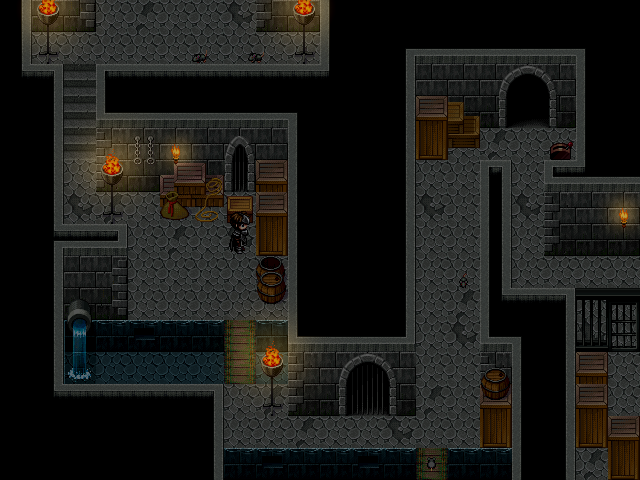
I really like the mood the torches are setting on the map, and I like your nifty mapping ideas, like the barrel on top of the box and whatnot. Near the top around the middle though, where the three boxes are stacked in that corner, if you want to be terribly realistic, the box in behind on top of the other one technically doesn't have enough room to be behind the tall box, judging by where it's placed on the floor.

Again, I'm just being annoyingly nitpicky, but hey, this stuff helps people...sometimes :D

Oh, and to add to my previous comment, gRaViJa, there's another little thing I noticed. The entrance in the upper right, the edge of that cliff falling down into the water, since the edges are so close together, on of those little cliff corner pieces got cut off by another one. I know that there aren't tiles that have two corners on them besides the cave RTP tilesets, but with all the edits done already, I can't see this being an issue to fix. :)

Oh, and a little lame screenshot from me:

[img]http://img826.imageshack.us/img826/963/battlework.png

Evented battle system started an hour ago. Whipped up some fancy text in Photoshop, layered the heck out of it, and through a series of Self Switches, picture swapping, fading, erasing, and too many event pages, I now have a fully functioning "choice window" mockup that I can expand on and actually make stuff work. Hitting up and down, like in normal choice windows, plays the sound effect, and the arrow moves, fading out the other choices. The key to making this work is the Button Input Processing event command. More specifically, using it as a placeholder to branch the event off depending on what buttons are being pressed (up and down in this case).

Check it:

examplez.png


It's so motivating when you make even the smallest amount of progress.
 
The screen looks really good and the edited rtp is nice. I think i know what you mean thoug. i think its is because the colors of teh houses, roads and ground are to similar. Try to use some more variation in colour.
 
Status
Not open for further replies.

Thank you for viewing

HBGames is a leading amateur video game development forum and Discord server open to all ability levels. Feel free to have a nosey around!

Discord

Join our growing and active Discord server to discuss all aspects of game making in a relaxed environment. Join Us

Content

  • Our Games
  • Games in Development
  • Emoji by Twemoji.
    Top